Advertisement

Pantone
Pantone isn't just a swatch system – it's practically a way of life for every creative since art school. But inside its Colour Institute is a team slowly and meticulously building Pantone into a brand with a unique – and colourful – way of looking at the world.
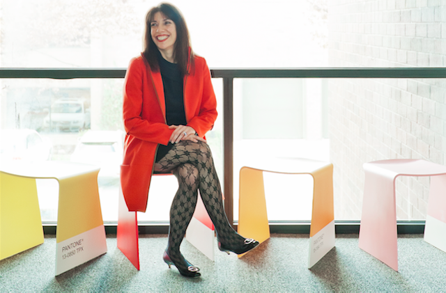
Laurie Pressman, vice-president of the Pantone Colour Institute, was on holiday in the south of France when the 00s financial crisis first reached boiling point.
“I was coming out of Galeries Lafayette and my husband said: ‘This just happened, and this just happened … Lehman Brothers has closed’. All of a sudden my eyes closed and all I could see was an empty selling floor in neutrals and greys.”
This is what life is like as a Pantone employee. Its workforce lives with a self-inflicted hyper-awareness of colour – not only its aesthetic and its uses, and the emotional effects it induces, but the meaning it imbibes of the world it inhabits. Launched in 1987, the Pantone Colour Institute was formed after its parent company, operating in a society of pop pulp psychology, became inundated with questions of meaning: what colour should my new product be, how can I use colour to target a certain audience?

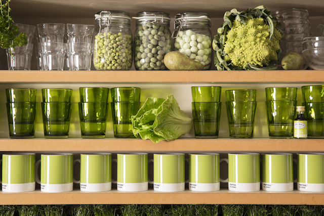
Pressman manages a global team of trained colour scientists, working closely with brands on their visual identity alongside trend report compilations and researching Pantone’s Iconic Colour of the Year accolade. The fresh, soothing 'Greenery' took the title in 2017.
The sheer amount of analysis and meticulous observation that goes into its colour of the year selection is indicative of the way the institute views colour. For those at the company, colour is not a tool but an opaque mirror reflecting society as a whole.
“We left 2016, when colour of the year was 'Rose Quartz' – a fusion of serenity – so we had already reached that need for wellbeing and the need for inner calm,” explains Pressman. “There’s currently still that need for balance. People are just saying: ‘I'm living in front of this screen all day long; this is not enough.‘”
'Greenery', for Pressman, represents what modern people are searching for. It’s “calming”, “refreshing” and “engaging with nature”, a symbol of rebirth and new beginnings that also reflects the west’s newfound love of green juice and recycling culture.

Interesting, though, that Pantone should pick a colour of such exuberance in a time when ice caps melt, refugees drown at sea and Donald Trump sits in the White House.
“We're going through so much turmoil everywhere around the world, and it's scary, and there's uncertainty because of that,” says Pressman. “However it's a colour that we feel that consumers are looking for. I go back to this idea of what colour can hope to answer. Colour influences our mood and it influences our outlook. So as people look to disengage and go out into the world and experience life, what colour reflects that aspiration?
"We're aspirational in that way. Nobody wants to feel doom and gloom – we're looking for hope and we're all looking for optimism – and we look for a colour that's going to reflect what people are looking for versus how they feel at that moment.”
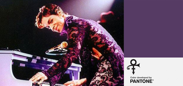
The year-long, almost anthropological study that went into crowning 'Greenery' was a world away from the process of creative 'Love Symbol #2', the custom shade created in partnership with the estate of Prince to commemorate the purple-loving pop icon. The exact shade of purple was chosen to match that of the singer’s bespoke Yamaha piano, which he due to take on tour before his death in April last year.

“Prince[‘s project] was probably simple in the sense that they were very clear on what they needed that purple to look like,” recalls Pressman. “It wasn't about the psychology or what that colour communicated. It was really about honouring him and communicating the essence of him.”
Partnerships don’t come much more high-profile than Prince, and 'Love Symbol #2' encapsulates how Pantone works with brands. Most of its work with third parties is done on a consultancy basis behind closed doors, but the deals worthy of a press release are selective to say the least. Jason Wu, Airbnb and the British Fashion Council are all former partners that emulate the essence of cool Pantone inarguably has in bucket loads.
Pressman is a little vague when asked just how discerning the institute is when it comes to partnering up (“We try to work with people that we feel are symbiotic with our brand, who will resonate with the consumer”), although she does admit they do have a tick sheet of values to look for in brands.
“I think we keep ourselves relevant by always being abreast of what's taking place in the world – again going back to the mentality of what's new, what's next,” Pressman continues. “We look at what's happening and how it can be expressed through colour, so with Airbnb or some of the other partnerships that we developed, these are relatable things that are fun, things that are evocative of the culture – what's happening now and what will be happening down the line.”
Pressman believes Pantone to be the “a designer's brand”. But she could easily make the case that it’s a marketer’s brand too.
“I do see more people or more companies turning to colour as a way to create a distinctive visual identity and stand out on the shelf in the market and communicate their message,” she says, citing brands from Esteé Lauder to Method toilet cleaner as examples of labels using colour as their primary method of gaining new audiences.
“It is more important than ever to create a visual identity,” she says. “Brands are looking for a way to stand out, but they also want to tell their story. We live in a flat world. We are all spending so much more time online, but you can't touch online – there's no texture, no heritage.
“I think people that haven't grown up with that texture… they want to be engaged. Part of building a community and loyalty and allegiance is telling the full story. I think colour now is being pulled out and extracted as part of that story in a way that it hasn’t been before.”

It’s not surprising that a Pantone representative would predict an industry-wide refocus on colour. But whether or not you agree with tone and shade’s subliminal power over consumers, it’s hard not to be slightly envious of Pressman – who, armed with a psychology degree and a background in retail, now finds herself working in the middle of a rainbow.
“When I first came to Pantone I almost felt like Dorothy in Oz,” she recalls. “It took me into a whole different understanding of colour and the thought process behind it. Colour is a visual feast for the eyes and a mode of expression.
“It takes us back to the time when we're kids – it’s something to have fun with.”