'The people's money' - The story behind the Royal Bank of Scotland's new polymer notes
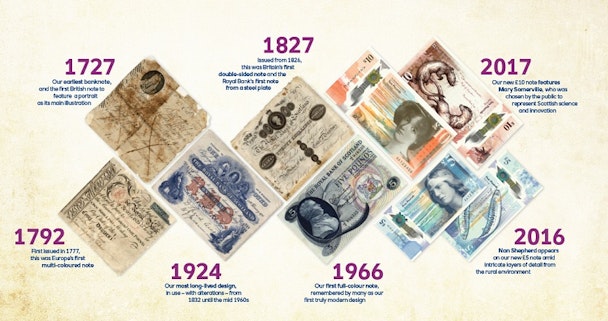
If you think of Scottish bank notes the traditional ‘shortbread tin’ image of Scotland probably springs to mind with castles, tartan, thistles and men of good repute synonymous with the nation’s currency – until now, that is.

RBS has turned to the people of Scotland to create its new notes
Taking a process that is usually kept behind closed doors and turning it on its head the Royal Bank of Scotland (RBS) has – for the first time – consulted the people of Scotland to create a currency indicative of those who use it every day with the first of the new look £5 going into circulation this week (Thursday 27 October).
Working with business, service and experience design agency Nile, RBS looked to visually capture the voice of the nation through workshops, online communities and surveys before turning to the country’s top designers to bring the ideas of more than 1,100 Scots to life.
“Rebekka [Bush, RBS creative director] came to us with an opportunity to build a collaboration on a national scale. She was looking to engage the people of Scotland in the design of their bank notes – a revolution in the bank’s approach to note design and something which really took it beyond its comfort zone,” explained project lead Jeni Lennox of Nile.

Reaching out to the public in May 2015 work began on the winning theme ‘the Fabric of Nature’ last summer with Nile inviting the likes of O Street, Graven Images, Stuco Design and Timorous Beasties along with contributors from the fields of numismatics, marine biology and poetry to get involved whilst it took a step back to “guard the people’s voice and ensure nothing was lost in translation.”
“The challenge was to gather the voice of a nation and turn it into something visual, to find and organize familiar images and arrange them in a way that would remain fresh despite being seen every day for decades,” added Lennox.
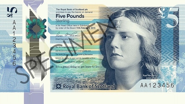
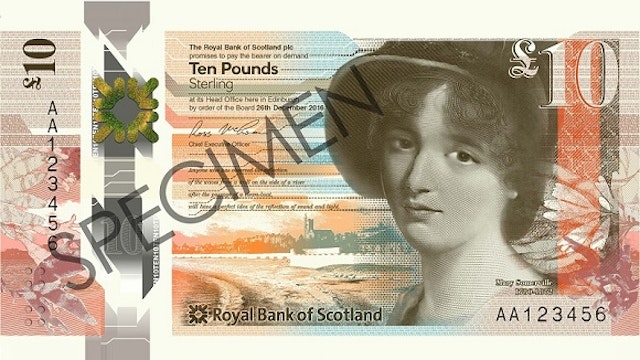
As well as throwing out the rule book when it came to design RBS also took the decision to feature women on its notes for the first time with novelist and poet Nan Shepherd selected to appear on £5 notes and scientist Mary Somerville debuting on the nation’s £10 notes which will follow in 2017.
A decision which, RBS Scotland Board chair, Malcolm Buchanan has said filled him with “enormous pleasure” to be able to celebrate the “fantastic, and often overlooked, achievements of two great Scottish women.”


Shepherd’s beloved Cairngorms feature on the note behind her along with a quote from her first novel, ‘The Quarry Wood’, - ‘It’s a grand thing to get to leave and live’ – and one from her observations of the Scottish landscape, ‘The Living Mountain’, in keeping with the overarching ‘Fabric of Nature’ theme.
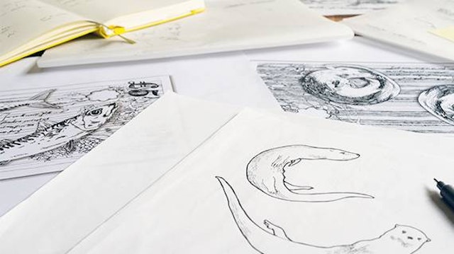
The reverse of the notes shows two mackerel, the single most valuable stock for the Scottish fishing industry, along with an excerpt from Sorley MacLean’s ‘The Choice’. The fish were illustrated by Glasgow artist and Stuco Design studio owner Stuart Kerr – the only trouble is he suffers from a severe fish allergy.
“I knew that I had to draw the images from life – or as close to a fish as I could safely get,” joked Kerr. “It was a difficult commission, trying to capture every detail of the fish while not getting too close to them. I had to have my assistant hold the fish up while I studied and drew them. The whole time I was working, I was trying not to breathe.”
The soon-to-be-released £10 note the reverse also features illustration from Kerr who completed the seaweed background for the two otters featured on the reverse of the note.


With so many design elements it was up to O Street to create a “cohesive environment” a process which owner Neil Wallace described as a “rollercoaster” thanks to the complex creative problems thrown up by the bank’s new polymer notes.
“It required a realistic mix of compromise, innovation and old school hard graft,” he revealed, adding unfortunately some aspects of the original design were simply not possible.
“We knew once our design was put through the engraving process at De La Rue and the security windows, foils and UV had been integrated somethings might have to change,” said Wallace.
“We were understandably anxious to see the outcome of the work we’d handed over and happily, for the most part, the note came back looking the way we’d hoped. Now we hope people enjoy spending them and folk are pleasantly surprised to find a woman on the front and a fish on the back.”
Of the final product, Buchanan said he was “delighted” that the public had managed to play such a pivotal role in the creation of the notes. “People in Scotland will be using this money every day and it’s quite right that they got to play an important role in designing it.
“This truly is the people’s money.”

