Wood’s Old Navy Rum introduces new packaging to become ‘more memorable’

William Grant & Sons has brought in new packaging and visual identity for its Wood’s Old Navy Rum to achieve greater stand out and become “more memorable” for consumers.

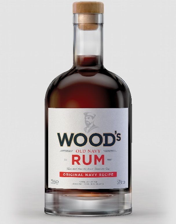
The drinks company approached Purple Creative for the overhaul which created a new bottle shape with thicker glass in a nod to the sailors in the British Navy in the eighteenth century when they were given their daily ration of rum. A cork has been introduced to make it look more premium, while the brand’s sailor icon has evolved from a pastel illustration to a stronger image.
Purple founding partner and creative director Steve Bewick said: “Our objective was to make the Wood’s bottle and packaging more premium, iconic and memorable. We conducted extensive research into the history and heritage of Wood’s, including unearthing some previously unknown facts about the brand inspired by its rich naval heritage and traditions.”
Bold stripes have also been added to the label as a graphic device that can be used on communications to create a recognisable look and feel.
Gwilym Cooke, Wood’s brand manager, commented: “After evaluating the brand’s rich history, consumer trends and the dark rum category, we recognised an opportunity to rejuvenate Wood’s. Purple has succeeded in creating premium packaging that matches the quality of the liquid inside the bottle, without straying from the navy history that is so iconic to the brand.”