CBBC unveils ‘versatile and dynamic logo… for a broad age spectrum’

Children’s broadcaster CBBC has revealed a new logo and identity, moving away from the green decals that have served it for almost a decade.
The new logo falls far short of legibility, with Cheryl Taylor, controller of CBBC, admitting “it doesn’t scream ‘children’s TV”.
Taylor, who made the announcement on Monday morning (14 March), said: “Today we wave goodbye to our very hard worked green and black logo (it's been a sturdy companion for almost a decade) and say hello to a colourful and versatile identity that is box fresh and fit for purpose in a mercurial and constantly shifting media landscape.
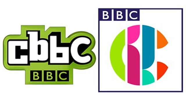
She added that the channel is now in possession of a “versatile and dynamic logo which works in every space and is designed to appeal to both ends of our broad age spectrum”.
Something feels... different this morning. pic.twitter.com/jdhhjPYyow
— CBBC (@cbbc) March 14, 2016
The redesign comes after BBC Three released a new logo back in January, to wide mockery on social media.