The Drum, in association with Synergist, brings you a round-up of some of the latest interesting creative work.
Every fortnight The Drum, in association with Synergist, publishes a selection of new creative work. Now you can vote for the work you like best with the winners to feature in the next issue of The Drum (2 August). Submit your vote before Wednesday 7 August to guarantee your favourite makes it into the printed magazine. To submit work for future publication contact gillian.west@thedrum.com.
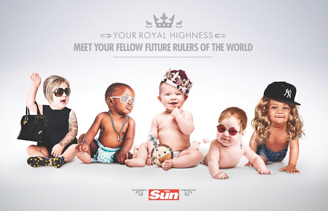
Grey London: The Sun Royal Baby ad
Brand: The SunHeadline and copy text (in English): Your Royal Highness meet your fellow rulers of the worldAgency: Grey, London, UKAgency Website: http://www.grey.co.ukExecutive Creative Director: Nils LeonardCreative Director: Dave Monk Creatives: Dominic Butler, Jasper ChoRetoucher: Act2 UMPublished: July 2013
Wieden+Kennedy Amsterdam: Coca-Cola Music brand identity
Brand: Coca-ColaTitle(s): Coca-Cola MusicAgency: Wieden+Kennedy Amsterdam, Amsterdam, the NetherlandsAgency website: http://www.wk.comExecutive Creative Director: Mark Bernath, Eric QuennoyCreative Director: Edu PouCreative/Design Director: Joesph Burrin Photographer: Chad MooreAdditional Credits: Designer: Philip CronerudPlanner: Amanda FeveGroup Account Director: Andrew Kay, Kirk JohnsenAccount Manager: Alex AlcottArt Buyer: Kristina WilmarApplication Programmer: Jesus GollonetRetoucher: Loupe ImagingPublished: July 2013Short Rationale(optional): The Coca-Cola Company has engaged Widen+Kennedy Amsterdam to create the brand identity for teen-focused platform Coca-Cola Music. Coca-Cola tasked the agency with designing a visual identity consistent with the tone of voice used for the brand’s global music programmes. As a result Wieden+Kennedy Amsterdam has created an identity which can, when needed, reinvent itself to serve a multitude of Coca-Cola Music events and programmes across different markets. At the core of the project is the Dynamic Logo Creator, a reactive application developed to create dynamic sound signatures. Built around the iconic Coca-Cola bottle the app generates bubbles emanating from the bottle like soundwaves, the unique sound signatures can then be generated from any music track to create limitless versions of the identity.
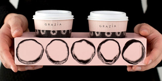
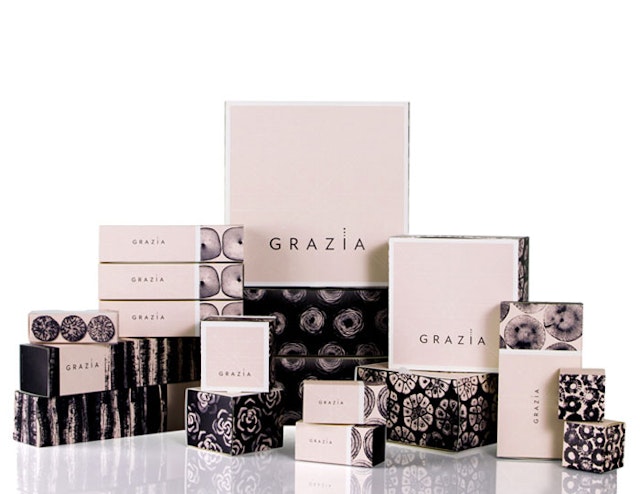
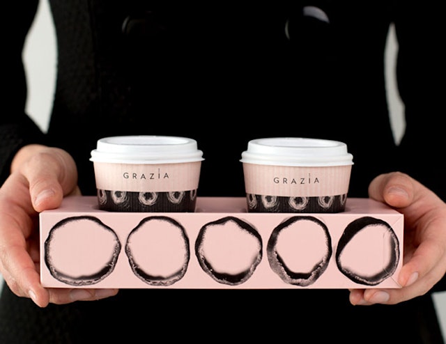
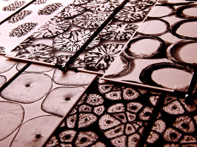
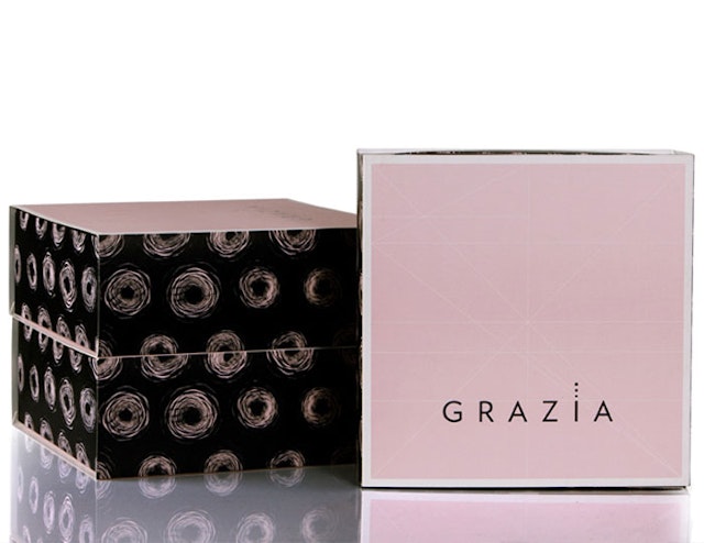
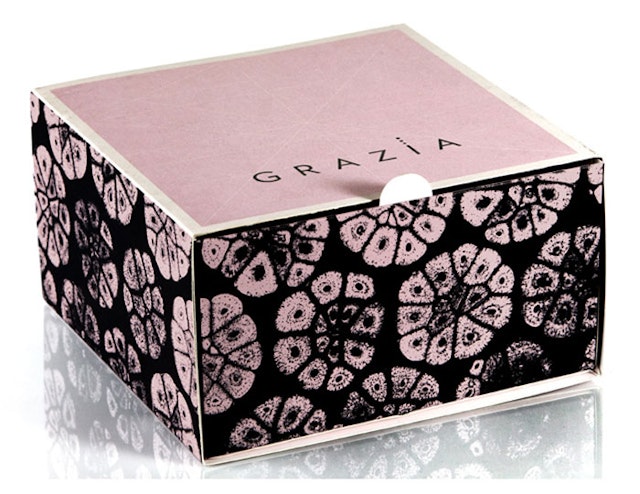
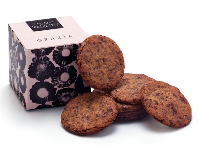
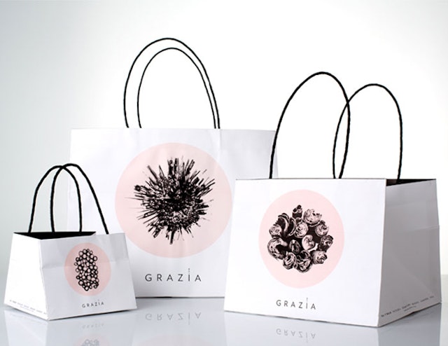
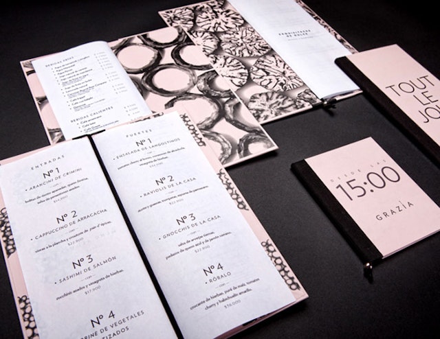
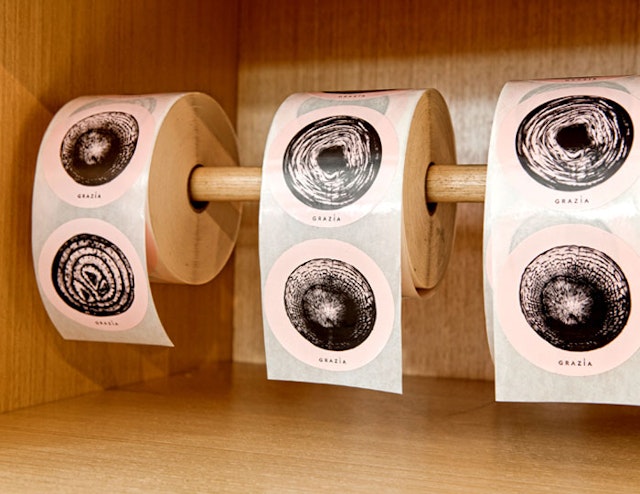
P576: Grazia branding, visual identity, packaging
Brand: GraziaTitle(s): Branding, visual identity, packagingAgency: P576, Bogotá, ColombiaAgency website: http://www.p576.comCreative Director: Arutza Rico OnzagaArt Director: María SilvaPhotographer: Max Morales, Ugo PasalacuaAdditional Credits: Max Morales, Ugo PasalacuaPublished: February 2013Short Rationale (optional): Grazia is an eatery in Bogotá, Colombia where lovers of food can buy refined sweets and savory delicacies. The challenge of this project was to create a visual language that honors the beauty and perfection of the food. Design firm p576 began with a graphic investigation of the ingredient forms, which were later developed into a series of patterns for use on all the packaging pieces. “We visited the local market with the chefs, picked some vegetables and fruits, and then went to their house to cut and to photograph the food,” said Art Director Arutza Rico Onzaga. “Claudia and Raphael prepared a big delicious lunch with the crew! To reinforce the concept of perfection,” Onzaga added, “we proposed a second brand element: lines that show the spatial structure of the objects and registers the logo position.” These elements, along with the simplified typography, define the brand’s sophisticated and modern style.
Look, Touch & Feel: National Farmers Union (NFU) Countryside website
Brand: National Farmers Union (NFU) Countryside Title(s): National Farmers Union (NFU) Countryside website Headline and copy text (in English): NFU Countryside. LTF was delighted to be engaged by NFU, and thoroughly enjoyed the collaborative process and challenging brief to create this contemporary website.Agency: Look, Touch & Feel, Northamptonshire, UKAgency website: http:www.looktouchfeel.co.ukCreative Director: Rick O’Neill, FRSA Art Director: Matt HollandCopywriter: Chris StreetIllustrator: Andie JackmanPhotographer: Andy LeeAdditional Credits: Security Director: Pixel Published: 2012
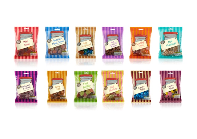
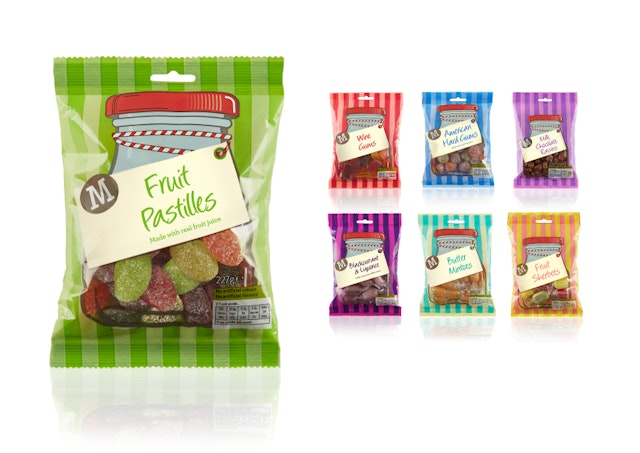
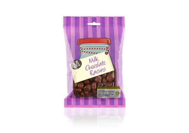
Stocks Taylor Benson: Morrisons Family Sweets packaging design
Brand: Morrisons Title(s): Morrisons Family SweetsAgency: Stocks Taylor Benson, London, UKAgency Website: http://www.stockstaylorbenson.comCreative Director: Glenn TaylorArt Director: Lysa Millergill Short Rationale (optional): Stocks Taylor Benson has recently redesigned Morrisons range of traditional family sweets. "Our aim was to give these packs a comfortable, nostalgic feel – reminding customers of the good old days of the village sweet shop with jars upon jars of sweety goodies." says Art Director, Lysa Millergill. "We used the clear, plastic film of the bags to ours and our client's advantage. By leaving the jars print-free we created an impactful design that would show the product at its best without incurring photography or illustration costs." The whole range comprises over 30 bags of everyone's favourite sweets from Mint Humbugs to Fruit Sherbets, and en masse creates a strong wall of colour in-store to help define the category area.
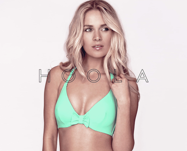
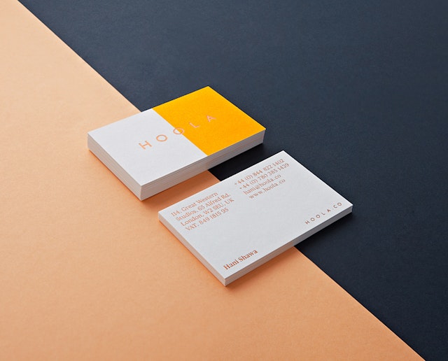
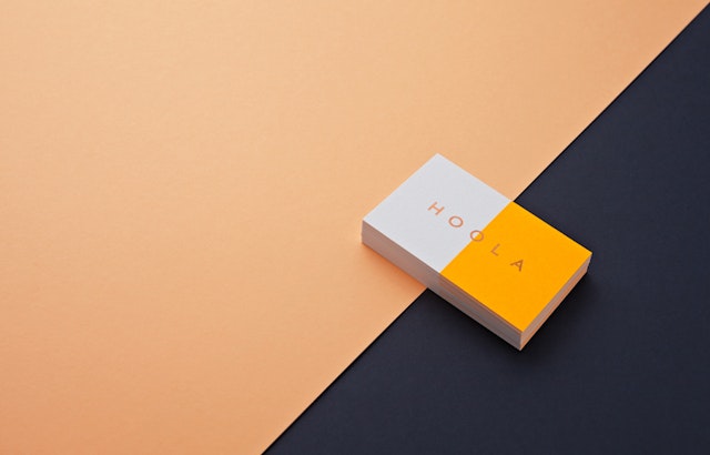
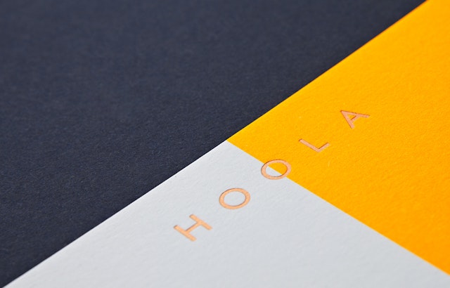
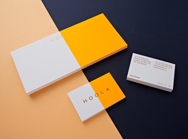
Two Times Elliott: Hoola brand identity and collateral
Brand: HoolaTitle(s): Brand Identity and collateral Agency: Two Times Elliott, London, UKAgency website: http://www.2xElliott.co.ukCreative Director: James HorwitzPhotographer: Scott GummettPublished: July 2013
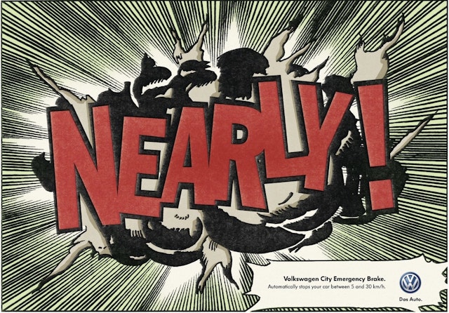
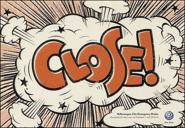
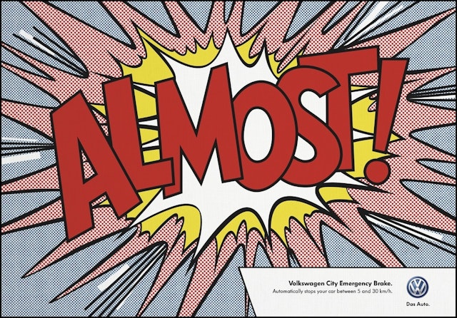
Adam&EveDDB: Volkswagen emergency break press ads
Brand: Volkswagen Title(s): Emergency Break Headline and copy text (in English): Volkswagen City Emergency Break. Automatically stops your car between 5 and 30km/h. Agency: Adam&EveDDB, London, UK Agency website: http://www.adamandeveddb.comExecutive Creative Director: Jeremy Craigen Art Directors/Copywriters: Aidan McClure, Laurent SimonIllustrator: John RogersAdditional Credits: Art Buyer/Head of Print: Daniel MooreyAccount Supervisor: Josh DavorenAdvertisers Supervisor: Jason LustyAccount Manager: Jonathan HillAgency Producer: Stuart CameronDesigner: Pete MouldPublished: July 2013
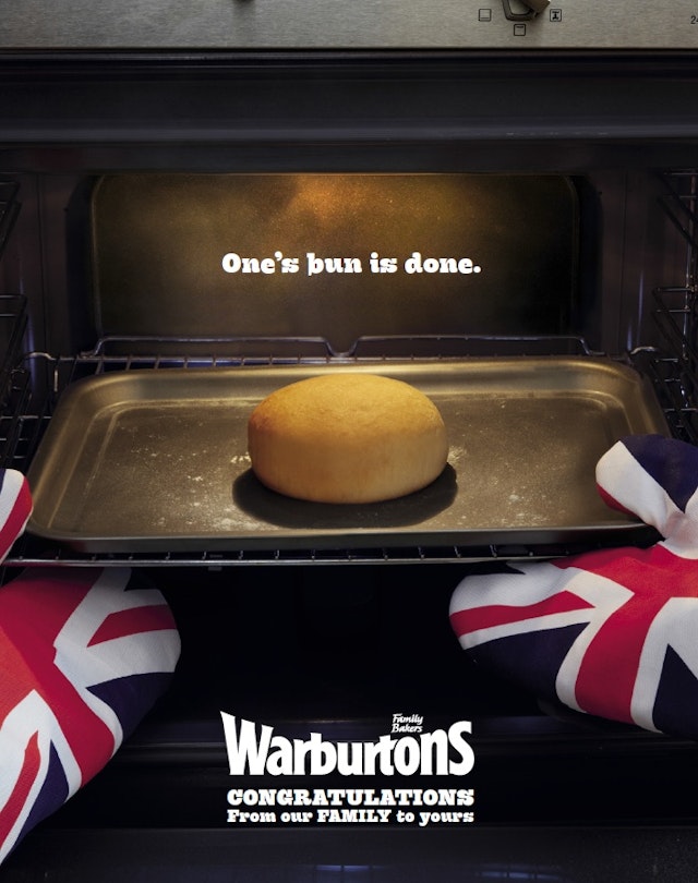
WCRS: Warburton's 'One's bun is done' Royal Baby ad
Brand: WarburtonsTitle(s): One’s bun is doneHeadline copy and text (in English): One’s bun is done. Warburton’s. Congratulations from our family to yours. Agency: WCRS, London, UKAgency website: http://www.wcrs.comCreative Director: Billy Faithfull Art Director: Katy HopkinsCopywriter: Steve Hawthorne Photographer: George LoganAdditional Credits: Client Services: Anna CovellMedia Buying: MindsharePublished: July 2013
Wieden + Kennedy: Tesco 'Love Every Mouthful' campaign
Brand: TescoTitle(s): Love Every Mouthful Agency: Wieden + Kennedy, London, UKAgency website: http://www.wk.comAdditional Credits: TV Producer: Gemma KnightProduction Compnay: Somesuch & CoDirector: Daniel Wolfe Published: July 2013
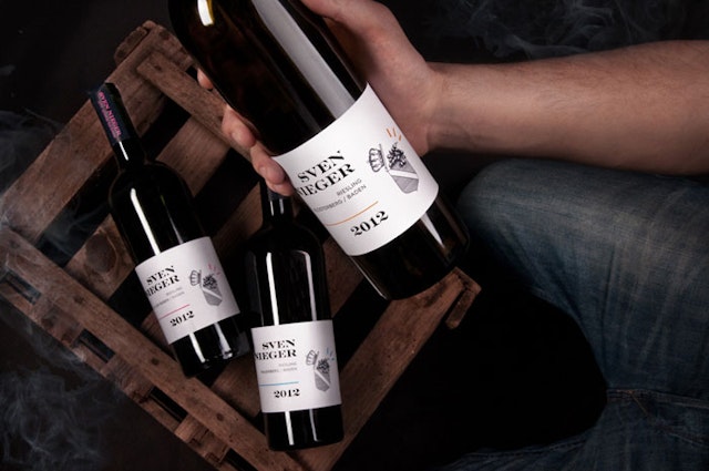
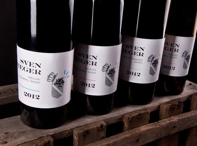
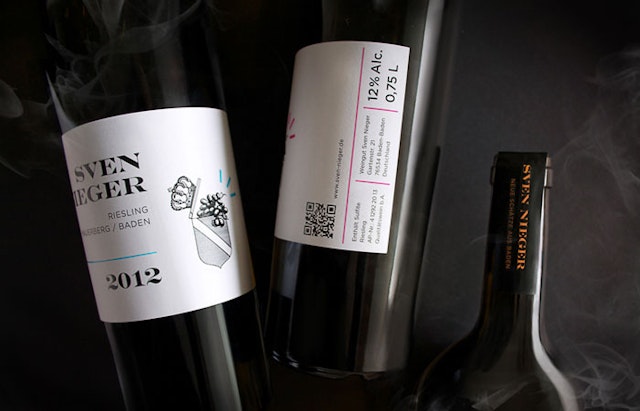
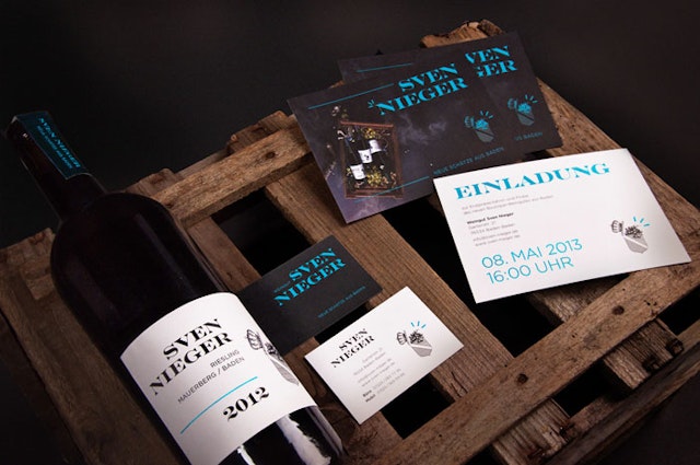
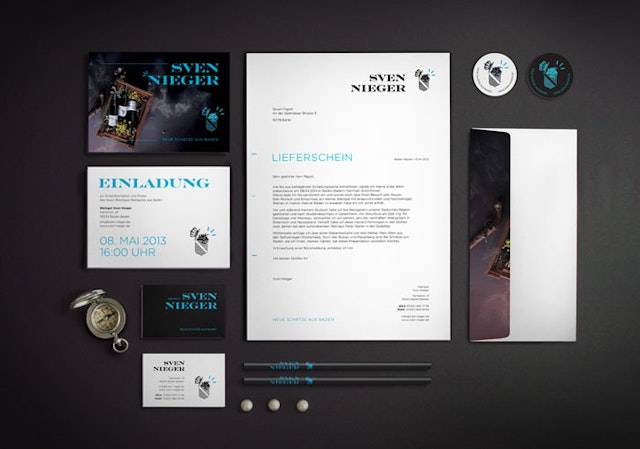
Park 13: Sven Nieger branding
Brand: Sven Nieger Title(s): Boutique Winery of Baden Headline and copy text (in English): New treasures from a lost and old vineyardAgency: Park 13, Wiesbaden, GermanyAgency Webiste: http://www.park13.deCreative Director: Petra Hain-DietleinArt Director: Petra Hain-DietleinCopywriter: Petra Hain-Dietlein, Harry SeifertIllustrator: Petra Hain-DietleinPhotographer: Petra Hain-Dietlein, Harry SeifertPublished: June 2013Short Rationale (optional): The logo resembles a typical crest symbol (often used in German wineries) from Baden. The crest symbol is of a chest with an open lid – grapes hanging out from it, like precious jewels ‘New Treasures from Baden’.
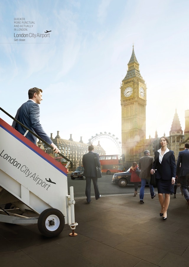
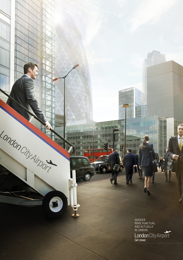
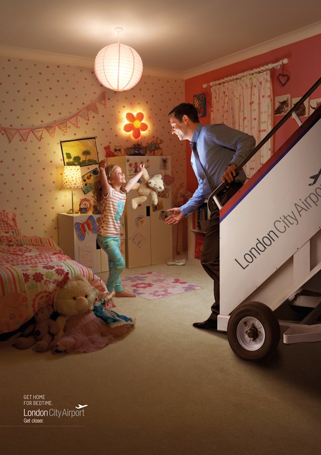
Big Communications: London City Airport ad campaign
Brand: London CityHeadline and copy text (in English): Quicker, more punctual and actually in London. London City Airport is the only airport that is actually in London, making it the most convenient and quickest for passengers.Agency: Big Communications, London, UK Agency Website: http://www.bigcommunications.co.uk Executive Creative Director: Dylan BoggArt Director: Tim JonesCopywriter: James Cross Photographer: Matt BirdAdditional Credits: Designer: Duncan BancroftPublished: July 2013
Leo Burnett: McDonald's 'Sun Party' TV ad
Brand: McDonald's Title(s): Sun PartyAgency: Leo Burnett, London, UK Agency Website: http://www.leoburnett.co.ukCreative Director: Tony Malcolm, Guy MooreCreative: Adam TuckerAdditional Credits: Production Company: Home CorpDirector: Lucy Blakstad (repped by Another Film Company)Audio: Wave StudiosAudio Op: Aaron ReynoldsPublished: July 2013
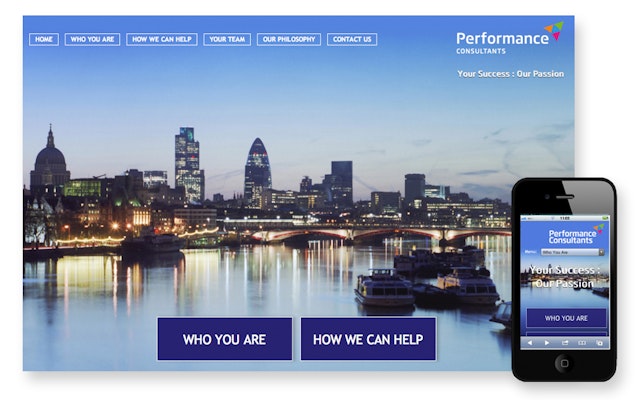
Look, Touch & Feel: Perfomance Consultants website and collateral
Brand: Performance Consultants Title(s): Perfomance Consultants Website and Collateral Headline and copy text (in English): Perfomance Consultants. LTF was delighted to be engaged by Performance Consultants and thoroughly enjoyed the collaborative process and challenging brief to create this contemporary website and collateral. Agency: Look, Touch & Feel, Northamptonshire, UKAgency website: http:www.looktouchfeel.co.ukCreative Director: Rick O’Neill, FRSA Art Director: Matt HollandCopywriter: Chris StreetIllustrator: Andie JackmanPhotographer: Andy LeeAdditional Credits: Security Director: Pixel Published: 2012
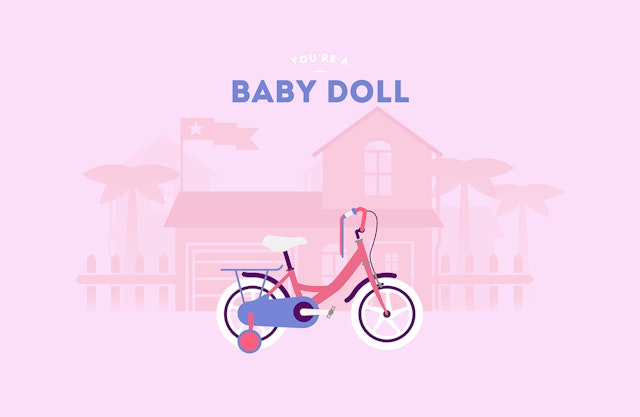
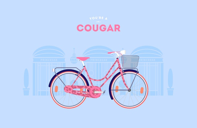
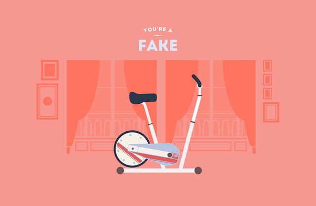
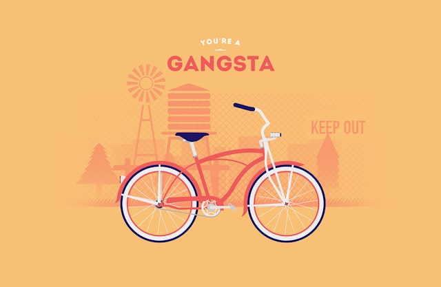
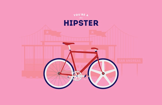
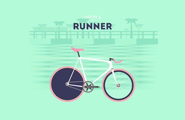
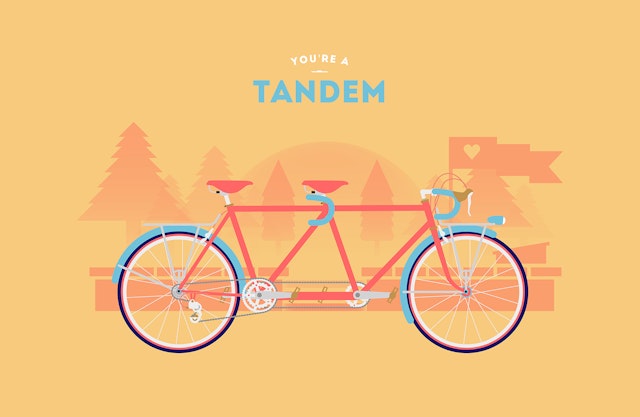
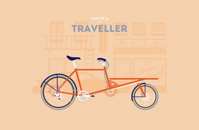
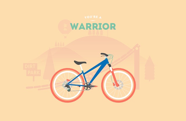
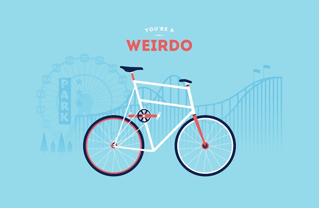
Thomas Pomarelle and Romain Bourdieux: Cyclemon 'You are what you ride'campaign
Brand: CyclemonTitle(s): You are what you rideHeadline copy and text (in English): Cyclemon is a made in France graphic design project created by Thomas Pomarelle and Romain Bourdieux for the 100th anniversary of the Tour de France. The principle of the Cyclemon, “You are what you ride”, combines bicycle designs with categories of different kinds of people in a caricatured manner.Agency: Thomas Pomarelle and Romain BourdieuxCreative Director: Thomas Pomarelle and Romain BourdieuxArt Director: Thomas Pomarelle and Romain BourdieuxCopywriter: Thomas Pomarelle and Romain BourdieuxIllustrator: Thomas Pomarelle and Romain BourdieuxPublished: July 2013
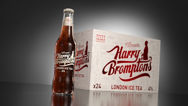
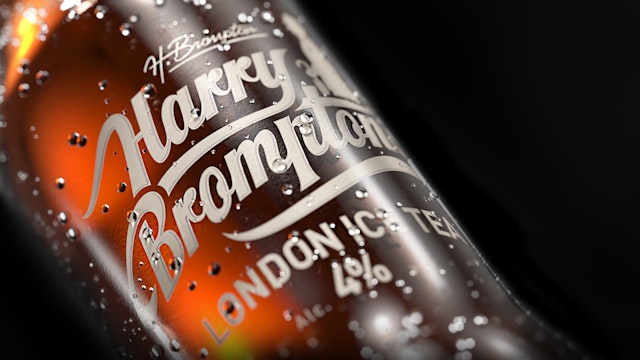
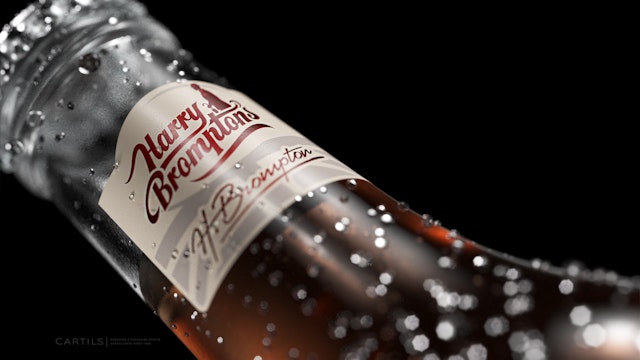
CARTILS: Harry Brompton’s branding and packaging
Brand: Harry Brompton’s Title(s): Harry Brompton’s ice tea; an instant classicAgency: CARTILS Branding & Packaging Design Consultants – Amsterdam & LondonAgency Website: http://www.cartils.com Creative Director: CARTILS Art Director: CARTILSCopywriter: CARTILSIllustrator: CARTILSPhotographer: CARTILSAdditional Credits: Client: Tudor Drinks Ltd.Published: July 2013Short Rationale (optional): Unique in the world as a premium alcoholic ice tea, Harry Brompton’s was launched this month with success. In a matter of weeks demand has soared, and it seems that Harry Brompton’s ice tea is not only here to stay, but it’s here to conquer the world. In the traditional tea-loving country of Britain the brand was finally launched after years of perfecting the ‘secret’ hand-crafted recipe. CARTILS Branding & Packaging Design Consultants were responsible for the design, reaffirming their expertise in the area of ‘New Product Developments’. The design is becoming an instant classic by keeping traditional cues, while avoiding over typographical clichés. Harry Brompton’s clearly shows the crisp and refreshing flavour by maintaining a minimal colour setting while showing elegance in the hand-drawn logo. Mr O’Donohue of Tudor Drinks Ltd “Harry Brompton’s has exceeded all expectations the brand is performing very well indeed. There are always 2 things we hear from our consumers: 1. How great and refreshing the taste is, and 2. How great the packaging looks! Currently Harry Brompton’s is Available in London, Bath, Bristol, Brighton and Amsterdam, but the list is expanding rapidly.”
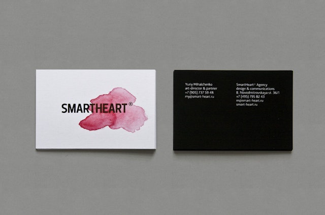
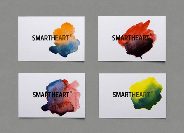
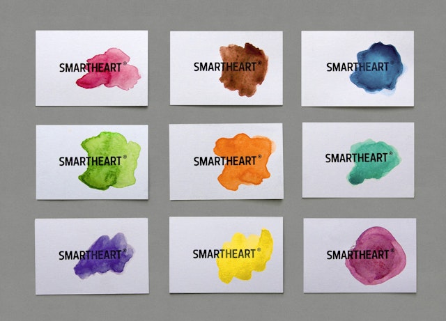
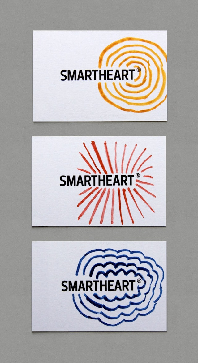
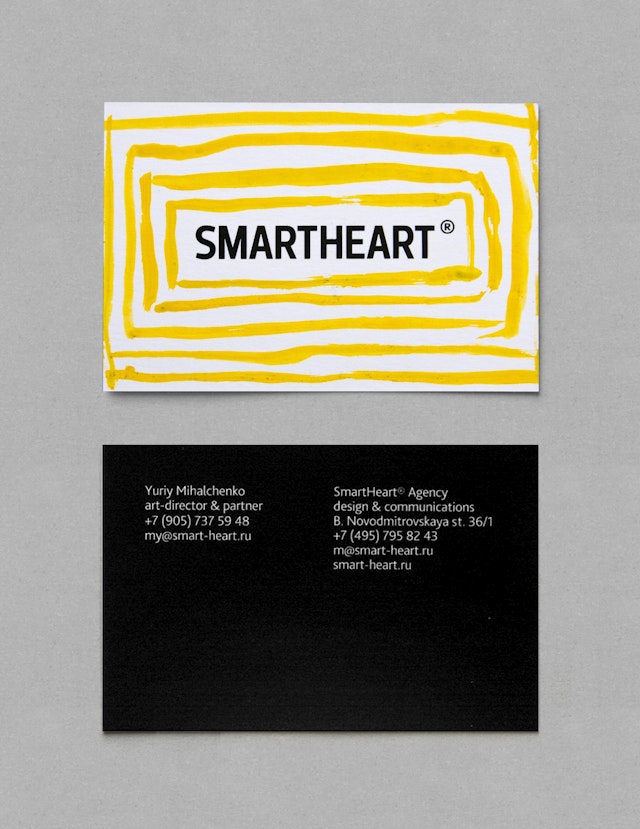
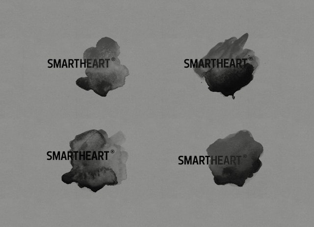
SmartHeart: SmartHeart visual identity
Brand: SmartHeartTitle(s): Emotionalisation of SmartHeartHeadline and copy text (in English): A variation of identity for SmartHeart agency, a series of business cards with increased emotional components. Agency: SmartHeart, Moscow, RussiaAgency Website: http://www.smart-heart.ruArt Director: Yuriy MihalchenkoAdditional Credits: Special thanks to Vova Lifanov. In our first meeting, he said that my business card is only Smart without Heart. Published: February 2013
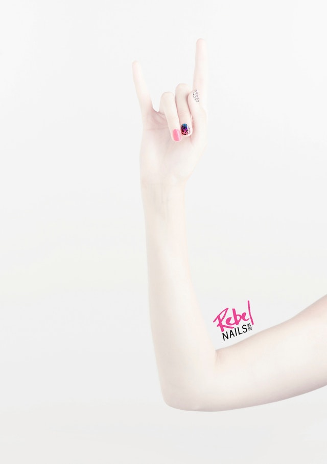
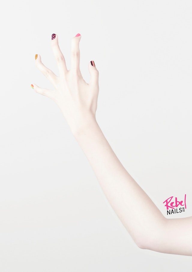
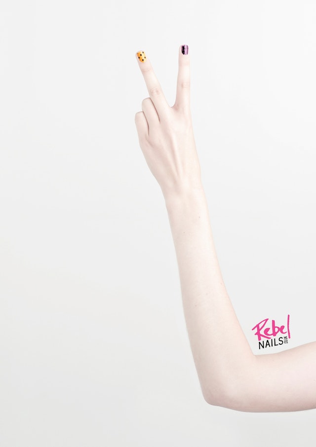
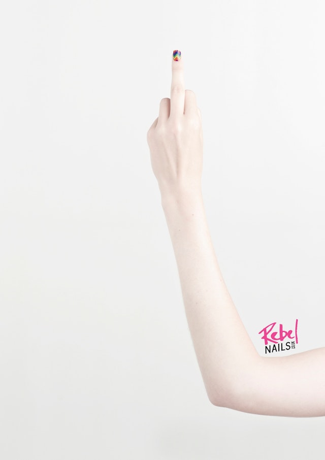
Vinny & Friends: Rebel Nails posters
Brand: Rebel Nails Title(s): RoarAgency: Vinny & Friends, London, UKCreative: Jason Vinny Vinciguerra Photographer: Ian WinstanleyPublished: June 2013
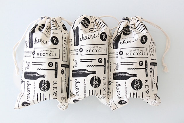
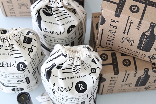
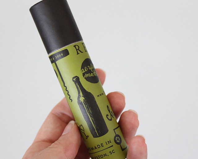
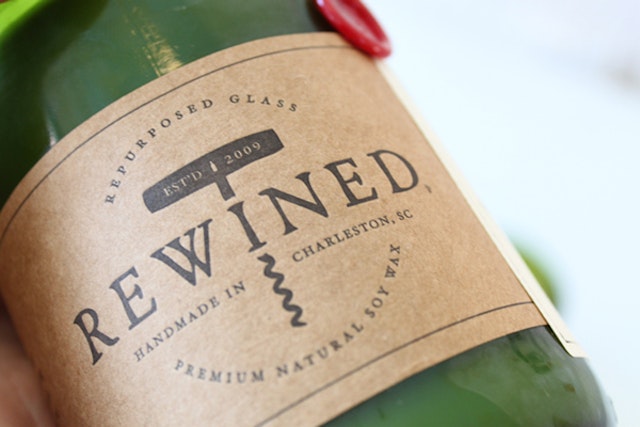
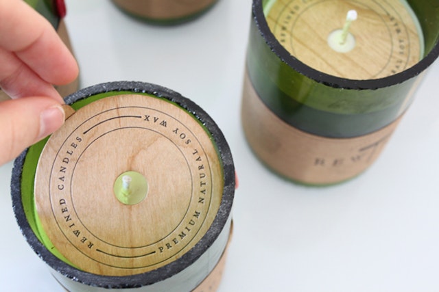
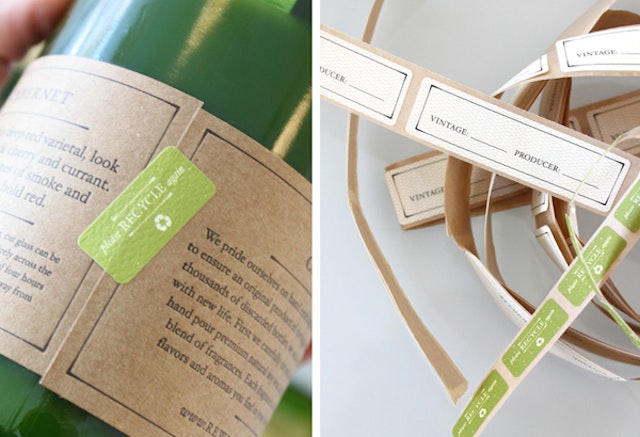
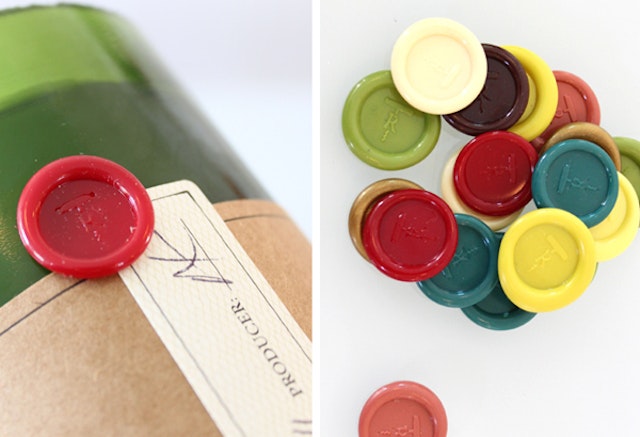
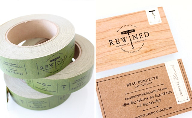
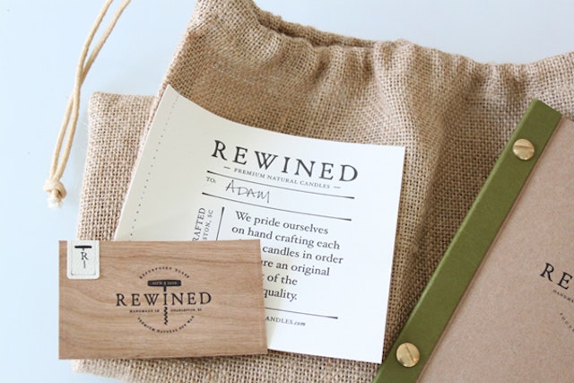
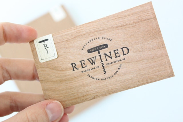
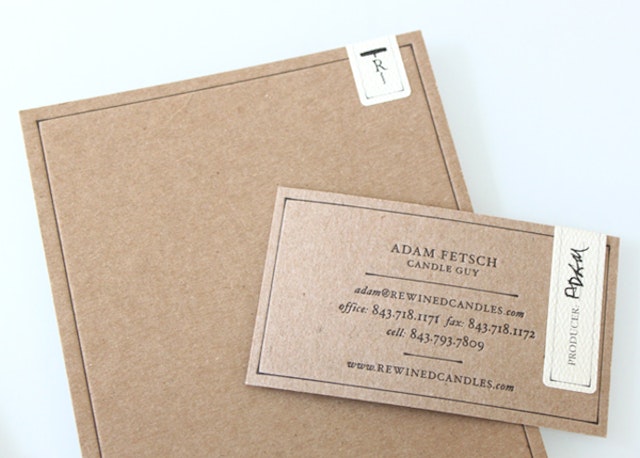
Stitch Design Co.: Rewined Candles branding, packaging, website design and development
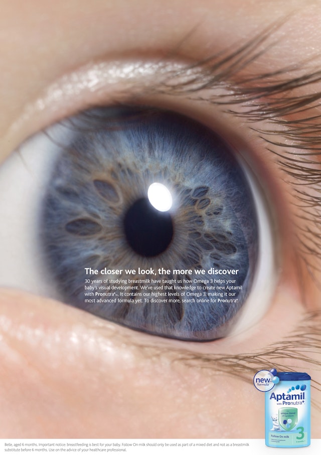
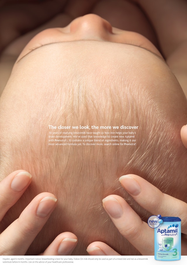
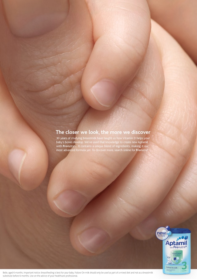
BETC: Aptamil 'Eye, Head and Thumb' print campaign
Brand: Aptamil Title(s): Eye, Head and ThumbAgency: BETC, London, UKAgency website: http://www.betc.co.ukExecutive Creative Director: Neil DawsonCreative Directors: Clive Pickering, Simon MorrisArt Director: Theo DufayCopywriter: James BriggsPhotographer: Tim FlachAdditional Credits: Designer: Louise SloperAccount Team: Catherine Barr, Jordan WoolleyPublished: July 2013
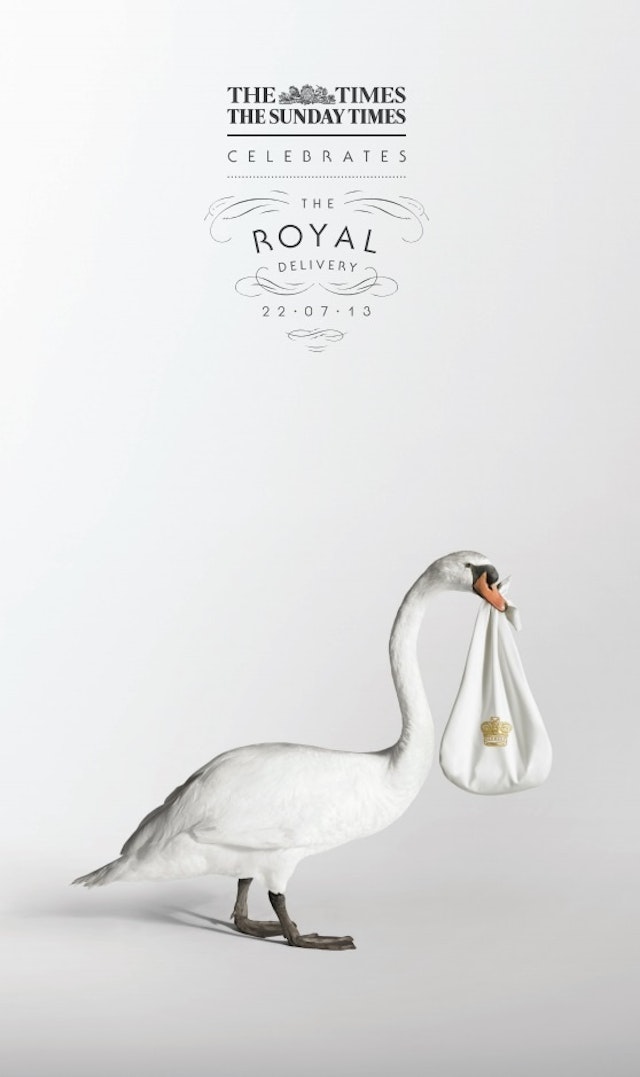
Grey: The Times/The Sunday Times Royal Baby ad
Brand: Sunday TimesHeadline and copy text (in English): The Times and The Sunday Times celebrates the Royal Delivery 22.07.13Agency: Grey, London, UKAgency Website: http://www.grey.co.ukExecutive Creative Director: Nils LeonardCreative Director: Dave Monk Creatives: Jonathan Rands, Alex Tizard Photographer: Jenny Van SommersPublished: July 2013
WCRS: Westons Cider 'The It Men' TV commercial
Brand: Westons Cider, Stowford PressTitle(s): The ‘It’ MenHeadline and copy text (in English): The ‘It’ Men is Westons Cider’s first ever TV campaign, promoting its premium mainstream cider, Stowford Press. Throughout the commercial a series of people perform minor acts of character, which cinematic shots make feel poignant and heroic in contrast to the size of the feats themselves. Agency: WCRS, London, UKAgency website: http://www.wcrs.comCreative Director: Billy Faithfull Art Director: Ben Robinson Copywriter: Mike Whiteside Additional Credits: Agency Producer: Jack Bayley Account Handling: Emma Marsland, Megan Armitage, Sarah Barber Media Agency: Universal McCannProduction Company: Rattling StickDirector: Ed Morris Producer: Chris Harrison Editor: Eve Ashwell Post-Production: UNITAudio: Grand Central Published: July 2013Short Rationale (optional): The ad aims to build national reach for the brand, which is currently more regionally well known.
Look, Touch & Feel: The Beauty Gurus Website
Brand: The Beauty Gurus Title(s): The Beauty Gurus Website Headline and copy text (in English): The Beauty Gurus. LTF was delighted to be engaged by The Beauty Gurus, and thoroughly enjoyed the collaborative process and challenging brief to create this contemporary website. Agency: Look, Touch & Feel, Northamptonshire, UKAgency website: http:www.looktouchfeel.co.ukCreative Director: Rick O’Neill, FRSA Art Director: Matt HollandCopywriter: Chris StreetIllustrator: Andie JackmanPhotographer: Andy LeeAdditional Credits: Security Director: Pixel Published: 2012
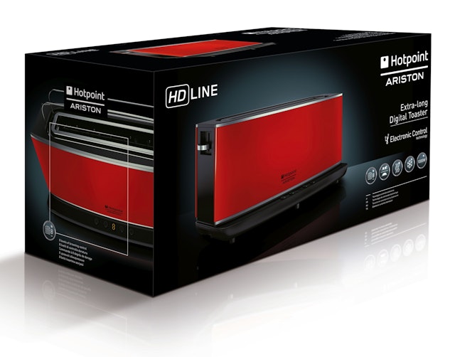
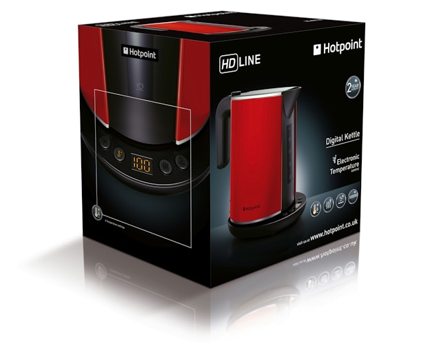
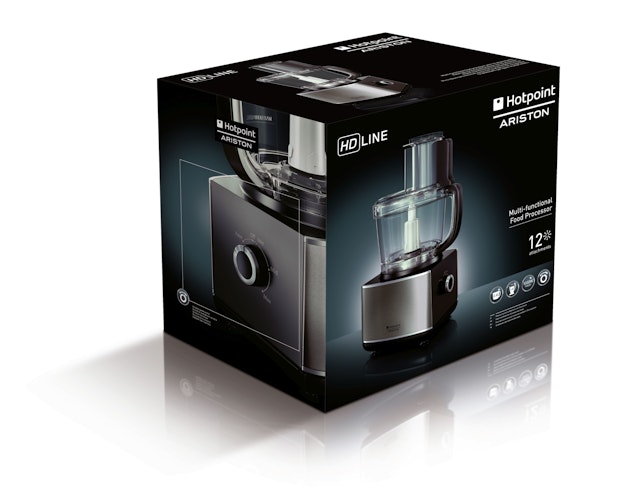
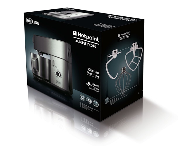
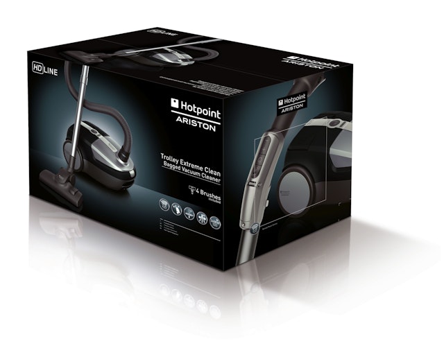
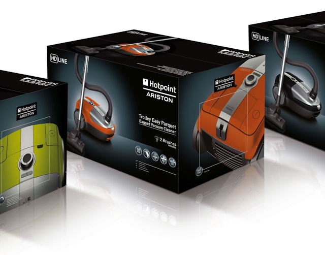
BOS:Design: Hotpoint small domestic appliances packaging
Brand: Hotpoint Ariston Title(s): Hotpoint small domestic appliances packagingAgency: BOS:Design Ltd, Cheltenham, UKAgency Website: http://www.brandonshelf.comCreative Director: Andy Willingham Illustrator: Shadowplay Photogapher: Shooting Food, Michael DannenburgAdditional Credits: Designers: Andy Willingham, Emma SunderlandRetouching and creative art-working: Debbie BarrettPublished: July 2013Short Rationale (optional): Indesit are famous for their large domestic appliance products and recognised an opportunity in Small Domestic Appliances (SDAs). Having won a design effectiveness award for their work on Kenwood, BOS:Design were the clear choice to launch this large range of SDAs for a company with no previous experience in the SDA market. The packaging needed to work equally well in Russia, Italy, Turkey and the UK, communicate the features and benefits of the products in a ‘non-lingual’ way and work consistently well across breakfast, food preparation and home products. In line with the Indesit values of HD performance and styling the focus of the SDA packaging is on elegant product imagery. Packs within this category can be cluttered with claims and graphic devices, so we adopted a clean graphic approach. The strong use of black sets this range apart from its competitors as confident and refined.
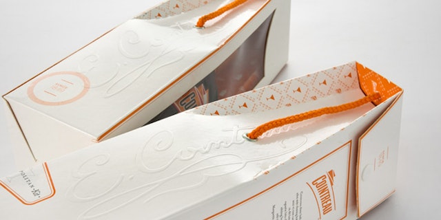
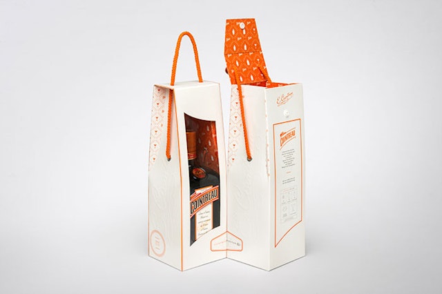
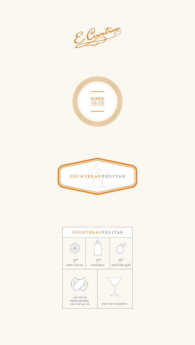
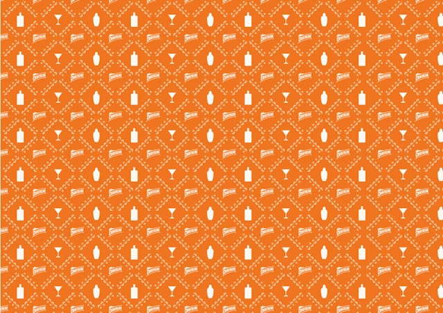
Rice Creative: Cointreau Limited Edition Pack
Brand: CointreauTitle(s): Cointreau Limited Edition PackAgency: Rice Creative, Ho Chi Minh City, VietnamAgency Website: http://www.rice-creative.comCreative Director: Chi-An De Leo, Joshua BreidenbachPhotographer: Wing ChanAdditional Credits: Designers: Van Nguyen, Nguyen Huynh, Truc DinhShort Rationale (optional): Cointreau approached us to create a limited edition pack for them. This pack was to help them communicate one of their most successful cocktails, by including a shaker with the bottle, and some simple instructions. This cocktail was to be made interesting to a female audience. This package also lined up with the Tet holiday in Vietnam, and Cointreau requested we consider this in the design. To communicate Tet, we developed a Tet inspired pattern to literally line the inside of a feminine handbag-like pack. We felt this solution effectively communicated a feminine touch to the Tet holiday. Being greatly inspired by Cointreau's heritage, we developed classic look for the devices which contained the messaging. Cheers.
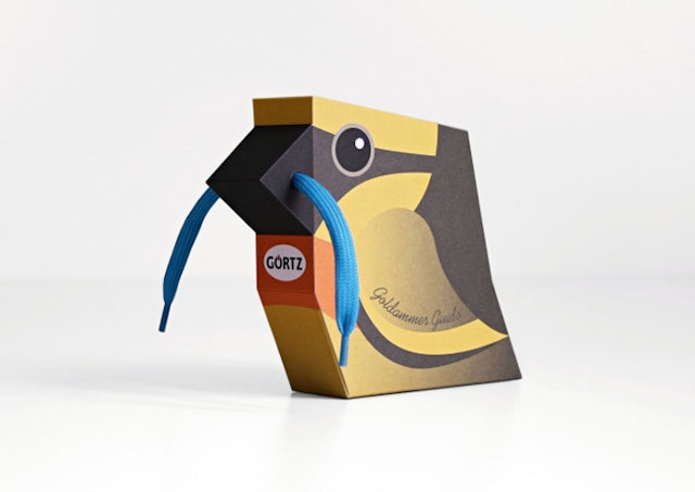
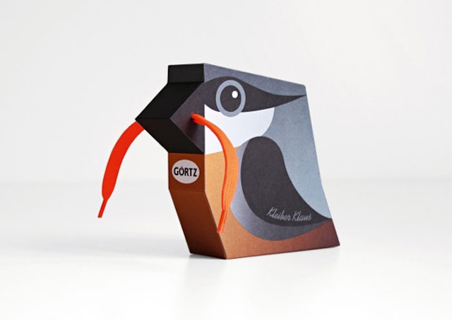
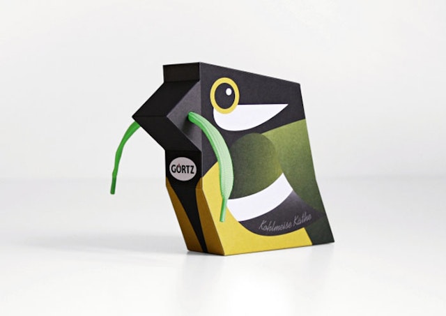
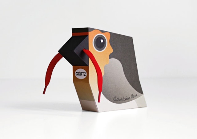
gürtlerbachmann: Görtz shoelaces
Brand: GörtzTitle(s): Simple shoelacesAgency: gürtlerbachmann GmbH, Hamburg, GermanyAgency Website: http://www.guertlerbachmann.com Creative Director: Uli GürtlerArt Director: Merle SchröderIllustrator: Merle SchröderAdditional Credits: Project Manager: Anne KukereitShort Rationale (optional): The colourful Görtz world of birds presents itself in all the Görtz sales areas set up for children’s shoes. Simple shoelaces were transformed into colourful small worms in the beaks of five lovingly designed bird characters, which served as eye-catching packaging. They show different native types of birds that invite to play and collect. The aim, with the help of the packaging as part of the campaign, was to increase customer frequency in the Görtz sales areas for children’s shoes and, at the same time, to win customers for the Görtz store card.
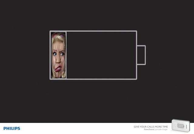
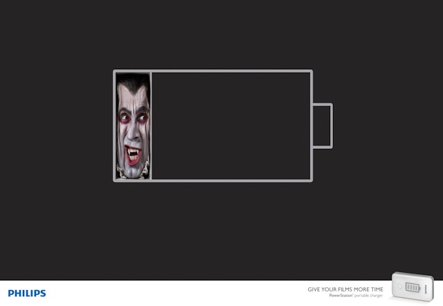
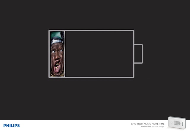
Ogilvy & Mather: Philips Power Station campaign
Brand: PhilipsTitle(s): Power Station: Calls, Films, MusicAgency: Ogilvy & Mather, London, UKAgency Website: http://www.ogilvy.co.ukExecutive Creative Director: Gerry HumanArt Director: Miguel NunesCopywriter: Simon LotzePhotographer: CariocaAdditional Credits: Business Director: Olivia RzepcynskiPlanner: Mattijs DevroedtAccount manager: AJ CoynePublished: July 2013
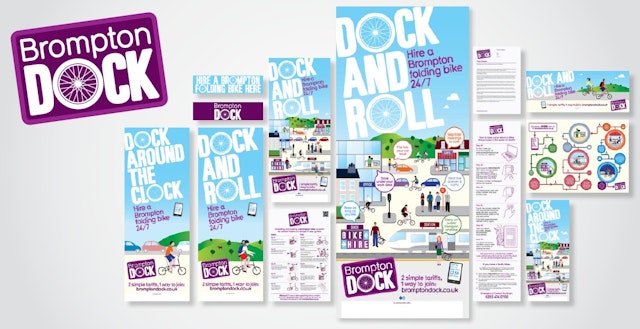
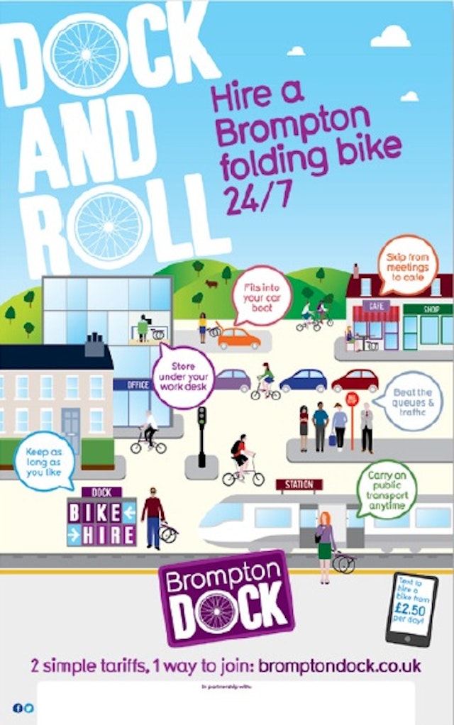
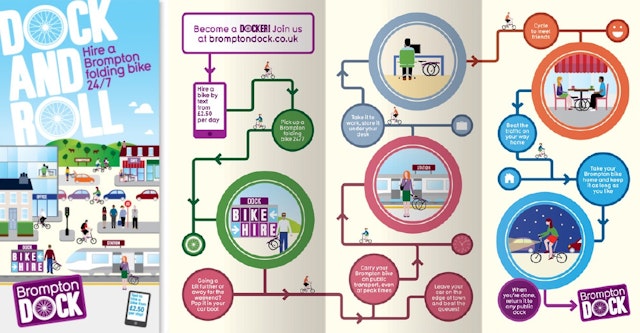
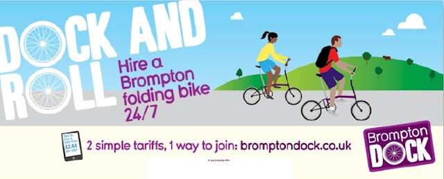
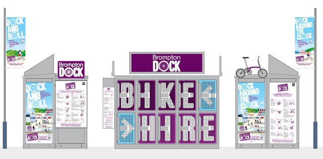
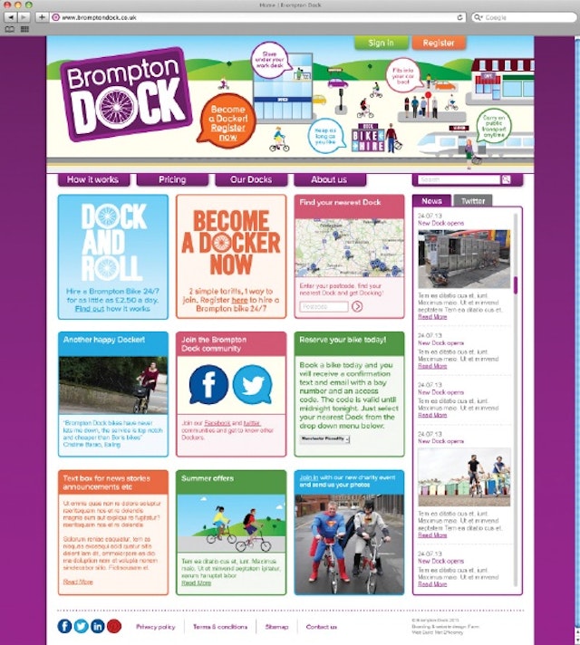
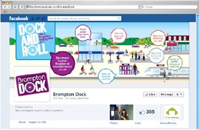
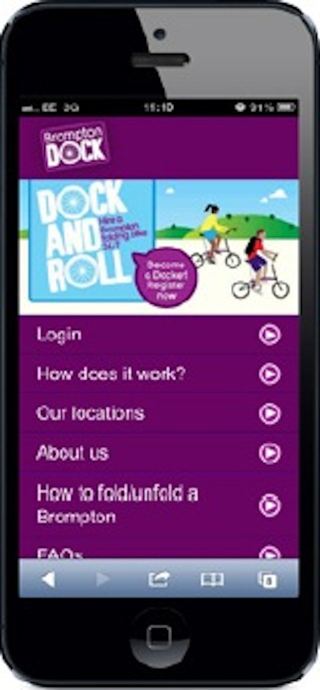
Form: Brompton Dock 'Brompton Rock' branding and launch initiative
Brand: Brompton DockTitle(s): Brompton RockAgency: Form, London, UKAgency Website: http://www.form.uk.comArt Director/Copywriter: Paul West, Paula BensonDesign/Illustration: Paul West, Paula Benson Published: July 2013
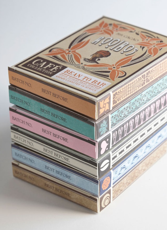
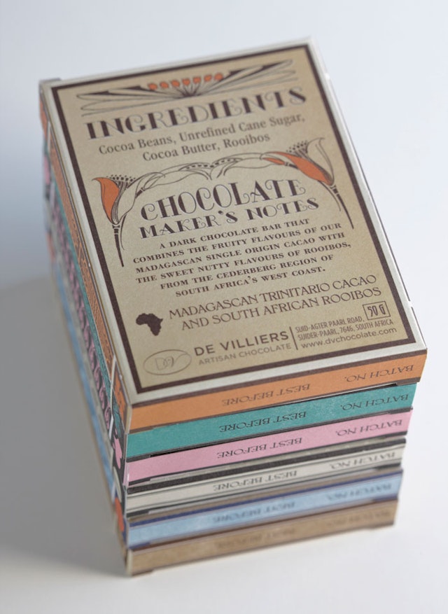
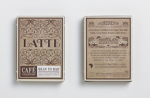
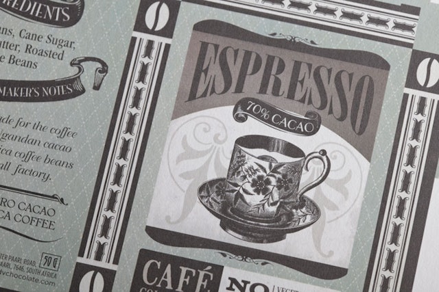
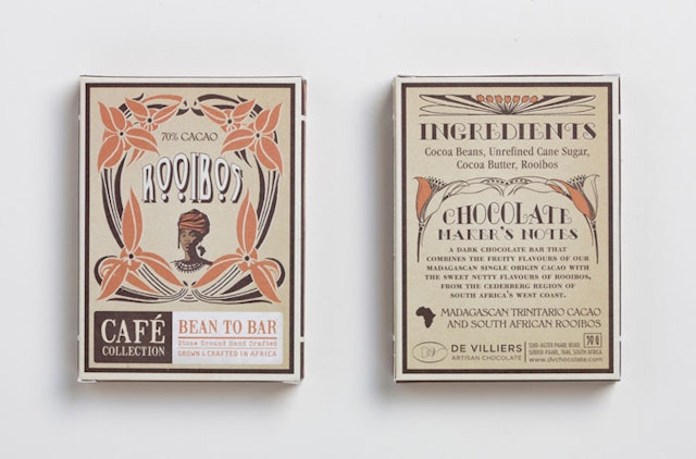
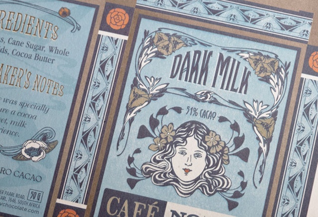
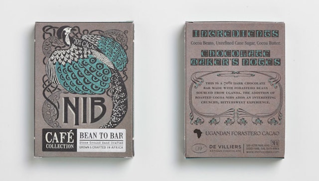
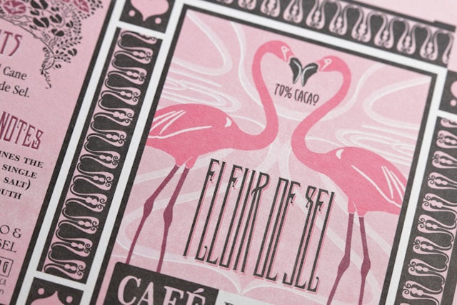
Jane Says: Café Collection Bars packaging design
Brand: DV ARTISIAN CHOCOLATETitle(s): Café Collection BarsAgency: Jane Says, Cape Town, South AfricaAgency website: www.janesays.co.zaCreative Director: Victoria Jane PeterDesigner: Victoria Jane Peter Illustrator: Victoria Jane PeterShort rationale (optional): The De Villiers family uses traditional chocolate-making techniques to create their artisanal ‘Bean to Bar’ range. An exclusive range sold only from their coffee/chocolate café, the bars are produced in small batches using the De Villiers’ signature attention to detail and focus on quality. Wanting to communicate both the old-fashioned production methods and the loving devotion to craft that the De Villiers’ bring to their chocolates, we used typical 1920s art nouveau posters as inspiration for our packaging concept. These beautiful, labour-intensive posters are synonymous with craftsmanship, skill and artistry – and perfectly mirror the meticulous detail-driven approach to chocolate that the De Villiers brand embodies. Each chocolate bar in the range was designed as an individual ‘mini poster’ using distinctive and elaborately crafted typography, illustration and colour. The spine on each bar was uniquely designed so that when stacked, they would resemble books. Each bar has a stand-alone concept designed around ideas and inspirations associated with its individual flavour or the way in which it is made. For example, the Fleur de Sal bar, which is made using sea salt, depicts the flamingos that feed in the saltpans, and uses the pink of the birds as inspiration for the colouring. Though each bar has been individually designed, the structure remains the same throughout the range: a chocolate-specific illustration combined with beautiful typography on the front, elaborate book-like spines on the side, and a uniquely designed explanation of each bar’s concept on the back. The result is a cohesive, visually engaging chocolate range that showcases the values of this artisanal brand and the care that goes into every aspect of its creation.
Carling: 'Decorator' Royal Baby ad
Brand: CarlingTitle(s): DecoratorAgency: Creature, London, UK Agency Website: http://creaturelondon.comCreative Director: Stuart Outhwaite, Ben Middleton, Ed WarrenCreative: Brooke Cutmore, Ruud KoolAdditional Credits: Production Co: SmugglerDirector: Sniper TwinsEditing House: StitchEditor: Phil CurriePublished: July 2013
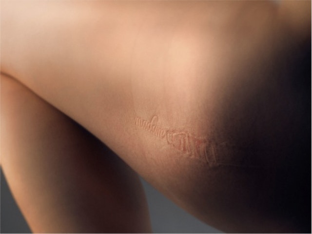
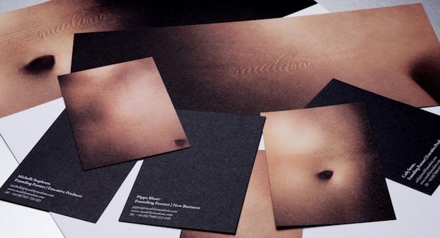
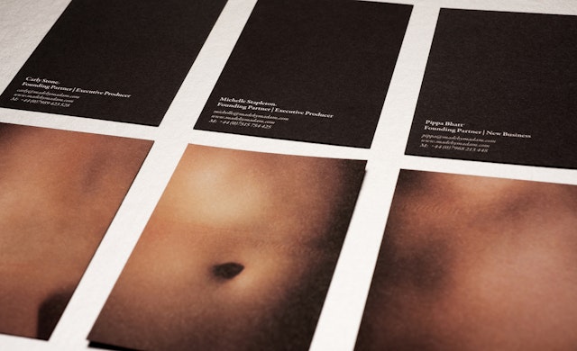
BETC London: Madam visual identity and branding palette
Brand: MadamTitle(s): Visual identity and branding palette Agency: BETC London, London, UK Agency Website: http://www.betc.co.ukExecutive Creative Director: Neil DawsonPhotographer: Rory CarnegieAdditional Credits: Head of Art – Simon MorrisHead of Design – Louise SloperHead of Copy – Clive PickeringDesigner - Dave TowersPublished: July 2013

.jpg?w=640&ar=default&fit=crop&crop=faces&auto=format)