Dow Jones unveils logo refresh from Studio Network

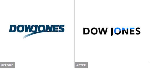
News Corp’s Dow Jones & Company has recently introduced a new logo, designed by Studio Network.
“We developed a clean and modern identity, with a bold sans serif typeface to keep the company distinctive and to begin a new chapter of Dow Jones with a fresh look,” said the New York-based design agency.
“Swoosh is integrated into ONE, at the same time it highlights ONE. It refers to the fact Dow Jones is the number one publisher in the world.”
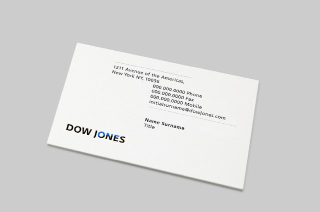
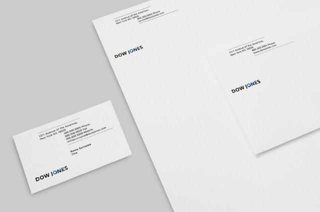
“We have developed a monogram based on the logotype in the need of flexible logo usages such as employee ID cards, application/social network icons and new products and services logos,” the statement continued.
The black and blue colour palette was chosen “in order to convey the vitality and energy of editors, journalists and all workers of Dow Jones.
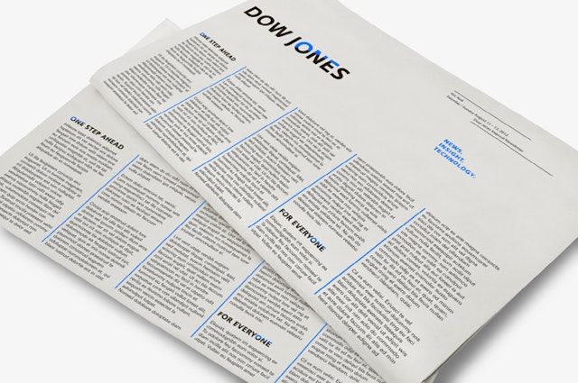
Dow Jones, parent company of The Wall Street Journal and employer of over 2,000 journalists, introduced the new logo across all of its sectors in April this year.