Victoria’s Secret, America’s largest retailer of lingerie, and the Canadian-founded La Senza have long since competed in the discreetly named ‘lingerie and intimate apparel’ industry. Selling everything from sexy lingerie to seductive sleepwear, both in stores and online, these two retailers are a world away from the practical garments typically associated with retailers like M&S. Today, the age-old rivalry of the USA and Canada to life is brought to life: it’s Victoria’s Secret against La Senza, in Qubit’s 7th Battle of the Sites. Who will top the charts for the best website user experience?
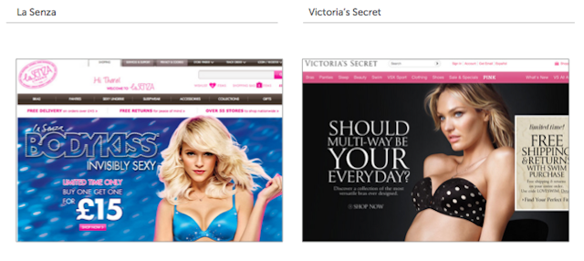
La Senza: La Senza begins the fight in this first section with force, delivering a clear and well formatted homepage and striking images to really draw users in - it’s obvious that this retailer means business. With impossible-to-miss offers, using large bold text and an effective use of colour - not to mention the scantily clad woman right next to it - you can’t help but notice the discounts featured. Want ‘invisibly sexy’ underwear just like the attractive blonde flaunts, at buy-one-get-one-free prices? It’s as if the bright pink call to action isn’t even needed. Though the young model arguably distracts from the La Senza logo and login function, it’s only a minor point. La Senza ensures that the help icon is visible to the user at all times, with well chosen navigation for customer satisfaction. Including a search function, and breadcrumbs to identify the users’ location on the site at all times, this website is nothing if not effective, even despite the lack of predictive search and small login function.
Victoria's Secret Victoria’s Secret battled hard in this section, using an equally seductive and alluring female to display their product and emphasise offers, but it fell short in the end. Though the login, help icon and logo were clearly displayed, and users were presented with a well-formatted homepage, the lack of drop-down or fly out menus hindered navigation. In addition, a lack of breadcrumbs further impeded the user’s experience. Moreover, the absence of any ‘hints and tips’ section for the user was disappointing in this part of the battle. It seems whatever secret Victoria is keeping was to remain her own. Despite a commendable effort, Victoria’s Secret underperformed and came in behind La Senza inthis section.
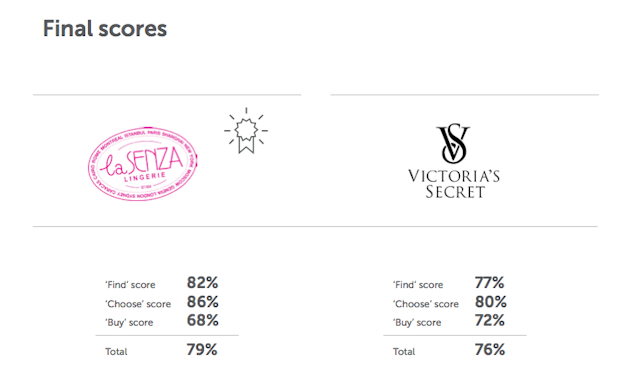
Find Score: La Senza 82% vs 77% Victoria's SecretThough both retailers fought hard in this section, with both La Senza and Victoria’s Secret displaying most key features well, it was the simple and user-friendly navigation that meant La Senza emerged the front runner here. Victoria Secret’s poor menus and lack of user support proved a let down in this 'Find' section; perhaps they felt that support was best provided by their products than on their website.
Round two - Choose
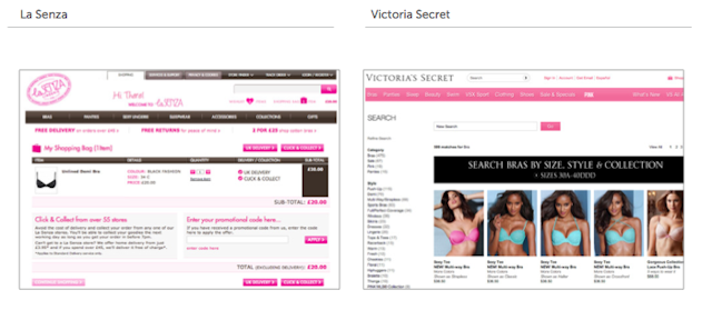
La Senza: Not only did La Senza provide high quality, clickable images when searching for a chosen term, they also provided a filter function. In addition, there were boxes around the products to ensure the page was made to feel uncluttered. Clear product badging such as 'sale' and 'new in' was also used to highlight important items to users, with every search returning at least one result above the fold for user-friendly searching. The product pages themselves offered multiple user images, a good product description and a clear, easy-to-understand price, with well chosen alternatives and cross-sells given to the user. However, there was little urgency created despite the prominent CTAs, and there were no product reviews to aid the customer in their choice. Despite these minor issues, La Senza provided a pleasing search experience.
Victoria's Secret: The retailer put up another good fight in this second section, providing equally high quality clickable images, showing what the products look like when worn (provided you’re attractive, young and toned), also ensuring results displayed above the fold. Victoria’s Secret used clear CTAs, with well chosen alternatives offered to the user, and a clear price. However, it again did not offer product reviews, nor did it create a sense of urgency by stating current deals or low stock levels for specific items. The product description also lacked in certain areas, as some images were not available, and there was poor use of product badging, merely having the word 'NEW' in the text, as opposed to a clear, eye-catching badge on the image. Overall, Victoria’s Secret had a pleasing product page, not just for the images used, but the layout too. However, La Senza managed to pull ahead, outdoing Victoria’s Secret praisable score by six per cent.
Choose Score: La Senza 86% vs 80% Victoria's SecretLa Senza once again emerged victorious in this second section, ensuring that search was made as user friendly and easy as possible, creating a pleasant user experience. With its product badging and use of multiple images, it managed to better a worthy effort from Victoria’s Secret.
Round Three - Buy
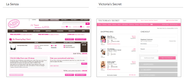
La Senza:It seems our strong contender peaked too early in this analysis, losing momentum in the final stage. From the very beginning of the buy journey, the user is presented with a busy and cluttered page, contributing to a confusing experience. Though the price was easy-to-understand, and the form was checked in real time for errors, La Senza failed to provide a 'find address' function, nor did it explain the benefits of registration clearly. Using stars to highlight the necessary stages of the checkout was an effective tool, as was providing only relevant information to the user, and quarantining the checkout. However, the lack of a third party seal of security meant that users were left a little uncertain and perhaps less confident and trusting. There was also no guest facility offered for easy checkout, nor were any third party payment solutions accepted. It seems the leader lost steam after the earlier rounds.
Victoria's Secret: A late move from Victoria’s Secret sees them finish with this well-formatted and easy-to-understand checkout, providing both a guest option and the benefits of registration to their user. Despite similarly lacking a 'find address' function, and only checking fields for errors on submission, the checkout process was bettered through the use of clear headings, highlighting the stages of the checkout, as well as displaying only relevant information. The payment could also be made using a 'Victoria’s Secret Angel Card' instead of the usual methods of payment. They also displayed third party security information on the page (though this was not entirely obvious, and so it could be improved).
Buy Score: La Senza 68% vs 72% Victoria's SecretLa Senza fell short in this section with its cluttered and busy checkout, allowing Victoria’s Secret to take the lead with their clear headings and simple intuitive checkout system, creating a pleasing user experience in this final stage. This round seems to have saved Victoria’s Secret from an embarrassing overall defeat. But still, it was La Senza that triumphed in this website analysis, with a three per cent victory over it’s competitor, Victoria’s Secret.