For the past few weeks we have published the results, which give insights into the strength of UK design. The next judge to make a selection is Gary Holt, co-founder of Someone, who has chosen the More4 identity by ManvsMachine.
Taking place in April 2013, The Drum Design Awards will bring design centre-stage as far as the marketing and communications industry is concerned, providing a platform to demonstrate to the world at large the contribution the design profession is making in both building brands and the UK economy as a whole.
The Drum Design Awards is now open for entry, with entries closing on 1 February.
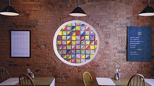
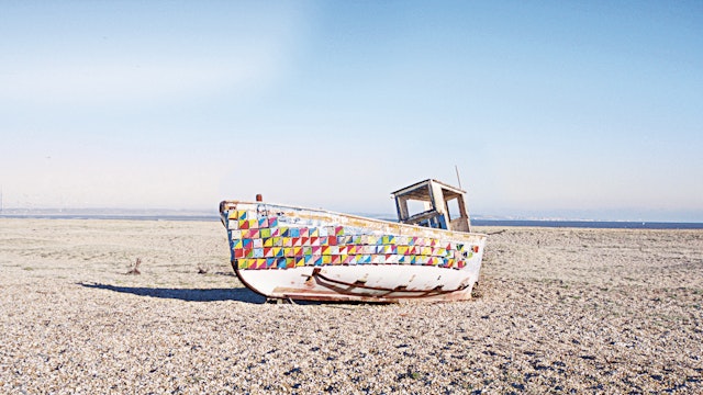
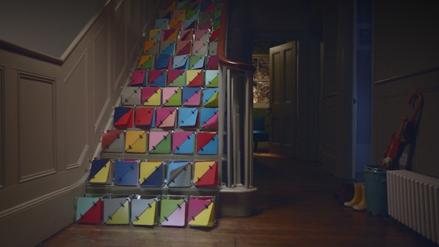
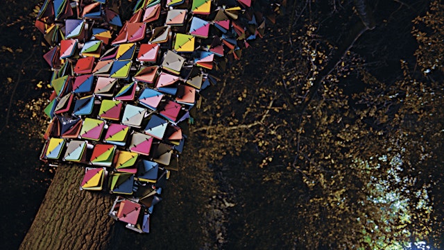
More4 identity – ManvsMachine
2012. A year rich in stories, events and great design. We’ve certainly not been short of inspiration all around us. So what’s been particularly interesting? What stands out? How about a brightly coloured angular logo? That can change depending on where you meet it? Building on a logo from our illustrious design past? But not London 2012. You need to cast your mind back to the quiet pre-Olympic month of January, and the relaunch of More4.
So why is More4 in my creative likes of 2012? Well simply because its a ‘brand world’, not a brand identity. There is a combination of design elements that delivers over and above the usual identity system.More 4 moves of course, as it’s an on screen ident. It’s digital and performs well online. It looks good in print. But alluringly it’s real. Physical. You not only get the feeling it responds to the elements around it – but you hear it too. Who would have thought the slight clitter-clatter of plastic triangles would make the base of a sound track for a TV ident? A mnemonic in the true sense of the word. It builds to present a subtle tone of voice, a way of moving and responding. The onscreen graphics and print work complete the picture (minus the click of plastic).Add to this that the identity doffs its cap to the origins of the original Channel 4 ident from way back in 1982, when computer graphics were in pre-history and we start to see the see the cycle. The return to craft. The resurgence of real.
So what’s so inspirational? Why hats off to ManvsMachine? Well it’s not about the TV, or in fact TV identity systems at all. It’s back to that ‘brand world’ I mentioned before, and the fact that all brands should strive for this. All brands should know how they move, how they sound, what their tone is – even those that don’t move currently. For too long, brands have been happy to accept only the graphic, the static, the mac generated. But we should strive to deliver more. Interaction principles, brand properties, mnemonics as well as graphics – but certainly more than just another logo – for all the brands we work with. We live in an interactive world after all, so it's vital that brands are able to move happily with this world.
Gary Holt, co-founder, Someone