10 energizing color palettes for sports branding and marketing
Color has the potential to mentally and physically stimulate its viewers, making it a powerful marketing tool for sports design and branding, writes Grace Fussell.
10 energizing color palettes for sports branding and marketing
Perhaps you’re creating a brand identity for a gym, a new product line for yoga instructors, or an ad for a sporting event. Whatever the case, color will play a vital role in the success of your project. In fact, whether you manage to attract the eye of your target consumer can hinge on your color choices.
That’s not an exaggeration: Certain colors have been proven to raise heart rates (red), boost metabolism (orange), or make an individual feel more optimistic about an upcoming competition or game (yellow). You can make the most of these psychological powers in your own designs through strategic use of color combinations.
To get started, check out these 10 free color palettes from Shutterstock, each of which draws on color theory and industry insights. More specifically, we researched marketing trends making waves across large sporting corporates such as Nike, Adidas, and Under Armour, as well as across major sports federations and events including ESPN, Sky Sports, the International Olympic Committee (IOC), and the Premier League.
Here are your winning palettes.
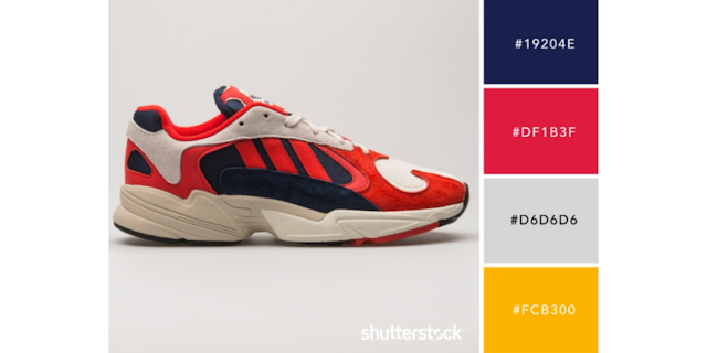
Palette 1: Euro Classic
Inspired by the brand redesign for Eurosport by Pentagram, this palette combines classic navy and gray with contemporary coral red and bright yolk yellow.
This mix of traditional sporting colors with fresher hues – an updated take on traditional navy and red – creates a balanced scheme that would be a perfect pick for sports events or broadcaster branding.
The scheme is especially appropriate for branding that requires a slightly more conservative approach, perhaps for sports such as golf, cricket, or rugby, providing the perfect harmony between old and new.
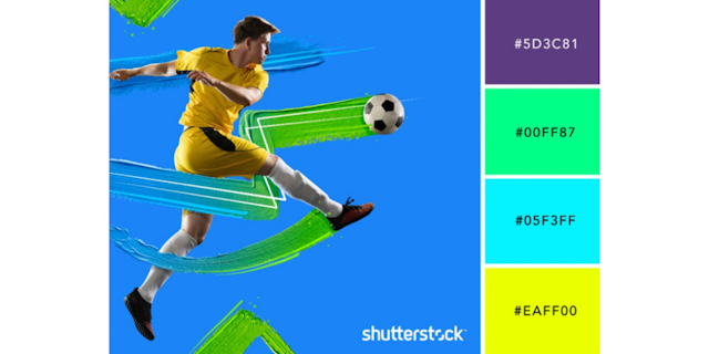
Palette 2: Neon Energy
Neon colors are a mainstay of sports marketing, and no wonder: They’re energizing, zesty, and high-octane – the sort of colors that can grab a viewer’s attention and keep them engaged. They also stand out on light-emitting screens, including computers and televisions.
This palette combines three acid neon colors from the cooler end of the spectrum with a deep, rich purple that anchors the scheme, making it feel mature and grounded – ideal for projects that need both energy and corporate suitability, such as branding for soccer, basketball, or baseball.
Palette 3: Competitive Spirit
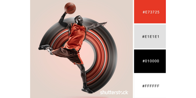
A German study found that English soccer teams who played in red kits won around 10% more games, meaning there’s now a research-backed reason why red is a go-to color for team kits across a range of sports.
Assertive, bold, and sure to get the blood pumping, red is a competitive color that can be used just as effectively across sports branding as it is on soccer shirts.
This color palette combines red with monochrome tones, allowing the confident hue to remain centerstage where it belongs. Perfect for crests, logos, banners, and uniforms all around.
Palette 4: Urban Workout
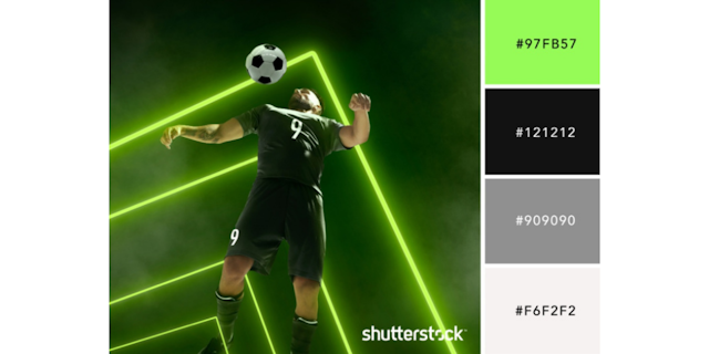
If you’re branding a sports venue or business in a city setting, this palette will help inject your project with both energy and edge. Florescent green brings life and intensity to an otherwise monochrome palette, while black and gray provide a cool, crisp backdrop.
Neon green and black are an ultra high-contrast pairing, making this palette particularly effective for posters, signs, or banners that need to catch the attention of passers-by. Keep in mind, neon colors will need to be printed using spot color swatches to maximize their impact.
Palette 5: Inclusive International
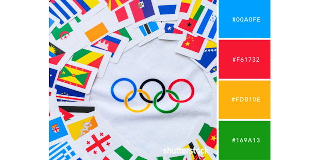
Inspired by the world-recognized color scheme of the Olympic rings, this multi-colored color combo is instantly reminiscent of international sporting events. In turn, the palette symbolically indicates inclusion or global participation, making it an excellent choice for large sports events or broadcasters who are showcasing sports content from around the world.
Palette 6: Serene Spectrum
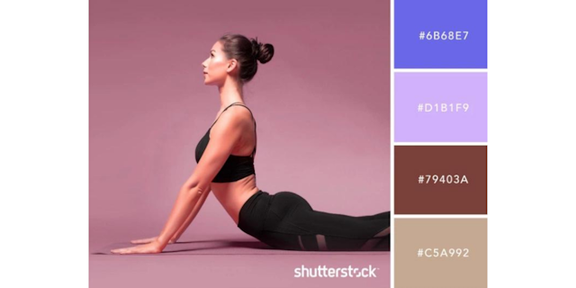
Lavender isn’t ordinarily associated with sports, but it’s a fresh and inspired choice for more serene and soothing activities such as yoga or Pilates.
When combined with violet and earth tones, pastel purple looks chic and modern. Brown and greige grounds the scheme, making this a palette that combines airy colors with an earthy base.
Nike used a similar scheme in its recent identity and apparel for Nike Yoga. But, these fresh, relaxing colors would also be a good fit for other sports connected with mental wellbeing and control, such as dance, martial arts, or wild swimming.
Palette 7: Teal Refresh
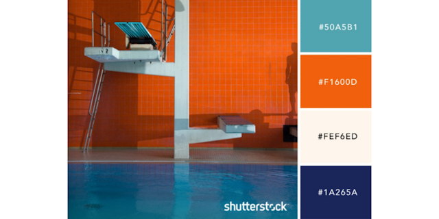
With stylish teal and rust orange at its center, this nature-lover’s scheme could help market aquatic sports such as diving and swimming, or winter sports, such as skiing or snowboarding.
Cool and fresh with a slightly retro feel, this palette is a good alternative for designers looking to depart from the norm without entirely reinventing the wheel.
Palette 8: Retro Race Track
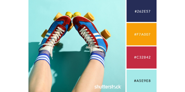
Sometimes, you can’t beat a classic. This retro palette looks to the colors used in sports in decades past, combining traditional navy blue with Seventies-inspired mustard yellow, cherry red, and Mid-Century sky blue.
This is a good scheme for brands that want to look established while retaining a sense of fun. Sports with a treasured history will also find mix of colors works well to tap into nostalgia marketing.
Try using this retro palette for motor sports, football, or rugby.
Palette 9: Surf’s Up
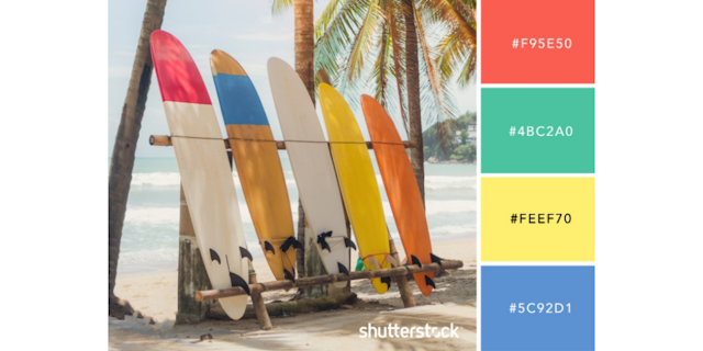
Tropical tones of deep coral, aqua green, sunshine yellow, and marine blue help to keep a surf-themed design looking suitably unique and beach-worthy.
Use these sunshine hues for surfing products or retail stores, or combine the colors into gradient swatches for sunset-inspired style.
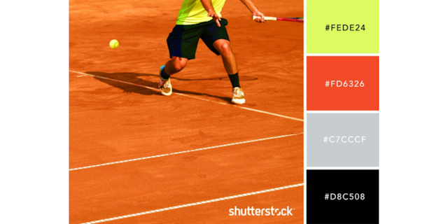
Palette 10: Tennis Clay
Tennis can have a stuffy reputation (think tennis whites and lawn courts). But, in recent years, the tennis marketing industry has shifted towards more contemporary takes on branding to appeal to younger and more diverse audiences.
With that in mind, this tennis-themed palette offers a new take on a tennis color scheme. The acid green of tennis balls is, of course, included, but it feels edgier when teamed with gray, black, and rich clay red.
Try using this scheme for club logos, marketing posters, or social media posts to give your tennis designs a stylish twist.
