Quicken Loans: Rocket Mortgage redesign by Lippincott
- Location:


Rocket Mortgage by Quicken Loans has become a household name over the last three years. Through two Super Bowl commercials, numerous national marketing campaigns and hundreds of online and social media ads - the familiar image of a rocket has been engrained in the memory of millions of Americans. Now the logos are showing off a significant upgrade.
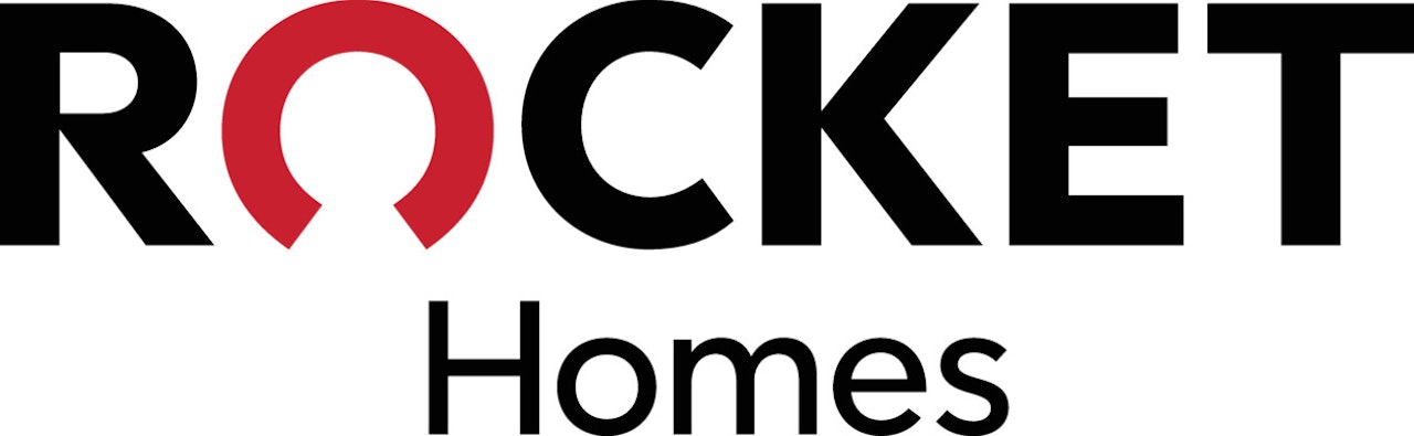
Quicken Loans released a new logo for Rocket Mortgage, the first completely online mortgage experience. Additionally, Quicken Loans’ sister companies Rocket Home and Rocket Loans and the newly launched Rocket HQ also unveiled their new branding marks. This is more than a simple logo change, or a different look to the brand, it’s a visual reminder of the partnership between the different companies that leverage the power of the Rocket brand.
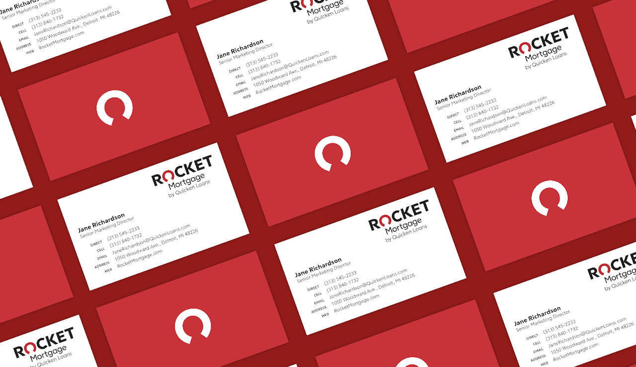
Since the focus isn’t solely on speed, the image of the rocket is no longer used in the new logos. Instead, the main element in the new logo for each company in this new partnership is a custom typeface with a “magic O.”
When looking at the negative space in the O, many have said they see an outline of a person — an intentional nod to keeping clients at the center of everything we do. Others have said they see the gauge of a speedometer to show speed or progress or the keyhole of a door—one that we believe can be used to open up a host of new financial opportunities and freedom. The beauty of this design element is that there are as many interpretations as there are reasons for a consumer to use Rocket Mortgage, Rocket Homes, Rocket Loans or Rocket HQ.
Credits
Agency: Lippincott
Client: Quicken Loans
Brands: Rocket Mortgage, Rocket Home, Rocket Loans