How to write copy for mobile
Over the weekend, I was writing a new ad for my thriller series. The goal is to get people to join my mailing list by offering them a free novel and short story.

I advertise my novels heavily on Facebook, which provides a preview of the ad as you create it.
There are three views: desktop, smartphone and feature-phone, with desktop being the default.
I wrote what I thought was a pretty good ad. It combined elements that had worked well for me in previous campaigns.
Then it came to preview time.
The desktop version looked great. Here it is.

We have 72 words of body copy. That’s short by anybody’s standard. They’re shared among six sentences, making an average of 12 words per sentence.
It’s divided more or less equally between narrative and testimonials (all of which are genuine, by the way, and sourced from reader emails).
The call to action comes at the logical point, just after the sales pitch.
There’s a compelling image that says “special forces” and shows the product and shouts the offer. So far, so good.
Then we have a social proof-style headline, a call to action subhead incorporating more social proof, and even three chevrons pointing to the download button.
But look what happens when we preview the ad in smartphone view.

The first thing that leapt out at me was, “Where’s the call to action gone?” Also, that first testimonial now looks, well, weird.
The headline’s OK, though Mr B Holloway has been truncated to Mr B…, but it still looks genuine so I can live with that.
In mobile view you lose the subhead, but again, I can accept that.
The final nail in the coffin of this particular version of the ad is the image.
Facebook serves the central portion, which neatly crops out the books and the word “FREE”.
What we now have is an ad for, what? A new movie? A military charity? A TV show? The reader neither knows nor cares.
I went back and reworked the copy. And the image. Take a look. First, at the mobile version.

Now we have the offer, the product and the call to action all in the first eight words. The body copy that follows sets these in context. And I picked a different testimonial that doesn’t get truncated.
Notice the small but significant edit from “he carries on with” to “he continues”. That saving of two words pulls more of the copy up from beyond the truncation point.
I also changed, “Despite the baggage of guilt from a botched final mission” to the far shorter and punchier, “He left with PTSD…”
My new-look image retains the books and the word FREE , crucial for reinforcing the appeal contained in the copy.
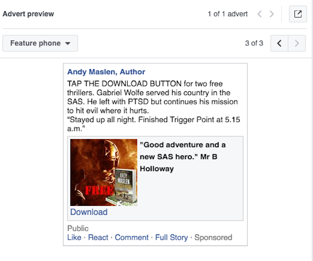
It even works on a feature phone.

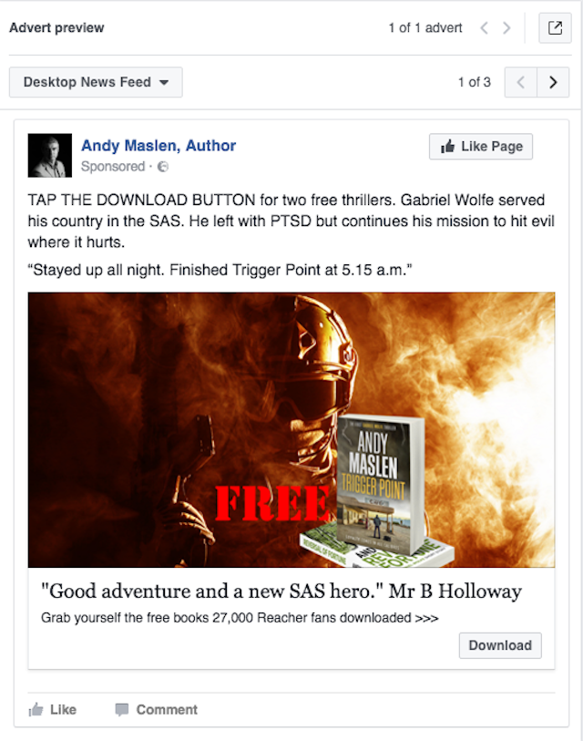
Finally, here it is on desktop.

Everything works, but the ad is optimised (horrible word) for mobile.
What of “Mobile UX?”
Of all the silly fads of the last year or two, “UX” owns a special place in my affections. It stands, lest we forget, for “user experience”.
“User experience” is a largely meaningless phrase. It is either so general as to encompass an impossibly broad range of factors, from the cleanliness of the user’s screen to the colour of a button, or so specific as to render it merely a substitute for perfectly good existing words and phrases, such as “design” or perhaps “ease of use”.
You may remember “user friendly”, another faddish phrase that has been superseded.
In the world of mobile copywriting, “UX” is primarily concerned with four things.
One, ease of reading.
Two, the need or otherwise for scrolling.
Three, ease of navigation.
Four, ease of responding.
One is a function partly of responsive web design (since apps should by their nature be suited to the screen on which they’re used) and partly of old fashioned copywriting disciplines, like short sentences and paragraphs.
Two means placing all your key copy (and images) on the first screenful of information served to a phone user.
Three is also handled by responsive design. In ads like mine, which appear on a linear news feed, navigation is irrelevant.
Four means having obvious buttons with simple commands in the imperative mood: Learn more, Download, Shop now etc.
My mobile-friendly ad works across these four important dimensions.
And the results?
The results are great.
Cost per lead of 48c (I work in dollars). My Facebook rep told me this was excellent.
Relevance 9/10.
In a conversation that prompted this article, a fellow copywriter said she’d been told “rethink, don’t shrink”.
Which has, as all good slogans do, a seductive quality.
It’s memorable, aided by the rhyme, and it seems to express some fundamental truth.
But is it true?
Well, partly. You do need to rethink the way you write for mobile.
But only in terms of some fairly well-worn techniques from other small-space media channels.
Putting your call to action where your reader (not “user”) can see it is a good idea. But it’s not exactly rocket science.
Condensing your appeal to as few words as possible, ditto.
Rejigging any images so they work well on smartphone screens, duh!
I would say, if you can write copy, you can write for mobile.
My main piece of advice would be preview your copy on a phone or a phone simulation.
And think about the world from your reader’s perspective, not yours.
