Less, but better: Why simplicity speaks volumes in today's overcrowded market
Essentialism. The currently inescapable design buzzword. But it’s nothing new. Its roots go back to industrial designer Dieter Rams, a protégé of the Ulm School of Design (successor to the Bauhaus), who made it his life’s work to filter through the noise to find the essence of a product. He worked to uncover the core truth about a brand and express it in the clearest way, eliminating the unnecessary. For Rams, “good design is as little design as possible. Less, but better.”

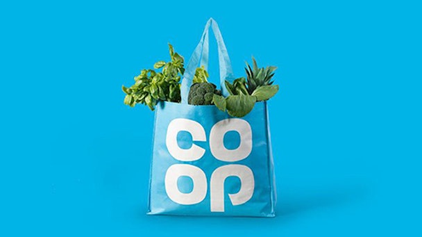
Co-op
The recent Co-op re-brand is a good example of how eliminating the non-essential works. It has returned to a name and identity based on Co-op’s iconic 1960’s clover leaf design, channeling the purity and timelessness of a classic design. Irn-Bru has also relaunched with a new look – inspired by its long-standing associations with industry and strength. Two very different brands, with an important design principle in common: a high regard for the wealth in their brand’s heritage. It’s the most effective way to bring a brand to life.
Co-op’s original clover leaf was designed to represent the spirit of bringing communities together and unify Co-op's various businesses under one identity. The power of the clover leaf revival lies in its clarity. It acts as visual shorthand, representing everything that the brand is about. It’s as relevant today as it was in the 1960s. The familiarity of the marque is wonderfully amplified through its consistent application across all forms of communication both online and in-store.
Research from design agency North shows that for the older generation it "evokes nostalgic memories of local shops”. But for a younger generation it suggests a “modern brand of the future ready to live and breathe in the digital world". Win-win.
JKR's relaunch of Irn-Bru also draws on the brand’s visual heritage with real purpose and impact. It retains the distinctive orange and blue colour palette but now incorporates a girder emblem, inspired by the 1980s 'Made in Scotland from girders’ campaign. The original idea of the strong man takes pride of place at the heart of the brand. It gives punch to the brand message of strength and industry. The result is powerful in its simplicity.
The important thing here is that Irn-Bru and Co-op show a real confidence in knowing who they are. Their design is steeped in meaning, celebrating what they are distinctive for. They’re not afraid to go big with what truly differentiates them. Clear thinking and planning, in order to determine a brand’s key equities, have never been more important in today’s overcrowded shelves.
Interestingly, the new British Steel logo has gone the other way. It has left the visual wealth of the original David Gentlemen identity behind and replaced it with something entirely new. Understanding what matters most gives the freedom to simplify and strip out anything extraneous. This is not about design minimalism; it’s about less, but better and eliminating the non-essential, so that a brand’s identity is instantly recognisable, distinctive and impactful. Every element counts.
Packaging design creates its own set of considerations; its primary role is to help people choose the right brand and product for them. The challenge for a piece of packaging lies in small selling-faces, multiple product messages and balancing brand consistency with range differentiation.
Increased complexity demands special attention at the creative planning stage. Quintessentially British brand Branston is a case in point. It’s a brand that started life as a jar of pickles in 1922. However, like many successful brands it has grown with new products and ranges, all of which need to be visible and understood by the shopper.
The design challenge here was not only to create simple and clear brand consistency across the new relishes and table sauces, but also build in the flexibility needed for range differentiation. And the solution was to make a meaningful contribution and ensure every line, shape, colour and font came from Branston’s visual essence. The aim was to intensify, not detract from the brand experience.
The most successful brands of today have strong sense of identity and use design to project it in a way that is instantly recognisable and appealing. Simplicity speaks volumes. It amplifies and clarifies a message, drawing the line between good and great design.
To quote Dieter Rams again: "Good design is making something intelligible and memorable. Great design is about making something memorable and meaningful”.
Less, but better is where every brand should be.
Jo Saker is creative director Parker Williams
