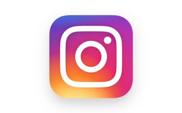
Insta-Slam: why you shouldn't be up in arms about the app's new design
Here we go again! The Gap, Air BnB, Google; as designers we are an opinionated and touchy bunch. I tend to cringe when some 'face of design’ does a hatchet job on a fellow designer's work and that then gets splayed all over the trade media for all to see.

OK I get it, and it’s fine, freedom of speech, but moments like this always take me back to the big London 2012 Olympic Logo debate. Wolff Olins (who I have always admired) had just unveiled their brand creation after many months of creative labor and it caused a blinding outrage. I recall being in my local gym where two men we’re debating what a waste of money it was and who could have created such a monstrosity? I felt a rising rage and to ask them ‘what the hell they knew about design?’ or ‘did they see the brief?’ I refrained of course from active conflict, being English, too polite and wary of getting into a ruck whilst partially naked... But it was probably the first time I can remember that our industry was being slammed in public for a “shocking waste of time and money”, and even, (if I remember correctly) making front page news, albeit The Daily Mirror.
So when criticism seeps out from the design world (where you obviously expect a certain amount of opinion) into the real world, you know there’s trouble brewing. A bandwagon inevitably gets rolling and before you can say ‘I loved the previous logo honest Guv’, everybody and your grandmother are asking you over the Christmas dinner table if you hate a new redesign?
With the London 2012 Olympic logo, it wasn’t until you saw the brand in application that you 'got it’…haters eventually turned to lovers and it spearheaded London’s highly successful Olympics charge. The result was vibrant, liberating, engaging and, dare I say different? The point here for me is about a logo vs. application in it’s environment. It’s early days for Instagram and I want to see how it plays out. So before you scream Tropicana! let’s maybe hold our design tongues.
I will always, always ask questions though. Doe’s it look hideous in the app eco-system? Is it iconic? Does it stand out? Did it stop me instantly updating the app? Do I totally hate the new brand video that goes along with it? No, no, no, no and no. Instagram is now so much more than just a photo-sharing app it’s a social network of choice and in my humble opinion, needed a new face.
Love or hate the new rebrand, I’d offer that things can look very different in the morning and you may be singing it’s praises later that day. Hell, what I was designing last night and I was in two minds about, feels a bit sweeter the next day once I walked away for a hot second and had time to reflect.
Here in the good old U-S-of-A Donald Trump is on the verge of the presidency; I think we have bigger things to worry about! So come on people, it’s one thing to share an opinion with friends; it’s another to trash someone’s work all over the industry!
