The new-look BBC Three and the challenge of adapting to brand change in the digital age
This week has seen the release of the new BBC Three identity, and the now inevitable tirade of online abuse from a range of design ‘experts’.
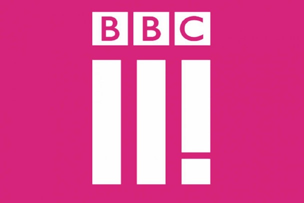
The new BBC Three identity
Whilst it is amusing reading the responses to the unveiling, particularly the observation that it doesn’t actually contain a number three in its identity, lots of the comments are very obvious and somewhat lazy, focusing on the similarity to the Roman numerals for ‘two’ or that it could be interpreted as BBC Eleven.
It is true that the new identity is a departure from the existing one, which explicitly featured the word ‘three’ alongside the traditional treatment of ‘BBC’. Instead they have endeavoured to create a symbol for the channel. A symbol that lends itself to the applications on which this will predominantly be executed.
The whole point of this redesign is driven by the relocation of BBC Three from TV to an entirely digital entity, meaning its prime usage will be online through tablets, laptops and mobile devices, rather than the traditional TV format (with the exception of smart TVs). The identity, therefore, will be viewed most often as an app button, rather than merely appearing at the top of the screen and in print.
This new identity is clear, simple and can be viewed in the small dimensions appropriate for this type of viewing (10mm x 10mm on an iPhone), making it a success in a real-life situation.
It appears that I’m in the minority, as I actually do like the new identity.
It is also far more ownable and unique than the online detractors suggest. This is vital in establishing a memory structure with which users will connect. Devices are nowadays filled with apps and there is vast opportunity for distraction when looking for entertainment. Being memorable and standing out will help cut through this and more likely increase usage of the BBC Three app over other viewing options.
It is quirky and unexpected, and far more in keeping with its target market of a younger audience. It is distinct and memorable, which is important as you want your identity to resonate and stick.
Niki Carr, the head of marketing at BBC Three, has stated that the new icon “represents BBC Three’s three pillars, make me think, make me laugh and give me a voice”. The visual treatment of these three pillars to play the part of the station on which it is built gives the brand identity a story, a symbol. Symbols are more impactful in brand than words, therefore no matter how abstract, it is much stronger than the obvious execution of the literal number three.
All new rebrands that are unveiled to the public open themselves up to this type of attack, as consumers are often adverse to obvious change; however they quickly adapt to the new version, when executed well. Do we need to cast our minds back to the big unveiling of the 2012 Olympics identity and the barrage of abuse that received? Can we all remember how fantastic it looked once applied to all the venues and merchandise?
The problem that we have here is not the identity but rather the fact that it was unveiled to the public with a fanfare – thus inviting the online detractors to take aim. The new identity also uses a colour scheme close to that already in use, so the change shouldn’t eventually be as shocking as it first appears.
There’s only one true irritant for me – the lack of alignment of the three ‘pillars’ with the BBC cubes. There doesn’t seem to be any logical reason for not aligning them. All that this does is invite visual and verbal criticism, alongside general frustration.
Overall, I am pleased that the BBC has gone for a riskier approach and not relied solely on the spelling out of numbers, as do most television stations. In the new world where television is no longer the main media channel, using a number to identify yourself becomes less ownable, and carries less meaning when disconnected with a television set.
In order to truly stay relevant in the digital age brand identities must be distinct, quirky and memorable to get the attention of consumers. After all, taken out of a television setting, what does ‘three’ even mean to the digital user?
John Ramskill is creative director at BrandOpus