In defence of the BBC Three identity: It's too easy to knock new branding
It's a waste of money. It looks like X or Y. I can't even read it. A five year old could have done it...
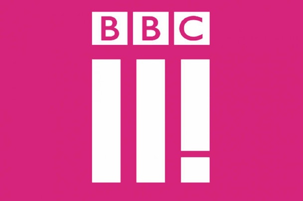
Just a few of the responses levelled at the new BBC Three identity from the press, design media and social streams.
It's predictable, lazy and more than a bit derivative – the reaction that is, not the work.
Derision is the same response that seems to echo round cyberspace every time there's a vaguely new piece of design or identity put out in the world.
It's fair enough to critique but it would be good to hear something more constructive, or a really fresh perspective. But as Taylor rightly says, haters gonna hate. It's always easier to knock something down than be brave enough to stand behind something new.
There's a certain irony in seeing these near identical claims of recycling other people's ideas or accusations of bandwagon jumping stacked neatly one on top another on a Twitter stream.
Sure the new design looks a bit weird (but weird goes hand in hand with anything that's new or out of the ordinary). It feels a bit bold and blunt (but it's going to have to work on an app button or a mobile). It could be misread (but it doesn't really look like any other channel). So at least it's switching things a bit.
Design needs to consider craft and care but sometimes it's also about context and cojones.
The truth is we can't know yet if the design is really any good. We need to see it in action, swipe it, press it, prod it and flip it.
Maybe we should give it some space, let it breathe in its natural environment. See if we skip past it tomorrow. See if it sits well with our favourite programmes. See if it really annoys us when it's sat in the corner for a whole hour programme. Discover if we get bored to death of it after two weeks.
The chatter seems to be almost entirely around the logo – but a broadcast logo is always one bit of a bigger whole of bugs, indents and lower thirds. Paul and Mary wouldn't judge a cake on The Great British Bake Off just by looking at a bag of flour, so perhaps it's better to look at the bigger picture.
Test the new formula, give all the ingredients time to rise and then we'll know if we should give it three stars or 10.
Chris Moody is creative director of Wolff Olins