Fresh INK: The inside story of an agency rebrand

How about a few fun statements and facts to kick things off? Perception is everything. Our brains process visuals 60,000 times faster than text. Instant judgement is made on how we look - that's people for you. No pressure for a rebrand then!
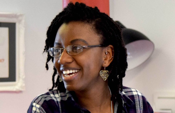
Louise Adu of INK Digital.
Sometimes a fresh new look is warranted to reflect a significant change in your life, like when you get a new job or after you've ditched an unsavoury ex-partner. It's a precursor for advancement in a new direction and all eyes are clapped on you to see what you can achieve next. For INK Digital, 2015 has been one of the biggest years we've had (more on that later) and this is how we took on the challenge of creating new branding.
How did we do it?
Translating brand values into an image that will do your company justice could easily cause some damp armpits and mild anxiety. Will people get it? Will they like it? Does it show who we are? However, the most important part of moving your brand development forward is that it's done truthfully and if it is, you needn't worry. Just look at the recent abstract and slightly bonkers Channel 4 rebrand, which was met with many 'what the...?' comments from some of the industry. Personally we think it's a great representation.
We wanted to take our time to re-imagine our identity as you can only make a second first impression once. We held various brand workshops featuring all of our creative, strategy, dev and marketing team members so that we could individually contribute and capture our beliefs as to what makes us INK.
What we created
We've affectionately named our new logo the 'Monocle and Moustache'. To break it down in a little detail, it was a unanimous decision for our hot pink and black colour palette to remain as it's a vibrant, strong and bold combination. The main attraction, however, of our refreshed appearance is the quirky 'K' of the typeface from which the design's moniker was born. It's INK in a quirky, honest, creative and character-packed visual nutshell and is the embodiment of us as a team of inquisitive, seasoned pro's honing and shaping our expertise to deliver the best for our clients.
So, why now?
Over the last 12 months we've been grafting away laying the foundations for our next strategic move. The digital market in Australia has been on our periphery for a number of years, so earlier this year we took the plunge and opened our first overseas office in Melbourne. The agency also turned 13 this year and Helen Darlington, Founder and Head of Creative at INK described it as pivotal milestone when you're growing up, so a new logo was befitting of this moment.
What we learned
Be clear with your vision - If you're not completely convinced as to why you're implementing such a change then hang fire until it's 100% crystal clear. There's nothing worse than backtracking on something that can be hugely costly in both monetary value and brand reputation.
Plan your attack - As with any project the planning is crucial. Whether it's a complete brand overhaul, or a relatively smaller scale update like ours, such an exercise takes longer than a lot of people may anticipate even when, like us, we have the expertise in house. Our creative team did an amazing job of designing a number of options which definitely made it tricky to whittle them down. If your company has a few stakeholders involved you can see how easily time can evaporate.
Don't strive for perfection - Once you've created your ideal visual for the present, get it out there. Endlessly tweaking a colour or graphic is not the whole picture, whereas evolving your business so your customers or clients have an outstanding experience is the crux of branding. That's the beauty of a visual representation as you can change it quickly to some extent, but shaping opinions of your service isn't a simple solution by any stretch of the imagination.
We had a blast taking on this challenge and came away with so much more than just a logo. The insight gained from multiple perspectives has been invaluable and we're massively looking forward to what's around the corner for us.
Louise Adu is a member of the Communications and PR team at INK Digital Agency.
Content by The Drum Network member:

Woven Agency
Woven. We make brands work beautifully.
Take decades of digital experience. A deep understanding of human psychology. Powerful, real-time social insights....