A decade in, Chobani updates creative focus, packaging and communications
Over the last 10 years, US Greek yogurt maker Chobani has grown into a dairy powerhouse, accounting for approximately 40% of the country's Greek yogurt market. But rather than slowing down, the company decided it was time for a change to address an expanded vision.
In honor of its 10th anniversary, Chobani set out to show that yogurt isn’t just good for you, it’s a part of an overall health and lifestyle change, illustrated in new packaging, communications and positioning.

With a new vision of “Make universal wellness happen sooner” the company has evolved its focus on better nutrition, better communities, and overall better environmental wellbeing.
“This didn’t come from a packaging question. It came from asking the question, ‘what is a modern food company?’ How do we create a modern food company?” stated Leland Maschmeyer, chief creative officer at Chobani. Maschmeyer went on to say that the move was more than just about food; the challenge was to explore the questions and really be a part of what the company currently sees as a “greater food movement” in the country.

“What really inspired change in identity – and all of our creative expression – goes back to that question. We’re part of that food movement. At the core is food as a source of good. The role we play in consumers’ lives, we realize our vision is that of the food movement, of universal wellness. People eat for much more than satiation and nutrients – we eat for happiness and fun. We want to enjoy food again. We also want to take care of the planet and our communities,” he said.
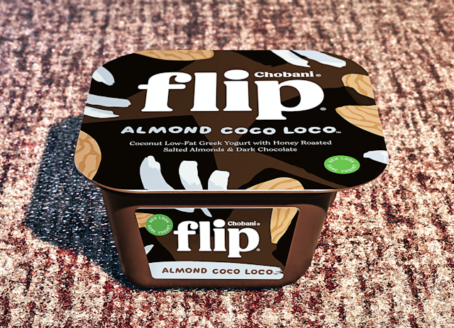
The change will be instantly recognizable on the shelf, as new packaging and shelf talkers take on a new look inspired by 19th Century American folk art.

First, the Chobani wordmark was altered to reflect a warm approachability and accessibility of the product and company. Second, a visual system was created with the folk art concept, to create a “happily-ever-after paradise,” according to the company, with colors derived from real fruits, flowers, leaves, and bark to connote the romantic beauty of nature, and a handmade quality to bring a playfulness to the brand expression.
“Our perspective internally was [that] we wanted to find a sense of joy and enthusiasm. We’re creating something better than food,” said Maschmeyer, who noted that the new brand expression, ‘Fighting for happily ever after’ has a fairytale quality. Broken down, the ‘fighting for’ signals the fearless spirit of a company with a track record of never backing down, and ‘Happily ever after’ looks to a future where everyone is nourished, healthy and happy.
“We can all have a happily ever after. The [new packaging] looks handmade, but there’s a sense of optimism about it. That got played out in new identity – there are more handcrafted cues to it. It gives an enchanting feel, and there are imperfections to it. It’s very craft oriented,” said Maschmeyer, who added that the idea about the packaging was created in-house by the marketing team. The brand has worked previously with Horizon Media and Droga5 on creative campaigns and it named Wieden+Kennedy its creative agency of record in 2016.
Overall, the new brand identity is designed to be experiential rather than transactional, and a new set of communications, including a marketing campaign, shelf talkers, packaging and more will roll out between now and into January of 2018 to support the philosophy.
“We’re focused on making food experiential, joyful and playful – that’s the world you’re stepping into,” stated Maschmeyer.

