Tiger Beer refreshes packaging design

Tiger Beer has launched a packaging refresh with a new look rolling out to cans, bottles and multipacks.
Singapore-based Jones Knolwes Ritchie (jkr) handled the redesign, striving to consolidate the brand’s position as ‘Asia’s beer’ through a more heroic and premium identity.
“Tiger is a brand with real energy and bite. The brand promise of ‘uncaging your courage’ reflects its character”, said Mie-Leng Wong, global brand director of Tiger Beer at Heineken.
“It was important that the ‘uncage’ message was integral to our identity as well as our communications,” she added.
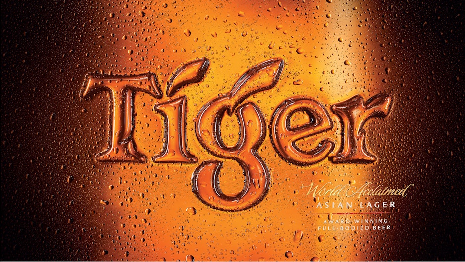
“The redesign literally uncages the Tiger from its orange roundel and allows it to ‘prowl’ freely across the Tiger word-mark,” said Katie Ewer, strategy director at jkr. “It’s a much prouder, more single-minded expression for the brand”.
“As a beer with a rich heritage, it was important for us to pay attention to the details. The Tiger icon has been redrawn-by hand to achieve a more dynamic feeling, and is now rendered in gold foil on metallic labels. Even our multipacks feature the same textural depth that our primary packs do.
“Our new design builds on Tiger’s heritage and distinctive brand equities, but evolves them to be bolder, more single minded, and more premium,” she added.