Design and Chinese New Year: how brands can cut through when tradition dictates aesthetics
As the world gets ready for a new Lunar New Year, welcoming in the year of the rooster, many brands are seeking to grab the attention of shoppers.

How to cut through with design around Chinese New Year
Supermarkets become swathed in red and gold. Gifts, snacks and confectionery stacked high on shelves. Even Western brand Virgin Active, never one to shy away from an affiliation with its own obsession with red, hands out branded hong bao red envelopes to guests as they arrive to work out.

Not all brands are primed with red branding, however, and traditions could make it tough to stand out. Or do the limitations spark even more inventive designs?
Louis Houdart, founder of China-born branding agency Creative Capital China, and Katie Ewer, strategy director at JKR, which has offices in China and Singapore, unpicked the nuances of design around Chinese New Year to explain how brands, local or foreign, can have an authentic place among tradition.
Houdart, explains: “Chinese New Year is very big in term of promotion as a festival and it is always a challenge for brands to stand out in such a competitive landscape.”
The festival does draw comparisons to Christmas in the West, he says. “The complexity and fragmentation of the Chinese market makes it always difficult to summarise in a few lines but, when it comes to CNY, gold and red are still working and are relevant for both Chinese brands and Western brands.
Chinese New Year is so strong culturally that there is usually less flexibility for brands, Chinese or Foreign, than for other times of the year. As an example in the western world, Christmas is traditionally represented by green, red, gold, and snow,” he explains.
According to Ewer, the meanings behind the Chinese New Year “visual tropes” make tradition harder to pay with.
“Red and gold, mandarin oranges, peach and plum blossoms, red lanterns and fish: all of these carry specific meanings – mostly around luck, fortune or abundance – that make Chinese New Year a festival that’s loaded with subtext. So if a business decides to break with convention and do something that doesn’t use these established codes, they’re not just removing decorative elements from their product, they’re divesting it of meaning,” she says.
However, both Houdart and Ewer agreed that tradition can be toyed with. Houdart says some verticals have more flexibility or tend to follow certain rules.
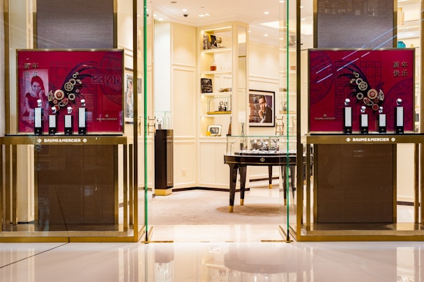
“Luxury and FMCG brands tend to play with them for two very different rationales: Luxury brands that are premium and have a global reach, and global consistent image, will need to “talk about CNY” in a meaningful way to its Chinese audience in China. At the same time it will also need to use Chinese code that will be aligned with the perception of their western audience,” he said, citing Baume & Mercier and MCM.
He added that “FMCG or fast fashion can have a more playful attitude towards the code, such as the brand Philippe & Gaston playing with their iconic dog, and dressing it up as a Rooster.”
Chinese New Year Design
“More niche, local brands or foreign brands, can be more daring in the code that they use, as their audience is much more selected, but you will still usually see some hints of red. A good example would be the Chinese fashion brand Icicle
Ewer says that a smart approach is to take on some of the tradition but adding a twist that makes sense to the brand story, or “same same but different” is you might say in Asia.
“The goal for every brand during this season should be to create something fresh and relevant, but that builds brand equity at the same time. Too many brands assume the two objectives are mutually exclusive. There is too much lazy, lowest common denominator design and thinking at Chinese New Year – but pasting this year’s zodiac animal on your product doesn’t necessarily create attention, interest or emotion. It just makes you invisible in a sea of generics,” says Ewer.
She gives the example of both Coke and Pepsi, which tend to take a new design approach to Chinese New Year each year, particularly for bottle design. Coca-Cola this year brought back a characters it’s used before, as well as focusing on a popular story around sticking together and reunions, but added in a world-famous festive character - the snowman. However, it’s an older Coke execution that caught Ewer’s eyes and Pepsi’s execution for the year of the monkey.


