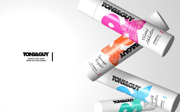
Toni&Guy responds to tough competition with new branding and packaging
Hair care brand Toni&Guy has rebranded as it hopes to stay front of mind with consumers in a cluttered sector.

Toni&Guy
The primary objective of the redesign is to ensure that Toni&Guy stays relevant and competitive in a crowded market filled with premium brands focusing on salon quality and strong heritage. The brand worked with PB Creative on the new packaging and brand identity and tasked the agency to create a new design that would emphasise the brand’s fashion roots, personality, and London heritage.
The new design is focused on Toni&Guy’s ampersand as well as the brand’s crest, which is now used as a watermark to boost recognition. Another key objective for the redesign was to improve navigation across Toni&Guy’s products. The new design adds further colour to the existing colours used across the range.
Ben Lambert, co-founder and creative director at PB Creative, explained: “Against a backdrop of fierce competition, it was time for Toni&Guy to create a new design that captured its own vibrant personality and translated it in a way that would make a striking impact on an audience driven by bold statements and fashion-led design.
“The ampersand is a means of bringing out the brand’s bold personality, so by making it the main focus of the design, we are reinforcing this fact whilst creating a system that allows us to clearly differentiate across the extended range.”
The new packs will be rolled out from September 2016, following an initial limited edition launch featuring designs by guest designer Roksanda in May which adopted this new aesthetic.

