KP Nuts gets new packaging to stand out on shelf

KP Snacks is this week rolling out a new packaging design for its flagship product KP Nuts as the brand looks to achieve stand out on shelf.
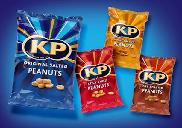
Working with branding consultancy Coley Porter Bell, KP Snacks tasked the agency to create a design which "reflects the brand essence of sociability, vibrancy and positive moments".
To stay relevant in the market, KP Snacks wanted to maintain its heritage and popularity in the sector but keep moving forward. As a result, the new pack design features an upgraded foil packaging and golden rays that surround and make the KP logo pop.
Carolyn Longcroft, senior brand manager at KP Snacks, said given its loyal consumer base, KP is "extremely careful" when it comes to something as fundamental as its packaging.
"The new design created by Coley Porter Bell has completely captured our brief to make the brand stand out in the market and ensure we stay relevant for our consumers," she said. "Being eye catching on the shelf is key on such a busy fixture and the metallic edge to the packaging really delivers on this, ensuring KP is a true beacon for the nut category.’’
The new design comes at a time of expansion for the brand and is part of a drive that has also seen KP Nuts launch XL Crunchy Coated Nuts and Double Oven Baked Nuts.