5 of the best art museum identities

If you’re in the business of design, landing a brief to rebrand an art gallery is a particularly nice gig. Developing an identity that encapsulates concepts like creativity, art and culture? How delightfully cerebral.


Devising a system that celebrates the masterpieces on show within the gallery’s walls through inventive visual flexibility? What an opportunity to show off your graphic skillz. The trouble is, in their pursuit of the expression of variety, a lot of art gallery identities end up looking a bit… the same.

So how do you create an identity system that speaks to the collection it represents whilst also having a sense of self? Here’s five of the best.
Victoria & Albert Museum, London

This is the logo that started it all. Simple yet elegant, statuesque yet agile, serious but with a bit of quirk… The monogram itself hasn’t changed since Alan Fletcher designed it in 1989 – proof a timeless identity maintains its relevance, no matter what the decade or the subject matter.
The Rijksmuseum, Amsterdam

The Rijksmuseum identity demonstrates the value of restraint. There’s a dash of quirk in the wordmark, but it’s not tricksy or try-hard.
Mauritshuis, Amsterdam

Who says the V&A has the monopoly on beautiful monograms? The identity for Mauritshuis by Studio Dumbar (home to that painting – Girl with a Pearl Earring) is understated and classy. It also shows how a real understanding of the product you’re branding – in this case Dutch ‘Golden Age’ painting – can inspire creative distinctiveness. This is one instance where the use of a logo to create a window to the artwork beyond really makes sense – because open windows, inviting doors and long corridors are such a recurring motif of Flemish art.
By the way, it’s worth comparing the élan of this marque with the exceptional strangeness of the previous logo.
Helsinki Design Museum
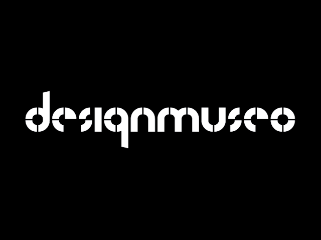
Monochromatic, modular modernist – the identity for Helsinki’s ‘design museo’ feels quintessentially Finnish. Interestingly, the designer commented that he felt the previous identity ‘got lost’ behind the exhibition themes it presented – striking the right balance between those two is clearly the trick.
The Serpentine Gallery
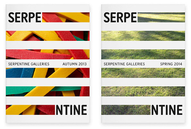
It’s not a snaking logo, but it does have length and agility! The Serpentine Gallery’s logo is contemporary and sleek, versatile but unmistakable. And not a window to an artwork in sight.
Take 5 is made in collaboration with Katie Ewer of jones knowles ritchie.