Bing rolls out new logo as it searches for a solution to Google’s dominance

Microsoft has refreshed the logo for search engine Bing, making minor refinements to the brand since its last alteration in 2013.
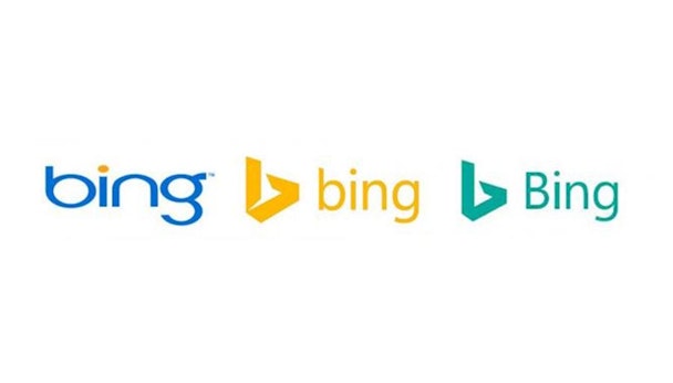
A colour change from yellow to green, a capitalisation of the B and a few other minor adjustments mark the differences in visual style.
Microsoft keen on having Bing branding which displays well across a plethora of devices, something the previous iteration didn’t according to Rik van der Kooi, Microsoft's corporate vice-president of advertiser and publisher solutions.
Van der Kooi told AdAge: “We expect Bing to continue to grow and are thrilled with our trajectory.
"We are the only search engine that is experiencing steady, consistent growth and have increased our share for 26 consecutive quarters. And we're not slowing down."
He concluded that the new creative indicates that Microsoft is going “all in on search” with Bing holding around 21 of the search market.