Bud Light gets a new look after eight years

Bud Light will be sporting a new look come 2016 as the brand tries to refresh its image.
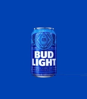
Created by design firm Jones Knowles Ritchie in collaboration with Bud Light’s creative agency Wieden + Kennedy New York, the packaging marks the brand’s first major redesign in eight years.
By “bringing back the brewer’s historic ‘AB’ crest” – which hasn’t appeared on packaging since 2001 – the brand hopes to communicate its heritage and “genuine brewing credentials” to consumers.
The new bottles and cans will be featured in upcoming work for the beer brand that is slated to launch “in time for the Super Bowl.”
Of the redesign, Bud Light’s vice president of marketing Alexander Lambrecht said: "In 2016, we'll put a more modern twist on Bud Light, from the way the brand looks to the way it acts. We're proud to introduce our fresh new look, which pays homage to our most iconic packaging of the past, yet feels current and unique with its bolder logo and distinctive blue colorway. It's a design that truly stands out from what's become a sea of sameness in the light beer category."
In July, Bud Light tapped Wieden + Kennedy New York as its new creative agency after working with BBDO for two years. The new packaging is part of what Bud Light is calling a “larger brand evolution” as it moves away from its most recent ongoing campaign ‘The Perfect Beer for Whatever Happens,’ which was largely geared towards college students.