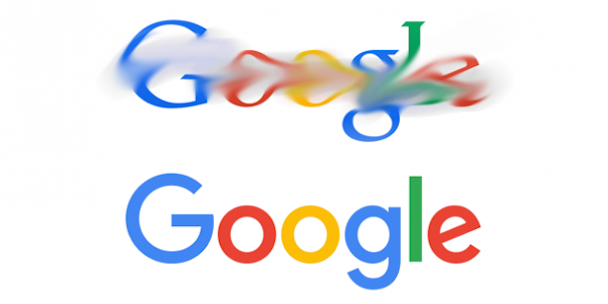
Old Google or New Google? Here's the verdict from our readers on which logo is best
Late on Tuesday evening Google rolled out a revamped version of its universally recognisable logo in a bold move which took many by surprise.

The new look, designed in-house, was explained to viewers in a simple gif.
We’ve changed a lot over the last 17 years, and today we’re changing things up again... http://t.co/gjK5Csd0pP pic.twitter.com/nNNMshhBat
— Google (@google) September 1, 2015
Design experts were largely receptive of the rebrand in discussions with The Drum, with Design Bridge creative director Asa Cook saying: "The new identity retains many of the positives (distinctive, friendly, human) whilst feeling relevant for today. I think the design team did a great job."
However we wanted to know what our readers thought, and so asked our social media followers to tell us whether they preferred #OldGoogle or #NewGoogle.
. @Google's new logo is dividing opinion, which one do you prefer #OldGoogle or #NewGoogle? http://t.co/negsD2dG53 pic.twitter.com/jrh2jQg51Z — The Drum (@TheDrum) September 2, 2015
Our informal poll saw #NewGoogle gain the seal of approval from over a third of respondents (70.2 per cent).The remaining 29.8 per cent remained rooted in the past preferring #OldGoogle.

Below is a collection of our most interesting feedback on Twitter. The tilted e proved to be a major talking point.
@theglorymill @TheDrum Because of the slanted 'e' I keep reading 'Googl' instead of 'Google' — David Moot (@MootDavid) September 2, 2015
Look! The 'e' is at a jaunty angle to show how they're fun, human and just a little bit quirky #GoogleLogo #NewGoogle — Adam Sefton (@AdamSefton) September 2, 2015
@TheDrum On the whole I like the #NewGoogle #logo but the 'e' looks really out of place pic.twitter.com/VmMGEC5yOT — David Moot (@MootDavid) September 2, 2015
There was a lot of praise for the new look.
#NewGoogle all the way - bold new logo for brave new world under Alphabet https://t.co/bkD3AvkOFV — Charlie Boss (@Charlie_Boss) September 2, 2015
@TheDrum @google still getting used to it but definitely the sans serif #NewGoogle — Alexa V. (@alexahvan) September 2, 2015
@TheDrum @google Iike #NewGoogle. The old logo feels antiquated now. — David Ferguson (@djf42) September 2, 2015
Love google's new logo!! #Google #newgoogle — Nick McCally ™ (@nickmccally) September 2, 2015
I'm liking the new logo...it looks neat and fresh #NewGoogle https://t.co/5q7R3yh0Pz — Jenny Davis (@JennyDavis91) September 2, 2015
It IS flat and kinda cute. What do our tweeps think? #NewGoogle http://t.co/FkxNrajRdh — Pitch Consultants (@pitch_talk) September 2, 2015
Others were unhappy with the changes.
I like elements of the new brand identity but for the main logo i think i'm #OldGoogle the new font is nondescript! https://t.co/oOn6VTBdqE — Clare Bowen (@ClareBowenUK) September 2, 2015
My thoughts on the #NewGoogle logo: No. Just no. Google's original logo is iconic. It's a bad omen when you fix something that ain't broke. — Sherman S&E (@ShermanSnE) September 2, 2015
@TheDrum It’s almost like the Google execs were last minute brainstorming on a kitchen fridge… #NewGoogle — Adam James Whittaker (@adamjamesUK) September 2, 2015
Not sure I like the #NewGoogle logo. It's looks a tiny bit too simple to me. Feels a smidgen childish. — Zoe C (Mama Geek) (@zoecorkhill) September 2, 2015
@TheDrum @google at the moment #OldGoogle wins but it feels like I've put specks on and suddenly #NewGoogle has become clearer — Lynn Lester (@Lynnsweettweet) September 2, 2015
@TheDrum @google The #OldGoogle looks much better. Quick, change it back before anyone else notices. — Kimberley Charles (@Cufflinxx) September 2, 2015
Definitley in the #OldGoogle camp. The new design belongs on a children's toy brand from the 90s....??? — Sarah Joy McDermott (@sarahDJOYmcd) September 2, 2015
On a wider scale, data from Amobee Brand Intelligence captured a 15-fold increase in mentions of the logo across the entire digital landscape on Tuesday evening.
In the 24 hours up to 9.30am Wednesday morning, there were 10,440 tweets regarding the logo. Almost a quarter of these were positive, a further 11 per cent were negative.
Most commonly users discussed the ‘smiling e’, generated by a slight tilt of the typeface. The sans serif font was the second most controversial aspect of the design.
Missed out on the chat? Don't worry, get involved in the conversation below in the comments... no questions on research methodology however please.

