The Drum, in association with Synergist, brings you a round-up of some of the latest interesting creative work.
Every fortnight The Drum, in association with Synergist, publishes a selection of new creative work. Now you can vote for the work you like best with the winners to feature in the next issue of The Drum (30 August). Submit your vote before Wednesday 21 August to guarantee your favourite makes it into the printed magazine. To submit work for future publication contact gillian.west@thedrum.com.
Adam&eveddb: Stop Marmite neglect campaign
Brand: MarmiteTitle(s): Marmite Neglect Agency: AdamandeveDDB, London, UK Agency Website: http://www.adamandeveddb.com Creative Director: Mike Crowe, Rob Messeter/Matt Lee, Pete Heyes Creative Team: Nick Sheppard, Tom WebberAdditional Credits: TV Producer: Chris StyringProd Co: OutsiderDirector: James RouseProducer: Benji HowellExecutive Producer: Robert CampbellDoP: Alex MelmanProduction Designer: Sam RileyProduction Manager: Tim SteelePost: FramestoreGrading: Simon BourneVFX Producer: Heather KinalEditing House: Work PostEditor: Art Jones / Neil SmithAudio Post Production: Clearcut SoundAudio Op: Mark HellabySound Designer: Mark HellabyMusic Production: Focus Music / Audio NetworkPublished: August 2013
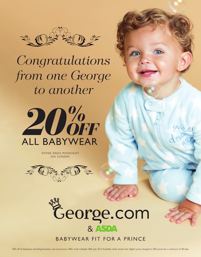
Publicis Blueprint: George royal baby ad
Brand: GeorgeTitle(s): George Royal Baby adHeadline and copy text (in English): Congratulations from one George to another. 20% off all babywear offer ends midnight on Sunday. Agency: Publicis Blueprint, London, UKAgency Website: http://www.publicis-blueprint.co.ukCreative Director: Adam Nowell Art Director: Melisa LeeCopywriter: Carole HamiltonPhotographer: Ken NivenPublished: July 2013Short Rationale (optional): George were obviously in a unique position once the name of the baby was announced and we felt it was essential to include a play on words connecting the Prince's name to the brand. The blue eyed baby boy with gorgeous curls is just how we imagine Prince George could well look in a few months and it has lots of essential ahh factor. We wanted to keep the look of the ad very simple and the key messages 'congratulations from one George to another' and 'babywear fit for a prince' pretty much says it all. On this occasion ‘less is more’ was very effective. The style of the ad was quite a departure for the George brand but they felt such a unique occasion warranted a different approach.
Island Records/Universal Music Group: Mumford and Sons 'Hopeless Wanderer' music video
Brand: Island Records/Universal Music Group, Mumford & SonsTitle(s): Hopeless Wanderer music videoAdditional Credits: Director: Sam JonesDirector of Photography: Eric SchmidtEditor: Chetin ChabukProduction Company: Black Dog Films Executive Producer: Coleen HaynesProducer: Christian NurseMusic Video Commissioner: Mike MooneyPublished: August 2013Short Rationale (optional): Mumford & Sons step aside for a little self-mockery in their most recent video release “Hopeless Wanderer” from director Sam Jones. The clip opens with strategically misleading shots of what we presume to be the quartet performing in a pastoral field, before the camera slowly reveals comedians Jason Sudekis, Ed Helms, Will Forte and Jason Bateman standing in for the English folk-rockers. A slapstick impersonation unfolds satirizing everything from Mumford & Sons’ signature Dust Bowl aesthetic to their passionate, multi-instrumental playing style. The Black Dog director pulls no punches with comedy’s finest whose over-the-top antics include a rowboat serenade, a four-way cry-fest, bearded make-outs, and a rollicking banjo solo. The light-hearted video proves that however old-fashioned the Englishmen may be in style, Mumford & Sons is game for a taste of modern American comedy.
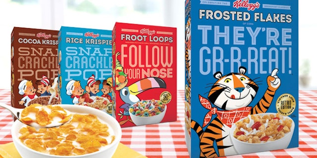
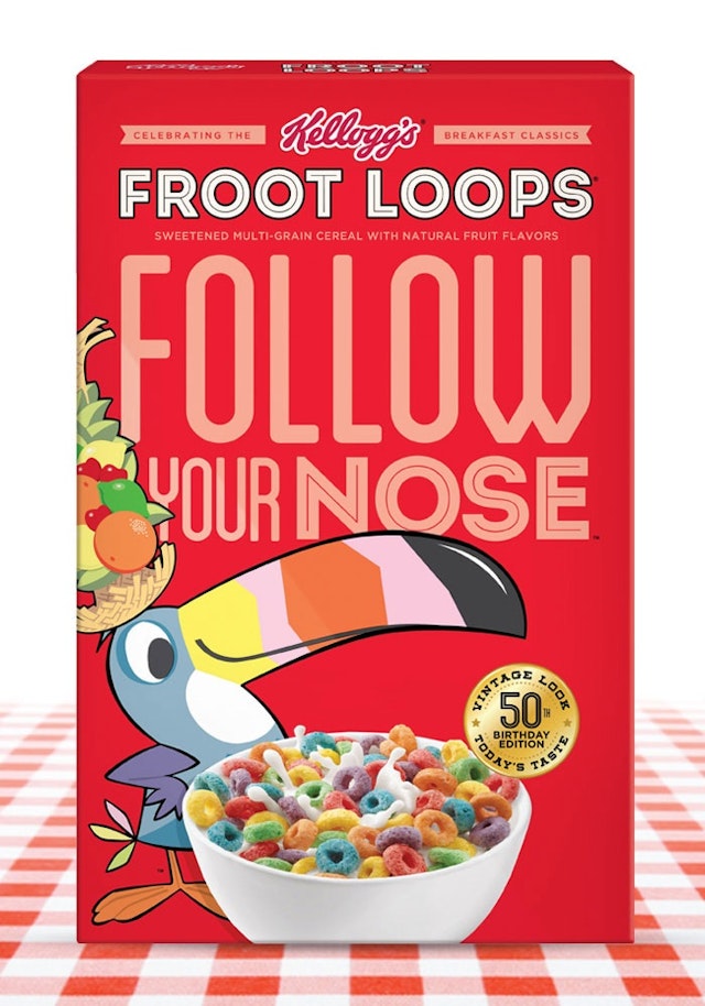
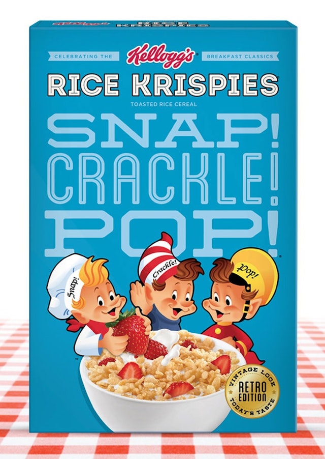
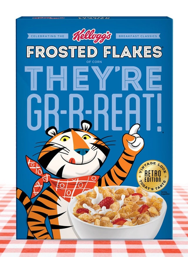
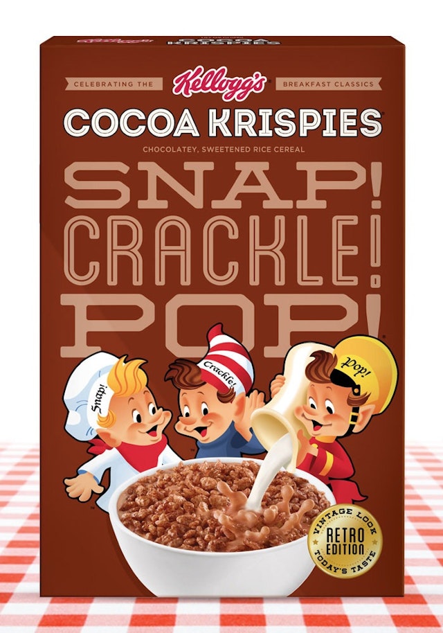
Anthem NY: Kellogg's retro packaging design for Target
Brand: Kellogg’s Title(s): Retro packaging design for TargetAgency: Anthem, New York, USA/Battlecreek, USAAgency Website: http://www.anthemww.comCreative Directors: Mark Meszaros and Gerard RizzoDesigner: Emily DolsonAdditional Credits: Account Management: Rachel Johnson, Ned JoyceShort Rationale (optional): Anthem created Kellogg Retro-inspired Packaging for Frosted Flakes, Fruit Loops and Rice Krispies. This is in stores now, exclusive to Target, and is the first time in Kellogg’s history that they have offered Retro-inspired packaging. The launch is part of a program to celebrate Froot Loops 50th anniversary. Anthem developed packaging design that allowed each brand to stay true to its core equity, while tapping into the feeling of nostalgia consumers felt for simpler times. The packaging balances the style of the characters, typography and catch phrases to create something not only memorable but eye-catching for consumers both young and old.
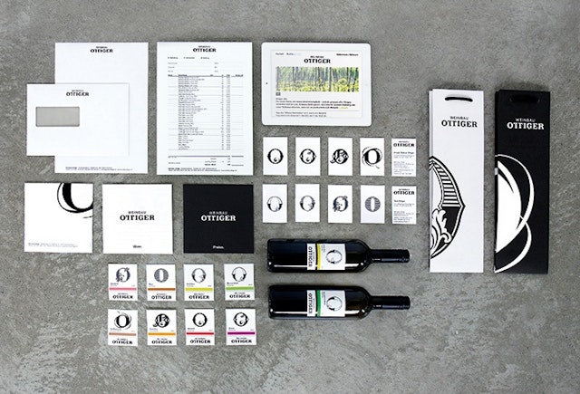
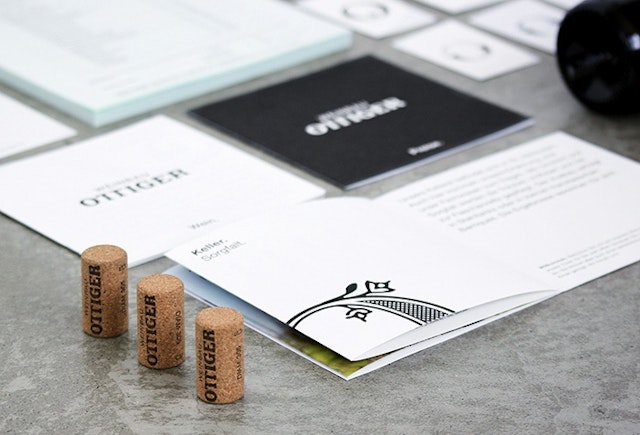
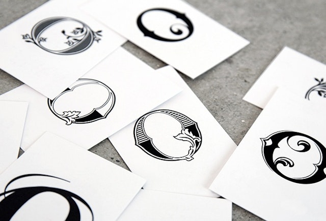
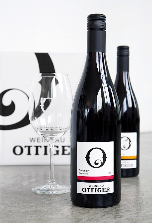
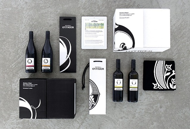
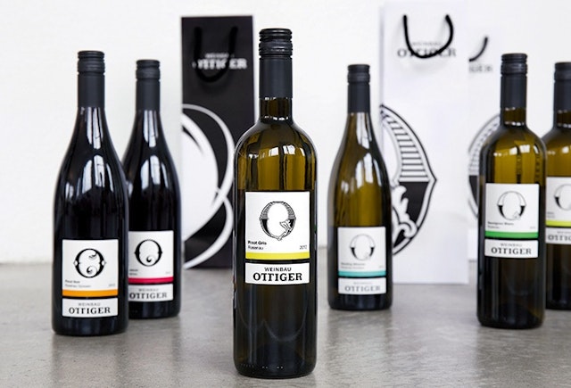
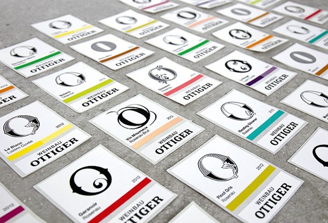
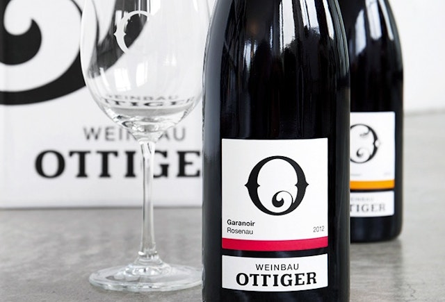
Rosenstar GmbH: Weinbau Ottiger brand and packaging design
Brand: Weinbau OttigerTitle(s): Brand and packaging design Agency: Rosenstar GmbH, Luzern, Switzerland Agency website: http://www.rosenstar.chCreative Director: Jana YaacoubArt Director: Robine AffentrangerCopywriter: Matthias Troller, Trollhouser Illustrator: Robine AffentrangerPhotographer: Simon BolzernAdditional Credits: Brand Management: Selina Krummenacher Published: May 2013Short Rationale (optional): Weinbau Ottiger is one of central Switzerland’s major vineyards. Winemaker Toni Ottiger and his team combine a traditional approach with an innovative and open-minded attitude. The previous visual identity did not match the company’s character. A new name and brand design help to reposition the brand in the market and express what Weinbau Ottiger stands for: unique high-quality wines made with great passion. In a close collaboration with the company, Rosenstar developed the values on which the whole visual concept is based. Weinbau Ottiger’s new brand design is modern, simple, elegant and confident. Just like the vineyard. Based on this branding concept, a range of communication media was created. As a unique logo, the Ottiger ‘O’ lies at the heart of the visual identity, appearing on labels, packaging, vehicle markings and signage. Thanks to the sharp, incisive design, Ottiger Weinbau’s bottles now stand out on every wine shelf.
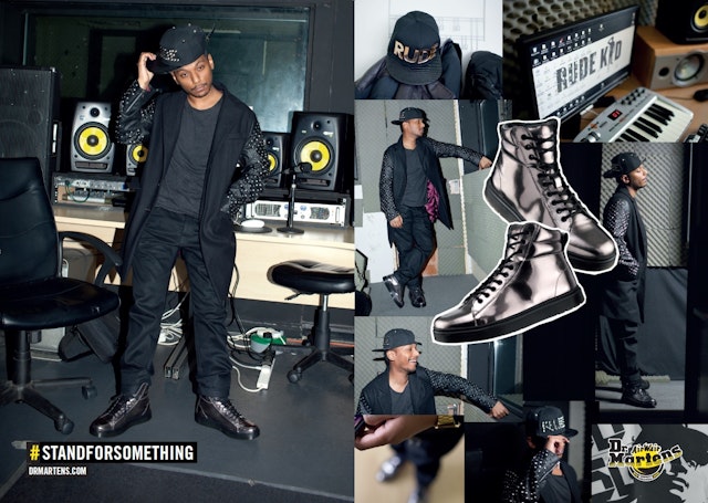
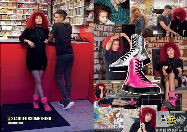
ODD: Dr. Martens #STANDFORSOMETHING global campaign
Brand: Dr. MartensTitle(s): Global ad campaign #STANDFORSOMETHINGBrand: Dr. Martens Title(s): Global ad campaign #STANDFORSOMETHING Agency: ODD, London, UK Agency Website: http://www.oddlondon.com Photographer: James Pearson-Howes Additional Credits: Film Directors: James Pearson-Howes & Reeve RixonEditing and Post Production: Zac Ella, Agile Films & James Taylor, Alpha CenturyMedia Agency: Goodstuff Published: July 2013
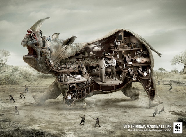
Ogilvy & Mather: WWF poster
Brand: WWFTitle(s): Poster designHeadline and copy text (in English): Stop criminals making a killing. Help kill the trade that kills at Facebook.com/WWFAgency: Ogilvy & Mather, London, UKAgency Website: http://www.ogilvy.comExecutive Creative Director: Gerry HumanArt Director: Denis KakazuCopywriter: Giles MontgomeryIllustrator: SalmagicaAdditional Credits: Planner: Tara AustinAccount Managers: Michael Alexander, Victoria RadfordArt Buyers: Coral StaffordTraffic Manager: Peter NuttalPublished: July 2013
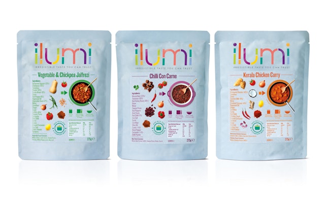
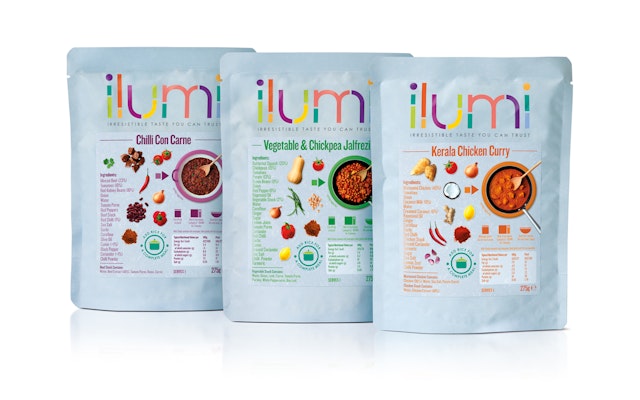
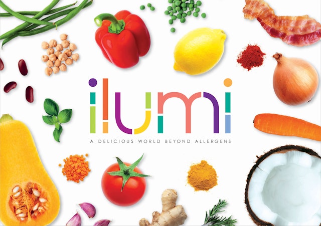
Pearlfisher: ilumi packaging design and brand identity
Brand: ilumiTitle(s): ilumi packaging design and brand identityAgency: Pearlfisher, London, UK Agency Website: http://www.pearlfisher.comCreative Director: Sarah CattleAdditional Credits: Founding Partner & Chief Creative Officer: Jonathan FordDesign Director: Poppy SteadmanSenior Strategist: Georgia LevisonSenior Account Manager: Joanna PeircePublished: August 2013
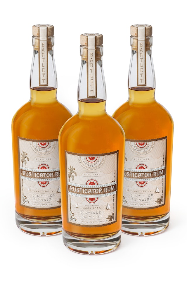
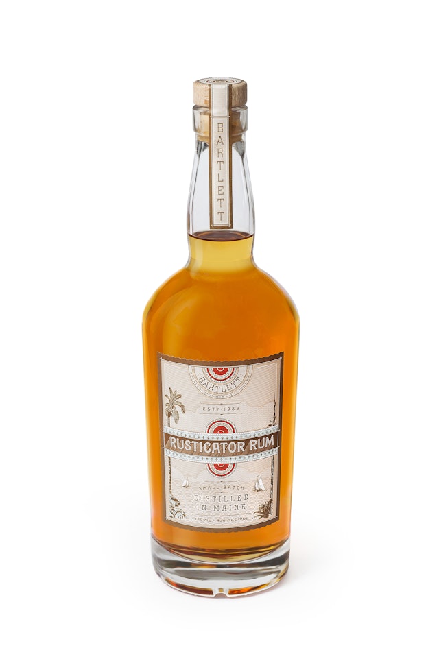
Louise Fili Ltd: Rusticator Rum bottle design
Brand: Bartlett Maine Estate WineryTitle(s): Rusticator Rum Agency: Louise Fili Ltd, New York, USAAgency Website: http://louisefili.comCreative Director: Louise FiliCopywriter: Bob and Kathe BartlettAdditional Credits: Desingers: Louise Fili, Spencer CharlesPublished: June 2013Short Rationale (optional): After years of creating award-winning wines, Bartlett Maine Estate Winery launched Rusticator Rum, using organic molasses sourced from South America. The name references late nineteenth-century city dwellers who who escaped to Maine in search of cooler climes.
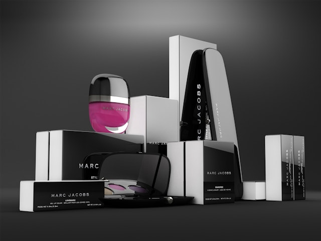
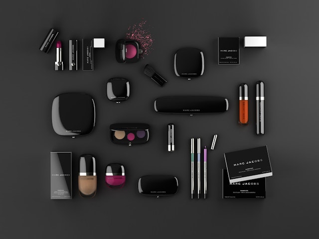
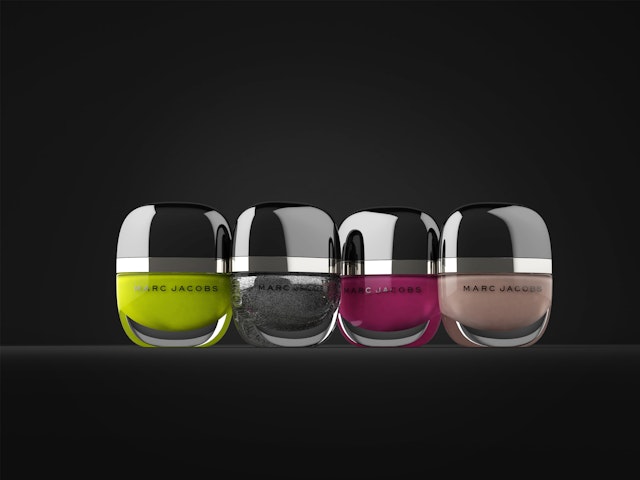
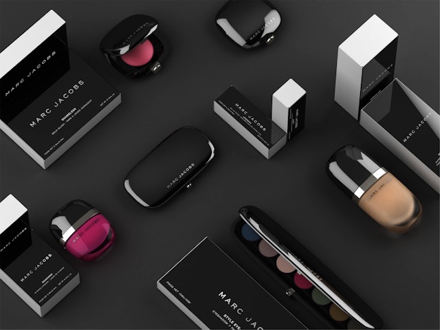
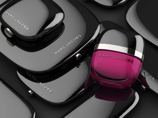
Established: Marc Jacobs Beauty packaging and identity design
Brand: Marc Jacobs BeautyTitle(s): Packaging and identity design Agency: Established, New York, USAAgency Website: http://establishednyc.com Executive Creative Director: Sam O’DonahueCreative Director: Pierre Jeand’heurArt Director: Felix DeVossPublished: July 2013Short Rationale (optional): Marc Jacobs and Sephora asked Established to create a line of shiny, beautiful products that every woman would want to hold in her hand and not put down. Something that was "just lovely." The result is a line of beautiful, fluid shapes in a high shine inky black lacquer finish. The sensual, complex curves of the products and unexpected proportions result in a collection that is both simple and timeless yet thoroughly modern. Every detail was meticulously considered from the ultra-thin frame-around mirrors to the layout of the makeup or an oversized button.
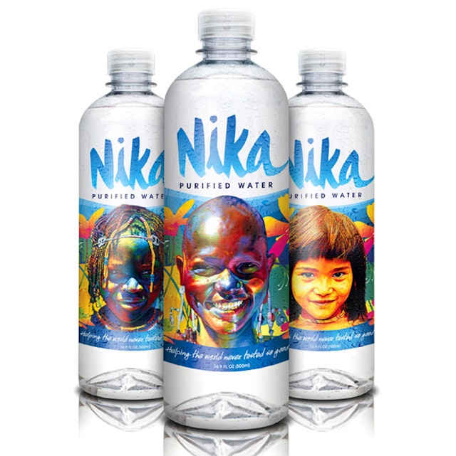
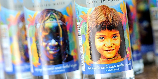
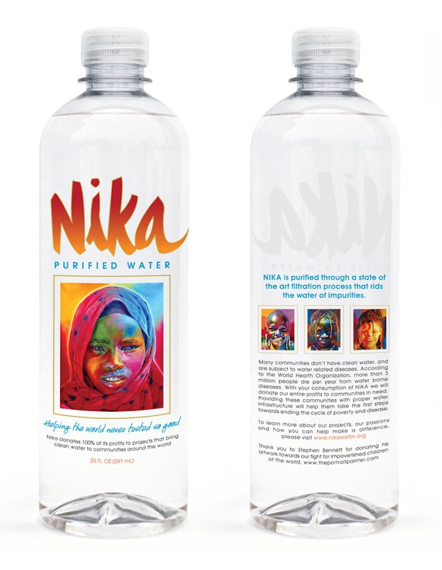
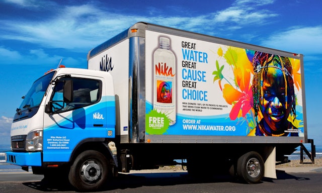
Nika Water Company: Nika Water branding
Brand: Nika WaterHeadline and copy text (in English): "Helping the World never tasted so good." Nika Water donates 100% of our profits to clean water, education and sanitation projects in developing countries to help end poverty. Agency: Nika Water Company, LLC. La Jolla, CA, USA Agency website: www.nikawater.org Creative Director: Jeffrey ChurchShort rationale (optional): Nika Water is social cause-driven, eco-responsible, premium bottled water, currently sold in thousands of nationwide retailers. Products like Nika’s are not only able to raise money for a cause through sales, but also simultaneously spread awareness to consumers in the process.
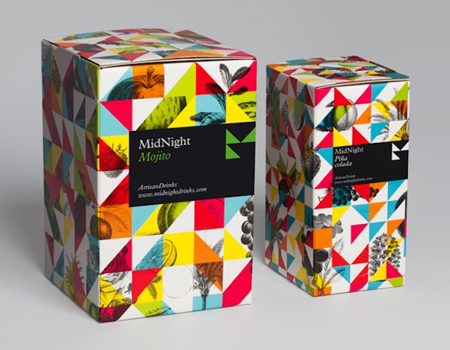
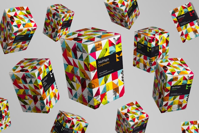
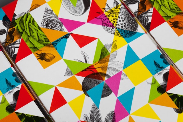
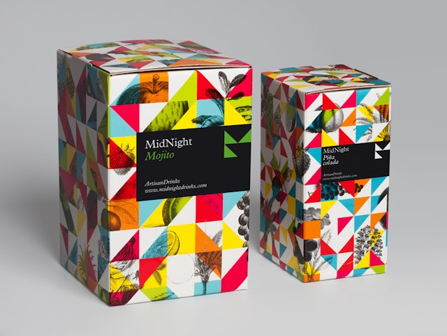
Mucho: MidNight Cocktails packaging
Brand: MidNight Cocktails Headline and copy text (in English): A new way of cocktail consumptionAgency: Mucho, Barcelona, Spain Agency website: http://wearemucho.comCreative Director: Pablo JuncadellaPhotographer: Roc CanalsAdditional credits: Design: Nuria RiveraPublished: August 2013Short rationale (optional): We were invited to generate a new brand identity that could retain the tradition and elegance of cocktail making, whilst reflecting this revolutionary new method. Based on the geometric reinterpretation of the 'M' and the 'N' in Mid Night we created a system of triangles that when mixed with classic engravings of fruits generate a kaleidoscopic visual language. It really captures this new and fun way of creating cocktails.
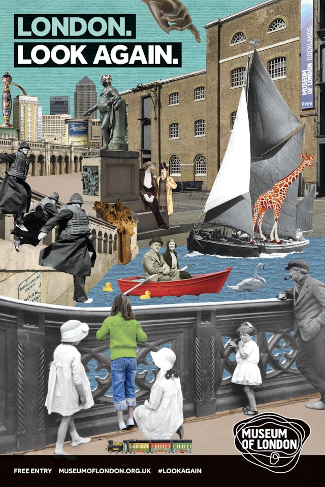
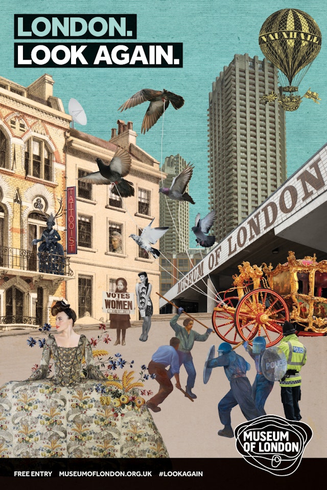
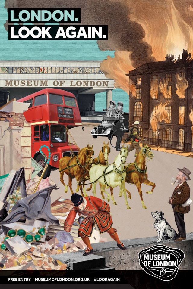
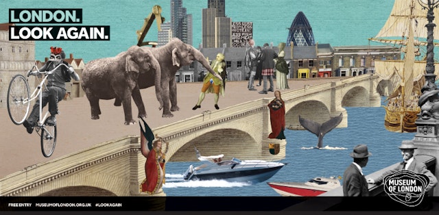
Together Design: Museum of London advertising campaign
Brand: Museum of LondonTitle(s): Advertising campaignHeadline and copy text (in English): London. Look again.Agency: Together Design, LondonAgency website: http://www.togetherdesign.co.ukCreative Director: Katja ThielenCreative Team: Nicola Robson, Keith Hancox, David ClaytonIllustrator: Nicola RobsonAccount Director: Marina KoemtzopoulouImages: courtesy of Museum of London ArchivePublished: August 2013Short rationale (optional): Launching in mid-August this is the first generic brand awareness campaign for the museum since 2010. The integrated campaign, which also includes PR and social media tactics, supports a new strategic direction for the brand with targets to more than double visitor numbers over the next five years, and attract more Londoners to both of its two venues – the Museum of London and Museum of London Docklands. The campaign will run across outdoor, tube and print media including The Guardian and Time Out. The creative makes use of a stylish pop montage approach to combine museum artefacts from different eras with London backdrops. The aim is to intrigue audiences with the layered imagery while positioning the museum as contemporary, culturally sophisticated, and in tune with the spirit of London.
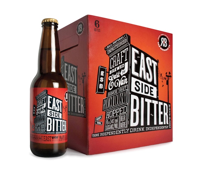
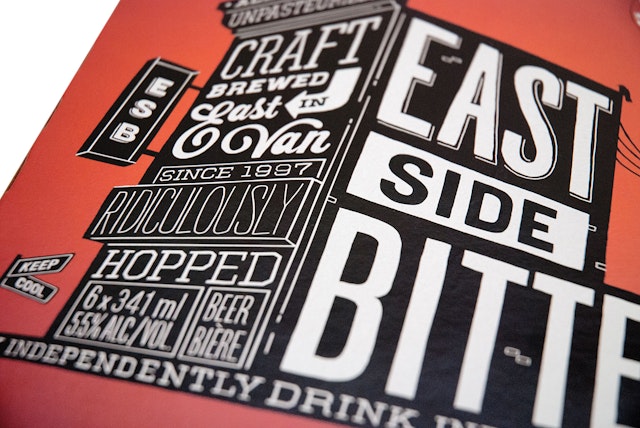
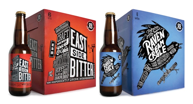
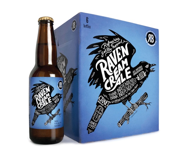
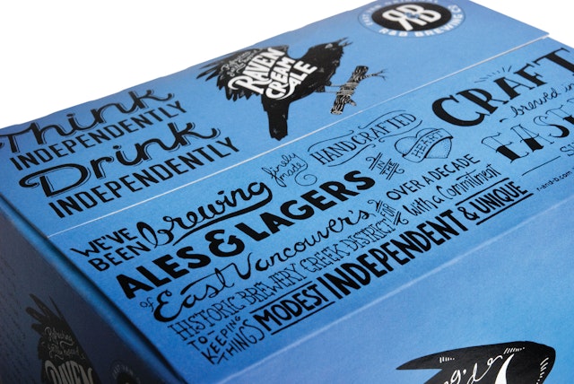
Saint Bernadine Mission Communications Inc: R&B Brewing Packaging design
Brand: R&B BrewingTitle(s): East Side Bitter and Raven Cream Ale bottles and 6 pk cartonsAgency: Saint Bernadine Mission Communications Inc, Vancouver, CanadaAgency website: http://www.stbernadine.com Creative Director: David Walker, Andrew SamuelArt Director: Helen Eady, Rory O’SullivanIllustrator: Helen Eady, Rory O’SullivanAdditional credits: Production Artist: Lisa Blackburn, Printing: Sterling Packaging (cartons), Westkey Graphics (labels)Published: May 2013Short rationale (optional): R&B Brewing is one of Vancouver's original East Van micro breweries, predating the current trend by almost two decades. Partners Rick ("R") and Barry ("B") asked St. Bernadine to help with a packaging redesign, initiated by the move from 650mL bottles to a standard 341mL 6-pack format. The design language is inspired by R&B's resolutely hand crafted product – as such, every element on the packaging is rendered by hand, including the bar code. Bold silhouette key illustrations take their cues from the beers' quirky naming conventions, and strong colours aid standout and shelf blocking. Key brand story elements, hand rendered in expressive type, and additional varietal information, like IBU scale, boil information, aging temperature, hop and barley type and mix all support R&B's independent, craft positioning.
Tribal DDB: Wall's 'Scoops of Happiness' online ad campaign
Brand: Wall’sTitle(s): Scoops of Happiness online ad campaignAgency: Tribal DDB, SingaporeAgency Website: http://www.ddb.comAdditional Credits: Directors: Alan Dickson (Yukfoo Animation), Sigi Spath (Waitemata Films)Production: Yukfoo Animation, Waitemata Films
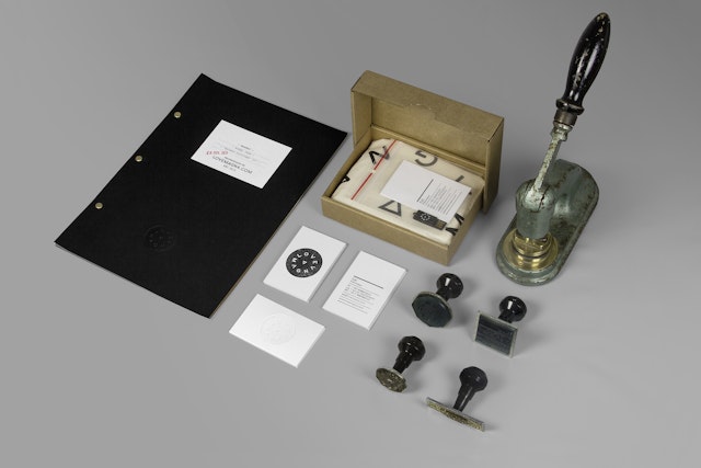
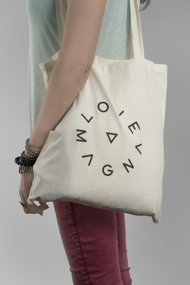
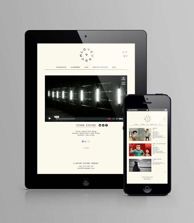
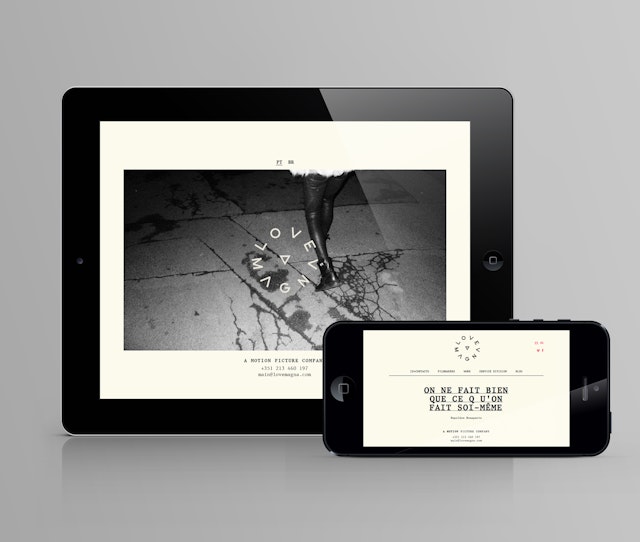
MusaWorkLab: LoveMagna brand and website design
Brand: LoveMagnaTitle(s): Brand and website designAgency: MusaWorkLab, Lisbon, PortugalAgency website: http://www.musaworklab.comCreative Director: Raquel Viana, Paulo Lima, Ricardo AlexandreArt Director: Raquel Viana, Paulo Lima, Ricardo AlexandreCopywriter: LoveMagnaPhotographer: MusaWorkLab and LoveMagnaPublished: February 2013Short Rationale (optional): LoveMagna is a Lisbon based boutique production company, specializing in custom made creative & production solutions.
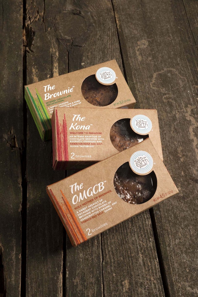
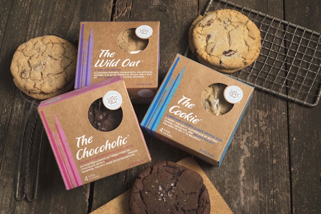
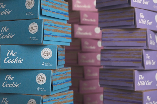
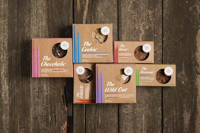
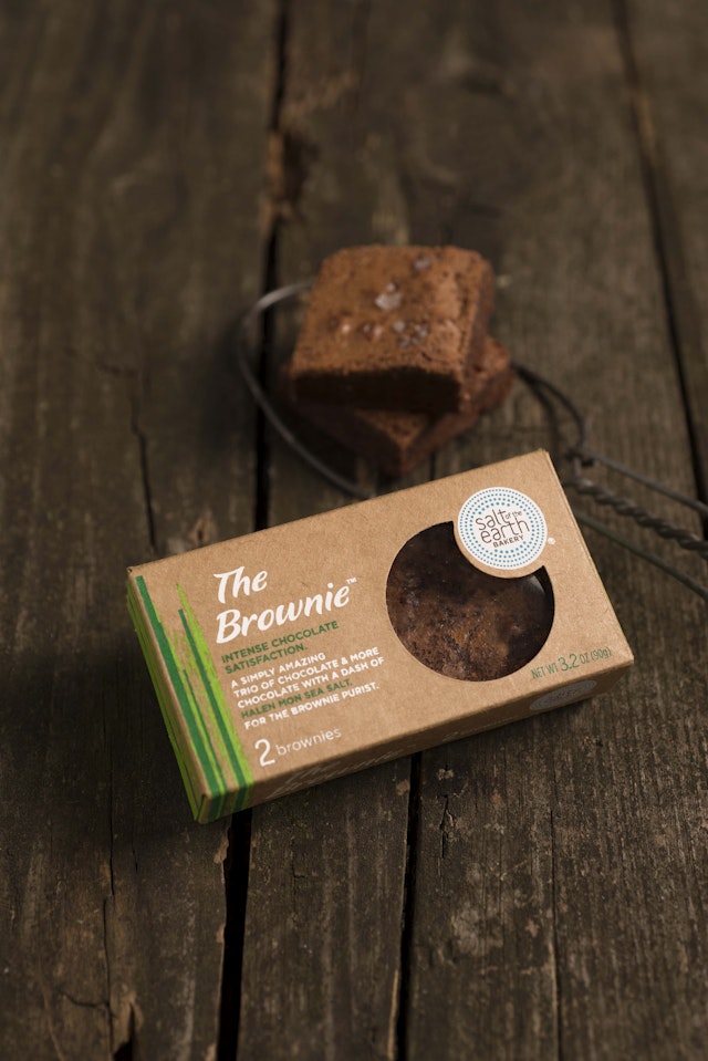
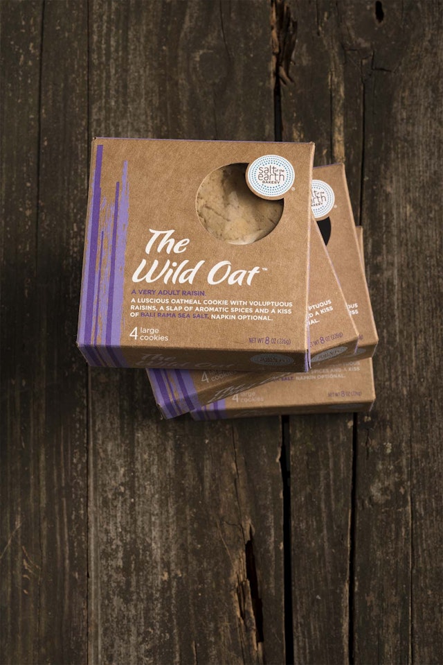
Little Big Brands: Salt of the Earth Bakery brand and packaging redesign
Brand: Salt of the Earth BakeryTitle(s): Brand and packaging redesignHeadline and copy text: Salt of the Earth Bakery has relaunched their artisan baked goods in fresh new structure and design worthy of these supremely delicious treats. The Bakery turned to branding partner Little Big Brands to lead the effort.Agency: Little Big Brands, White Plains NY, United StatesAgency website: www.littlebigbrands.comCreative Director: John NunziatoCopywriter: Pamela LongDesigner: Kelly WeeksPhotographer: Dave LazarusPublished: May 2013Short Rationale (optional): Salt of the Earth Bakery creations are unique in that each product is paired with the finest sea salts from around the world. Equally unique now is their packaging structure. Both cookies and brownies are housed in a custom craft box that hinges similar to a jewel box. It also features a large diecut window on top where the product is visible. The brand identity was cleaned up, given a more organic font, and depth and dimension added to the mark. Vibrant colors contrast the craft paper and are painted on the top and sides, with solid color peeking out from the bottom panels of the box. Typography was chosen to reflect the handcrafted nature of the product.Each product features a unique name and description on front of pack that speaks to the playful nature of the brand. Take for instance, The Wild Oat: A Very Adult Oatmeal Raisin. A Luscious oatmeal cookie with voluptuous raisins, a slap of aromatic spices and a kiss of Bali Rama sea salt. Napkin optional. Or perhaps you’d prefer, The OMGCB: Holy Mother of Brownie. A sweet assault of decadent chocolate brownie with rivers of handcrafted caramel and French sea salt. Damn!“We’re thrilled to have packaging that now truly reflects the heart and soul of our brand and all the love that goes into each cookie and brownie we bake,” said Alexandra Joseph Rabbani, Executive Chef, Salt of the Earth Bakery.
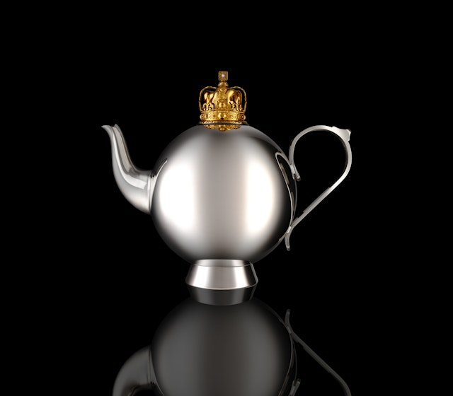
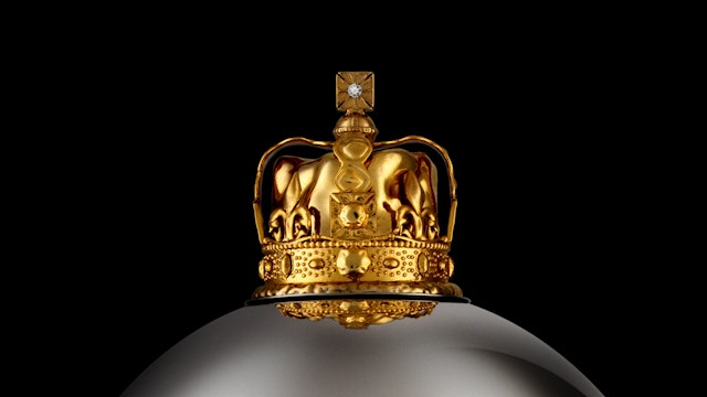
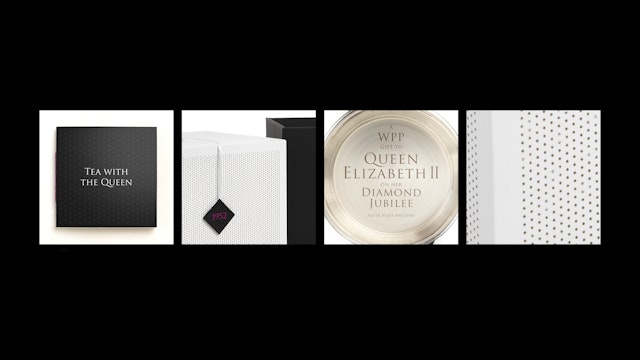
The Partners: WPP 60th anniversary of the Queen’s coronation project
Brand: WPP 60th anniversary of the Queen’s coronation projectTitle(s): The Queen’s TeapotAgency: The Partners, London, UKAgency Website: http://www.the-partners.comCreative Director: Greg QuintonAdditional Credits: Designer: Nick Munro Published: July 2013
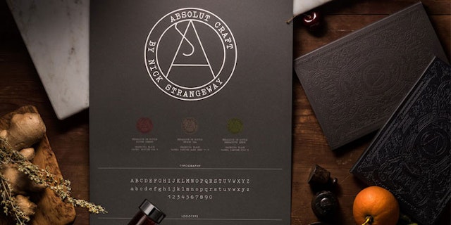
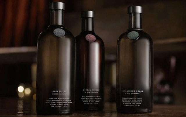
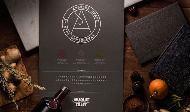
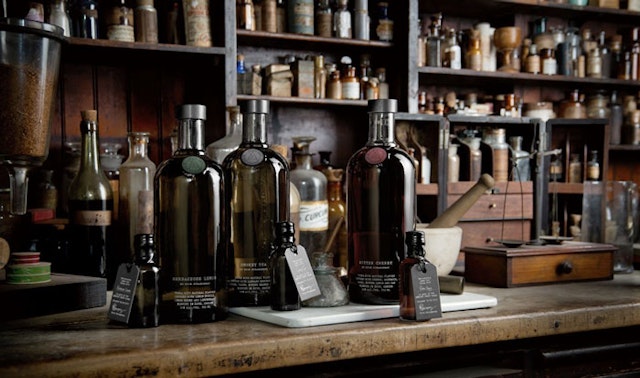
The Brand Union Stockholm: ABSOLUT Craft – Bartender’s Collection
Brand: The ABSOLUT CompanyTitle(s): ABSOLUT Craft – Bartender’s Collection Agency: The Brand Union (TBU), Stockholm, Sweden/No Picnic, Stockholm, SwedenAgency Website: http://www.thebrandunion.se http://nopicnic.com Creative Director: Henrik Billqvist (TBU)/Thoman Schaad (No Picnic)Additional Credits: Executive Director/Client Director: Jonas Anderson (TBU)/Alfred Alfred (No Picnic)Artwork: ProducktiondesignClient Manager: Britt-Maire Möller (TBU)Client Director: Felicia Leksell (TBU)/Jonas Westius (No Picnic)Client: Anna KamjouGlobal Director Design Strategy: Caroline MörnåsGlobal Manager Design Strategy: Magnus BidstamGlobal Director Trade Marketing: Miranda DicksonVisualiser/Producktiondesigner: Stefan Wennerström (No Picnic) Industrial Designer: Urban Ahlgren (No Picnic)Published: 2013Short Rationale (optional): Brief -Strengthen the credibility of ABSOLUT within the global bartender community and provide inspiration for cocktail creation among professional bartenders. Challenge - Create a design that reflects the focus and craftsmanship of mixologist Nick Strangeway and ABSOLUT. Solution - Focused on the iconic silhouette. The bottle reflects the brand’s heritage by featuring the alchemic symbol for distillation. The color coating is inspired by17th century apothecary jars.It also protects the natural raw ingredients. The design clearly differentiates this range as something new and distinct from ABSOLUT.
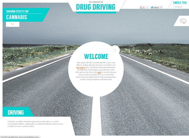
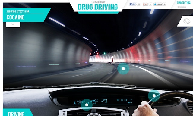
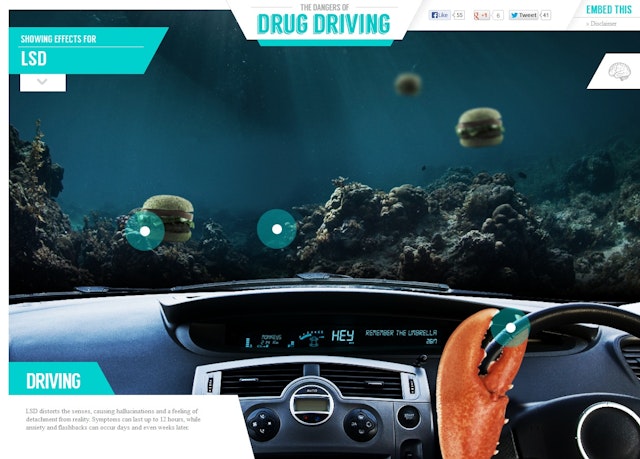
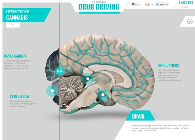
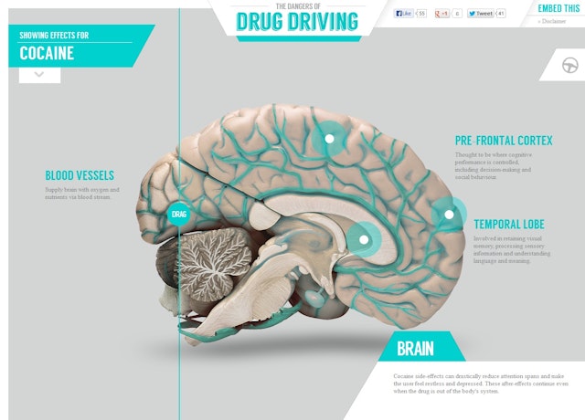
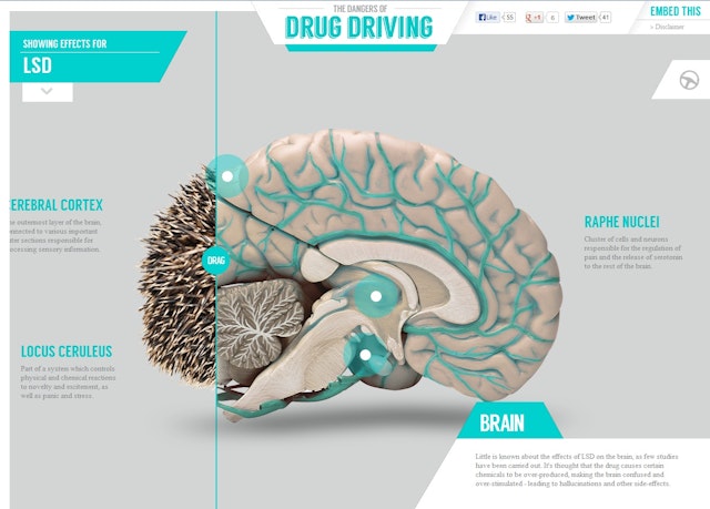
Epiphany: Evans Halshaw 'The Dangers of Drug Driving' website
Brand: Evans HalshawTitle(s): The Dangers of Drug DrivingAgency: Epiphany, Leeds, UKAgency Website: http://www.epiphanysearch.co.ukCopywriter: Siobhan GibsonIllustrator: Dave EllisAdditional Credits: Dave SellersPublished: July 2013Short Rationale (optional): A new test known as the Drugalyser is due to be introduced into police traffic proceedings in the coming year, to help police detect and tackle drug-driving offences at the roadside. With this in mind, Evans Halshaw provides this guide to how different drugs can affect your driving ability - and why you shouldn't get behind the wheel if you're under the influence.
Iris worldwide: adidas 'The New Speed of Light' online film
Brand: adidasTitle(s): The New Speed of Light online filmAgency: Iris worldwide, London, UKAgency Website: http://www.iris-worldwide.comCreative: Adam FishAdditional Credits: Director: Marcus LyallManaging Partner: Henry ScotlandAdidas Global Brand Director: Thomas Van SchaikAccount Director: Simon YoxallProduction Company: ML StudioPost Producer: Mark LogueProducer: Phil TidyAgency Producer: Sophie HornerPublished: August 2013Short Rationale (optional): To launch the new adizero F50 Messi boot, adidas and iris have createdfilm entitled 'The New Speed of Light' - showing the world’s greatest footballer, Leo Messi, as he's never been seen before - in a bespoke LED suit and a stunning concert visual style effects technique.We wanted to produce a film that captured and analyzed Leo’s movement, to reveal the secret of his genius on the pitch as well as highlight the “light in motion” design of his new boot. To do this, iris put Leo in a custom-made suit and hood, with hundreds of individual LED’s sewn by hand in to adidas TechFit gear. In addition, we gave him a bespoke LED football and lit up the stripes on his boots. He was then filmed at 1,000 frames per second using a Phantom camera. The footage was then treated using a specially developed technique, creating a beautiful film that captures the footballing genius of Leo as he’s never been seen before; exploring the moves that make him the best in the world in intricate detail.
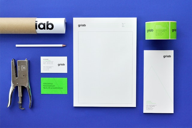
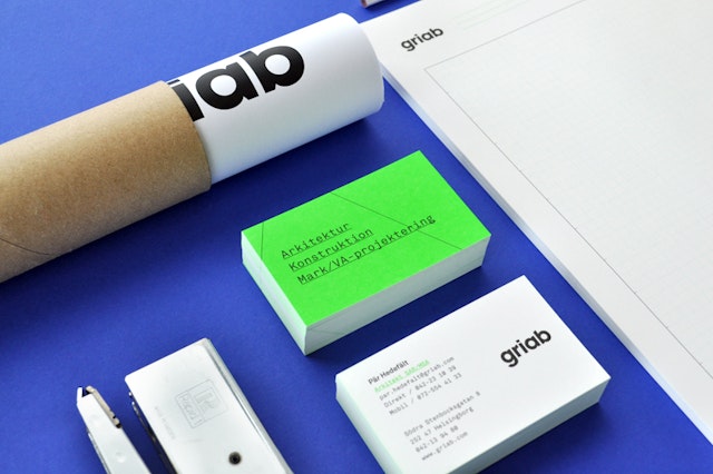
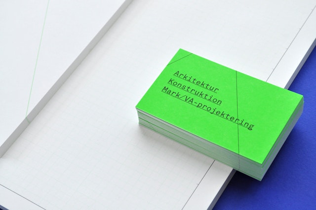
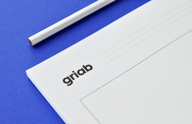
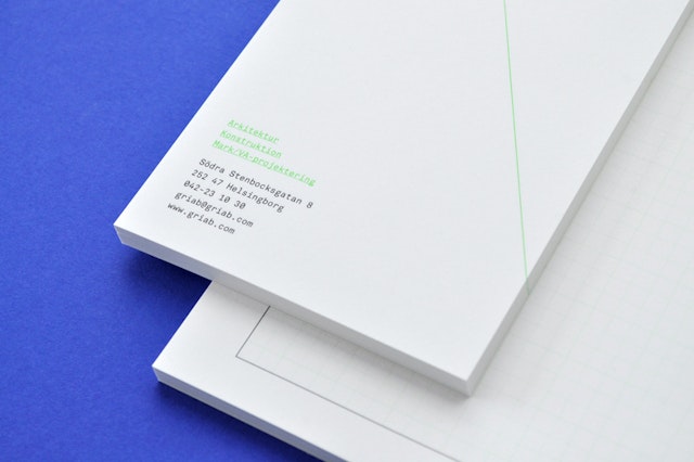
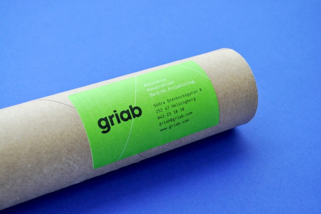
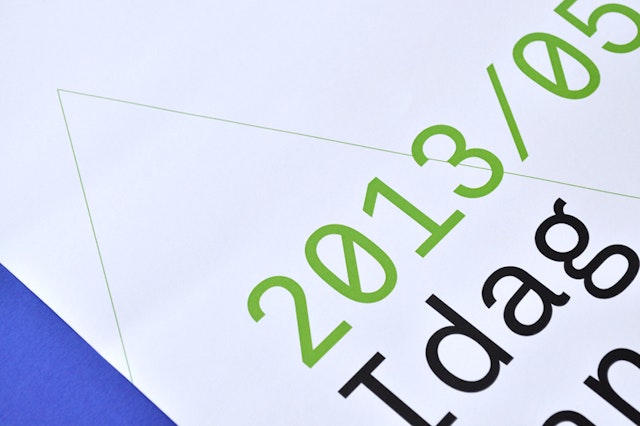
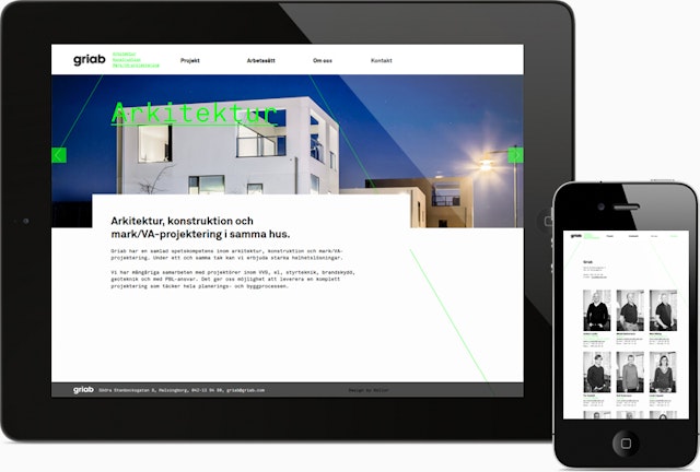
Kollor Design Agency: Griab branding, visual identity and web design
Brand: GriabTitle(s): Branding, visual identity, web designAgency: Kollor Design Agency, Helsingborg, SwedenAgency website: http://www.kollor.comCreative Director: Erik TencerArt Directors: Erik Tencer and Håkan PerssonWeb Designer: Håkan PerssonGraphic Designer: Eduardo MateosCopywriter: Ragnar FalckPhotographer: Calle-Mange Johansson and Eduardo MateosPublished: May 2013Short rationale (optional):Griab is a Swedish engineering firm, founded in 1957 and located in Helsingborg, Sweden, that specialises in delivering a holistic design and build service that includes land planning, wastewater management, architecture and construction.Developed by multidisciplinary design agency Kollor, Griab’s visual identity, “inspired by the the straight lines and shapes commonly seen in architecture” and created to help reinforce the firm’s environmental profile, includes a new logotype, stationery and website based around a sans-serif logotype, monospace typeface, grids, guides and a fluorescent green print treatment.
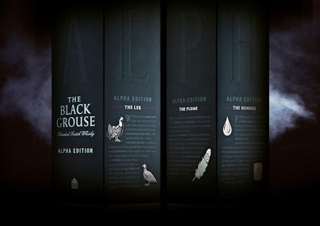
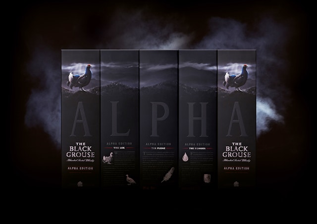
Taxi Studio: The Black Grouse, Alpha Edition packaging
Brand: The Black Grouse, Alpha Edition Title(s): Alpha EditionAgency: Taxi Studio, Bristol, UK Agency Website: http://www.taxistudio.co.ukCreative Director: Spencer Buck Design Director: Jonathan Turner-RogersCopywriter: Lindsay CampIllustrator: Graham Evernden, Sam HadleyAdditional Credits: Senior Designer: Pete HawkinsPublished: August 2013Short Rationale (optional): Situation: The Alpha Edition is a premium expression of the legendary Black Grouse. However, the existing design didn’t communicate the product’s richer, smokier flavour. And the way the bird was visually portrayed on pack (aside from failing to promote the product’s alpha status) was inconsistent with the rest of the portfolio. Solution: Once upon a year… black grouse gather to establish who’s the biggest show-off in a ritual known as the ‘Lek’. We dramatised this event on pack by placing large embossed letters on each side of the carton. Each letter starts a story that neatly relates to both the ritual and the whisky. And (this is the bit where we show-off), when placed side by side, the Black Grouse Alpha Edition asserts its position in the category’s pecking order.
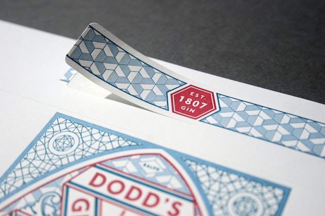
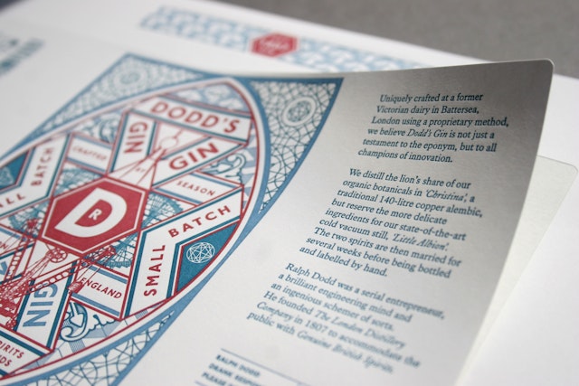
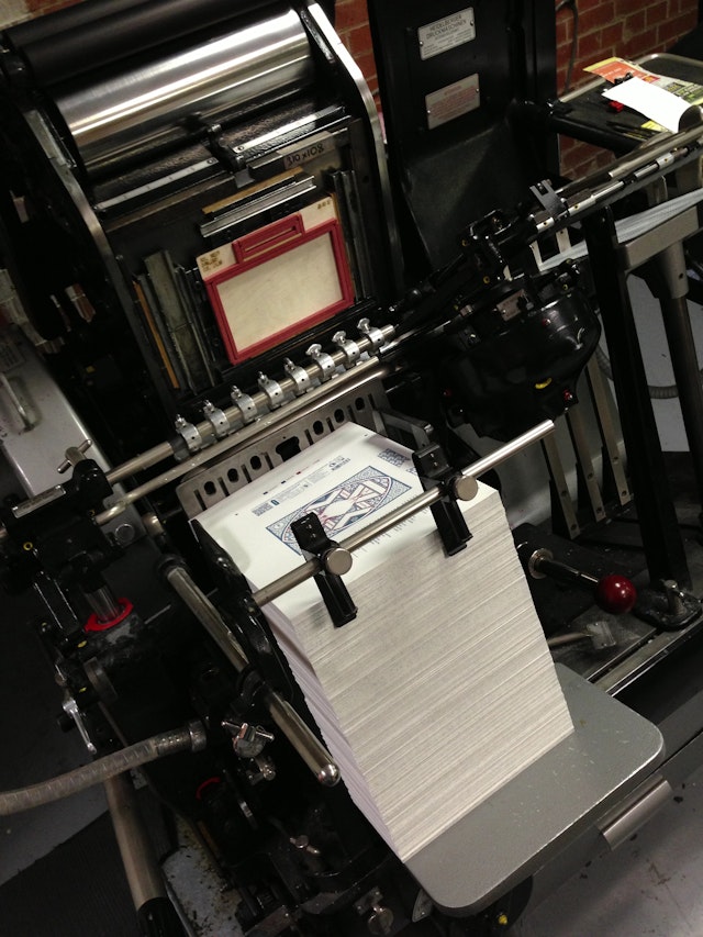
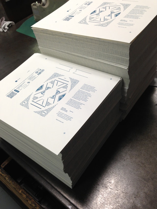
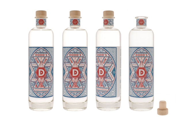
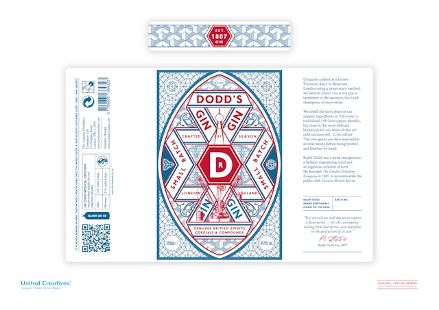
United Creatives: Dodd’s Gin design and branding
Brand: Dodd’s GinAgency: United Creatives, Manchester, UKAgency Website: http://www.unitedcreatives.comCreative Director: Chris Edmunds Art Director: Chris EdmundsCopywriter: Darren Rook of The London DistilleryIllustrator: Chris EdmundsAdditional Credits: Letterpress printing by Blush Publishing Published: June 2013
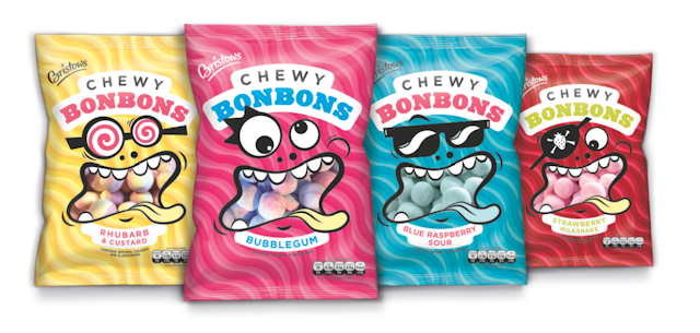
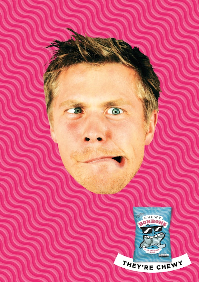
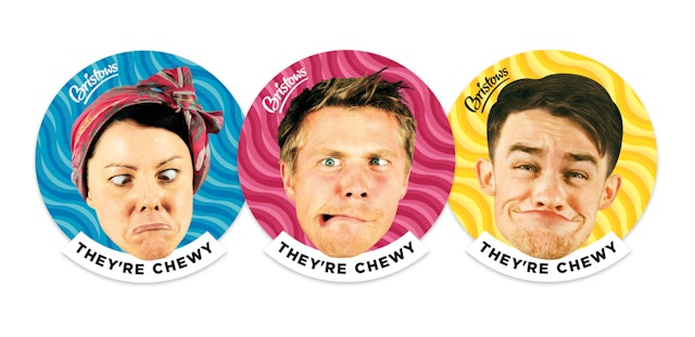
Aesop: Bristows Chewy Bonbons pack design
Brand: BristowsTitle(s): Bristows Chewy BonbonsHeadline and copy text (in English): They're ChewyAgency: Aesop, London, UKAgency website: http://aesopagency.comCreative Director: Martin GrimerArt Director: Gabriel SotoCopywriter: Mark TweddlePhotographer: Holliday KedikPublished: August 2013Short rationale (optional): We had great fun with this project which is part of an ongoing integrated campaign for Bristows. The Chewy Bonbons are aimed at a younger audience so the design needed to be colourful, fun and engaging. It was also vital that both the design and the campaign communicate the chewy experience and flavour hit.
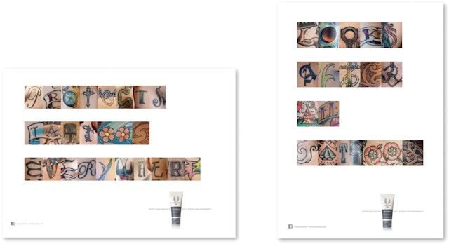
Anthem UK: Forever Ink 'Tattoo Guardian' campaign
Brand: Forever InkTitle(s): Tattoo GuardianHeadline and copy text (in English): Anthem takes revolutionary brand Forever Ink from niche to massAgency: Anthem, London, UKAgency website: http://www.anthemww.com/Creative Director: Mark RingerArt Director: Andrew CharlesCopywriter: Mark RingerTypographer: Andrew CharlesPhotographer: Mike WhelanPublished: August 2013Short rationale (optional): Anthem launched Forever Ink’s new packaging in late 2012. Since then, Anthem has moved the brand from niche to mass by creating an integrated campaign in print, web, cinema, TV, point of sale, social media and the design of an app that offers users bespoke advice on how to care for their tattoo. Underpinned by the wider theme of Forever Ink being the guardian of tattoos and tattoo culture, associations with this culture have been driven home through tattoo language in the creative to communicate with the audience. Mark Ringer, Executive Creative Director of Anthem, says: “Our campaign aims to take Forever Ink from a niche brand to a broader audience of people with tattoos on their minds or bodies. The creative positions Forever Ink as the guardian of tattoos and tattoo culture by speaking in the language of tattoos. ”
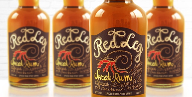
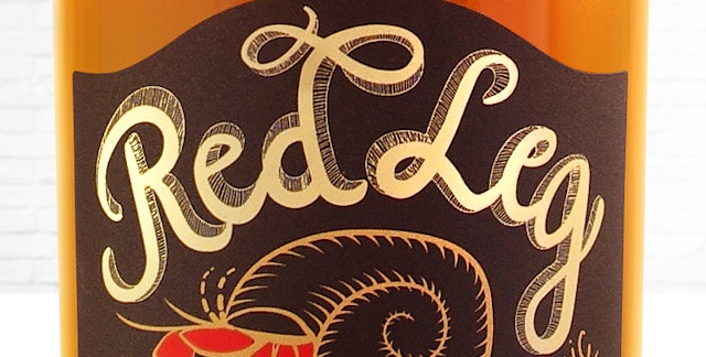
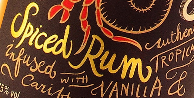
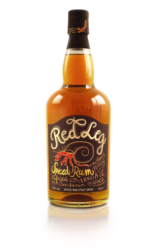
ButterflyCannon: RedLeg Rum packaging design
Brand: RedLeg RumTitle(s): Packaging designAgency: ButterflyCannon, London, UKAgency Website: http://butterflycannon.comCreative Director: Jon DaviesAdditional Credits: Designer: Pati ZywertPublished: August 2013Short Rationale (optional): Premium brand design agency ButterflyCannon have created the brand identity and pack design for RedLeg, an authentic Caribbean spiced rum infused with Jamaican vanilla, ginger and spices. RedLeg’s design captures the brand’s laid back Caribbean spirit; casual, chilled and totally Irie. An attitude shared by the brand’s friendly little symbol - the red legged hermit crab - a native of the glorious Caribbean coral reef whose scarlet legs protrude from its tiny shell and appear to have caught a little too much sun. A likeness that didn’t go unnoticed when the pale, rum loving, immigrants arrived from Scotland in the 17th Century and suffered from the same sun burn issues, their descendants still known today as the Red Legs. “We feel that ButterflyCannon interpreted our brief perfectly. We’re delighted with the end result; the packaging design alone has led to bar listings!” Don Goulding, CEO Blavod Drinks.The design has also already won a silver medal in the 2013 San Francisco Spirit Awards.
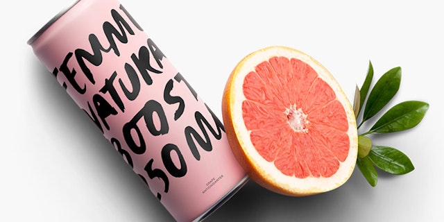
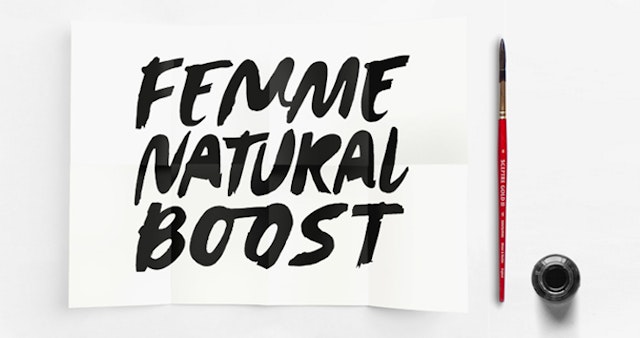
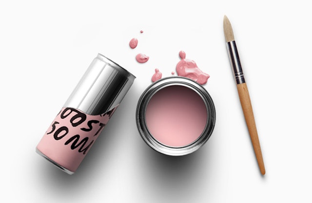
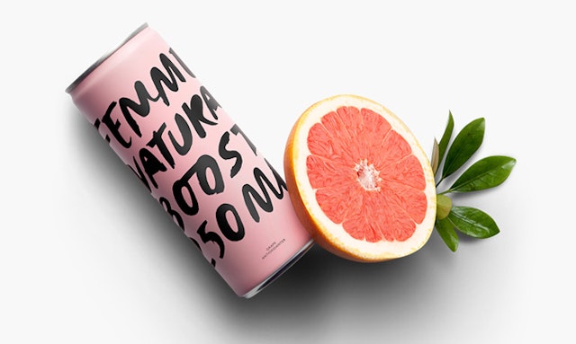
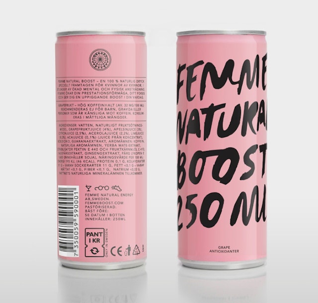
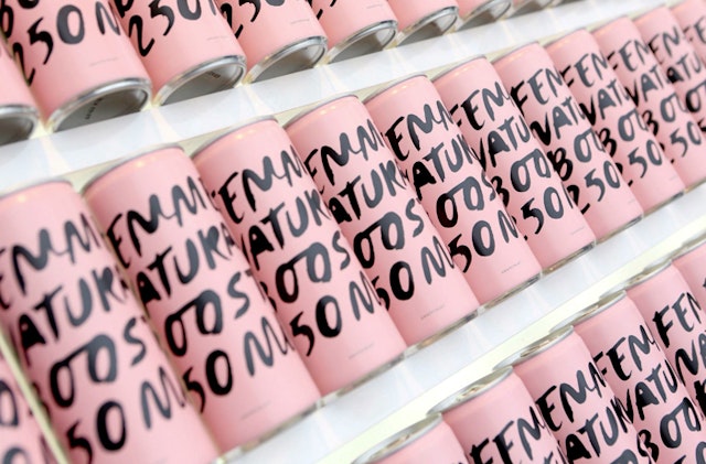
Brand: Femme BoostTitle: Femme Natural BoostAgency: Ehrenstråhle & Wågnert (Ehrenstrahle & Wagnert), Stockholm, SwedenAgency website: www.e-w.seArt Director: Martin Wågnert and David EhrenstråhleCopyrighter: Susanne HolmsäterIllustrator: David EhrenstråhlePhotographer: Jesper FlorbrandtAdditional Credits: Planner: Johan RudeShort Rationale (optional): Femme Natural Boost is an energy drink that turns to a female audience that, in the current situation, have no alternative available in a product category in which communication signals mostly extreme sports, masculinity and testosterone. The challenge was therefore to develop a package that attracts the audience without, for that matter, alluding to the old image of what is feminine. Femininity and independence were the key words in the creation of Femme’s brand, which included a complete graphic profile and packaging design. In terms of branding we wanted to express attitude and self- confidence with the female at the heart of it, which sets Femme apart from other competitors in the energy drink market. By working with a saturated yet distinctive colour along with hand-drawn typeface, the can got an expression that was feminine without being perceived as cliché-like.