The Drum, in association with Synergist, brings you a round-up of some of the latest interesting creative work.
Every fortnight The Drum, in association with Synergist, publishes a selection of new creative work. Now you can vote for the work you like best with the winners to feature in the next issue of The Drum (2 August). Submit your vote before Wednesday 24 July to guarantee your favourite makes it into the printed magazine. To submit work for future publication contact gillian.west@thedrum.com.
VCCP: Compare the Market 'Duets' TV ad
Brand: Compare the MarketTitle(s): DuetAgency: VCCP, London, UKAgency website: http://www.vccp.comCreative Director: Darren BailesCreative: Jonathan ThakePhotographer: Oliver CariouAdditional Credits: TV Producer: Larissa Miola Production Company: Passion Pictures, HSI London Director: Simon Cole, Darren WalshGrading: FinishAudio: Grand CentralSound Designer: Ben Leeves
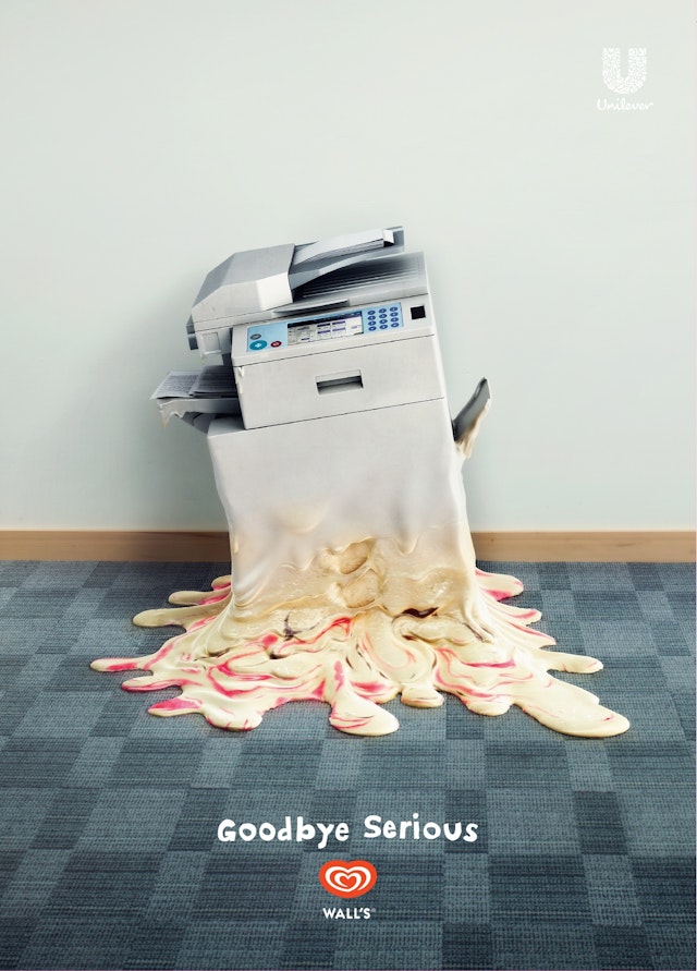
adam+eveddb: Walls 'Goodbye Serious' print ad
Brand: WallsTitle(s): Goodbye SeriousAgency: adam+eveddb, London, UKAgency website: http://www.adamandeveddb.comPhotographer: Sue Parkhill Additional Credits: CGI & Post Production: Taylor JamesPublished: July 2013
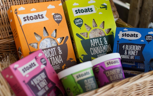
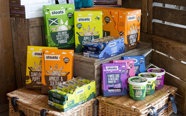
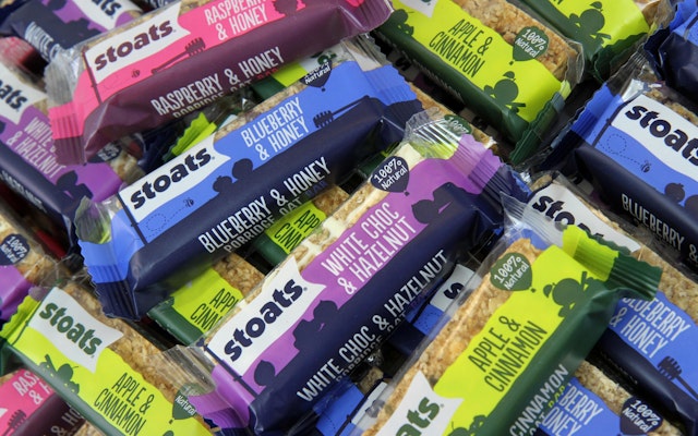
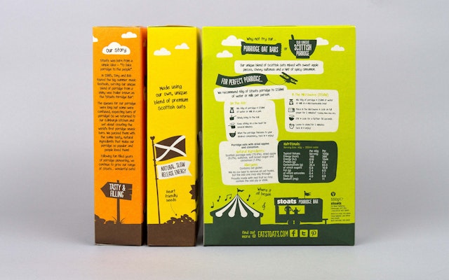
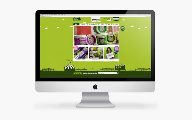
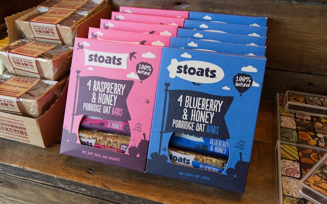
Robot Food: Stoats Porridge rebrand
Brand: StoatsTitle(s): RebrandHeadline and copy text (in English): Porridge To The People!Agency: Robot Food, Leeds, EnglandAgency website: http://www.robot-food.comCreative Director: Simon ForsterArt Director: Martin WiddowfieldCopywriter: Simon ForsterIllustrator: Martin WiddowfieldPhotographer: Martin WiddowfieldAdditional credits: Julia Allan, Mike ShawPublished: June 2013Short rationale (optional): Stoats Porridge has unveiled a major rebrand, masterminded by specialist consultancy, Robot Food. Stoats is a Scottish oats company with a passion for all things porridge and a focus on oat innovation. The company approached Robot Food due to its expertise in developing brand personality. The brief was to build upon the compelling brand story adding vibrancy and ownable IP to the packaging.Formed in 2005, Stoats converted an American hot dog trailer, to sell hot porridge with generous, natural, tasty toppings at summer music festivals. The young company went on to develop a range of retail products including the world’s first porridge oat bars, which include favorite flavour combinations that have helped the brand to grow. With the porridge aisle leaders focusing on traditional brand values as a worthy proposition, Stoats found a gap in the market for a vibrant, young company that would push the porridge bandwagon.
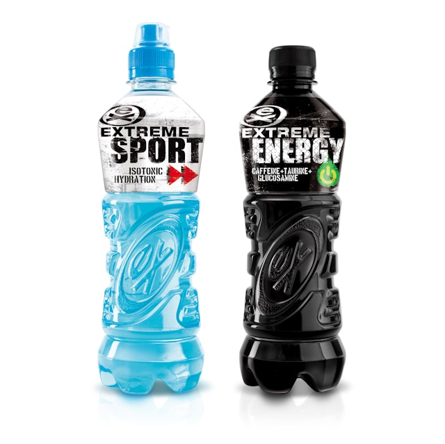
Bluemarlin: Extreme Sport and Extreme Energy brand packaging
Brand: ExtremeTitle(s): Extreme Sport, Extreme EnergyAgency: Bluemarlin, Bath, UKAgecny website: http://www.bluemarlinbd.com/ Creative Director: Chris HartPublished: July 2013Short Rationale (optional): Guided by the big idea of ‘Raw Rebellion,’ Extreme’s graphics reflect the razor-edged sensibilities of street art and graffiti. The design fits seamlessly into the world that the urban dreamer knows, inhabits and thrives in - skate parks; BMX trails off-the-beaten path, and exotic surf tribes. Working in perfect sync with the graphics, Extreme’s unique structure continues to reinforce the brand’s push-the-limits personality.
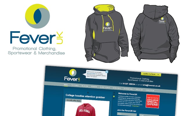
Look, Touch & Feel: Fever UK branding
Brand: Fever UK Title(s): Fever UK Branding Headline and copy text (in English): Fever UK. LTF was delighted to be engaged by Fever UK, and thoroughly enjoyed the collaborative process and challenging brief to create this contemporary branding design. Agency: Look, Touch & Feel, Northamptonshire, UK. Agency website: http://www.looktouchfeel.co.uk Creative Director: Rick O'Neill, FRSAArt Director: Matt Holland Copywriter: Chris StreetIllustrator: Andie Jackman Photographer: Andy LeeAdditional credits: Pixel, Security Director Published: 2012
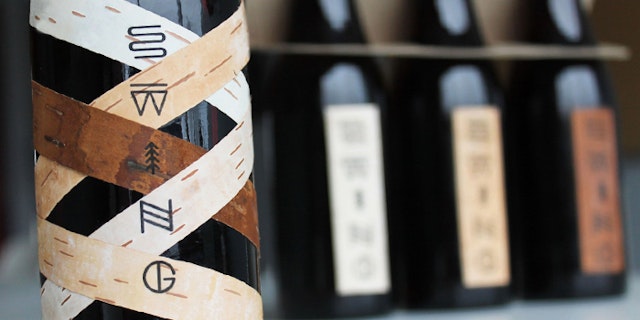
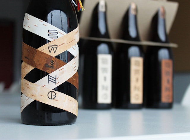
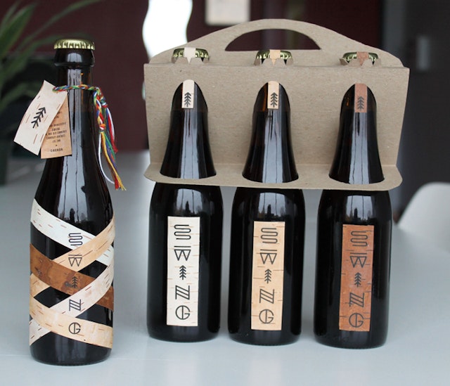
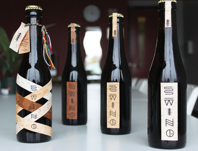
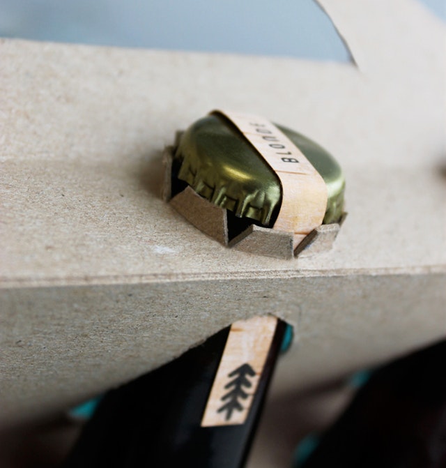
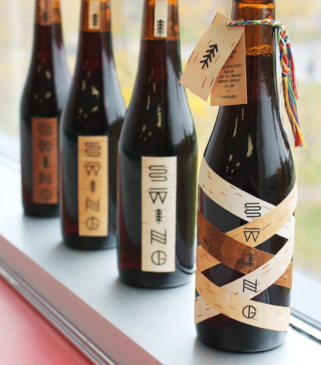
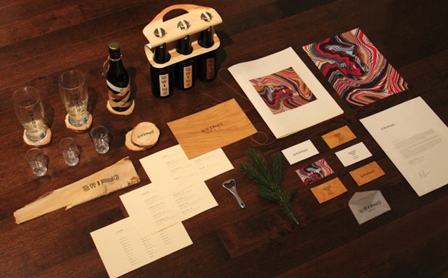
Simon Langlois: Swing Microbrewery packaging
Brand: Swing MicrobreweryTitle(s): Swing Microbrewery BrandingAgency: simonlanglois.ca, Montréal, Canada.Agency website: http://simonlanglois.caArt Director: Simon LangloisPhotographer: Simon LangloisPublished: April 2013
Mother: IKEA 'Make Small Spaces Big' TV creative
Brand: IKEATitle(s): Make Small Spaces BigAgency: Mother, London, UKAgency website: http://www.motherlondon.com Additional Credits: Production Company: Riff Raff FilmsDirector: MegaforceProducer: Cathy Hood/Matthew FonePost Production: FinishEditing House: Final CutEditor: Joe GuestPublished: July 2013
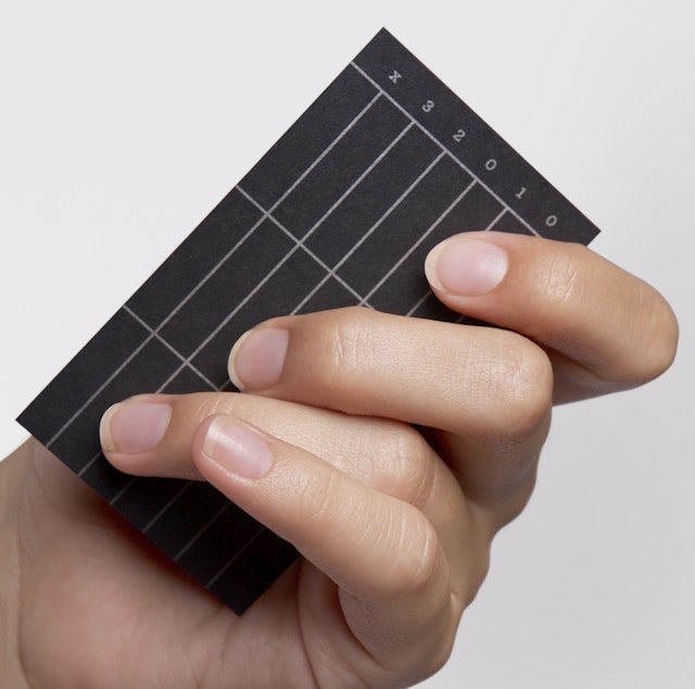
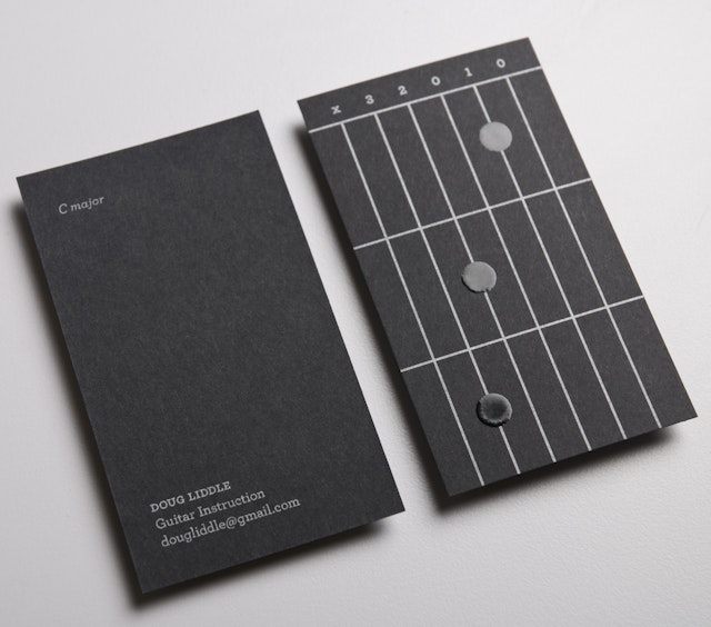
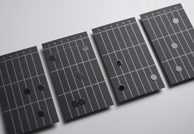
Saint Bernadine Mission Communications Inc.: Doug Liddle Business Cards
Brand: Doug Liddle Guitar InstructionTitle(s): Doug Liddle Business CardsAgency: Saint Bernadine Mission Communications Inc., Vancouver, CanadaAgency website: http://www.stbernadine.comCreative Director: David Walker & Andrew SamuelArt Director: Rory O'SullivanCopywriter: Jessica MoriIllustrator: Rory O'SullivanAdditional credits: Production Artist: Lisa BlackburnAccount Services: Jennifer Reynolds Published: 2012Short rationale (optional): These business cards introduce the fun of learning to play the guitar within moments of holding them. Raised thermographic printing adds a nice dimension to the guitar chord diagram and serves as tactile indicators for accurate finger placement.
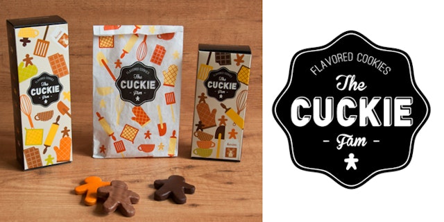
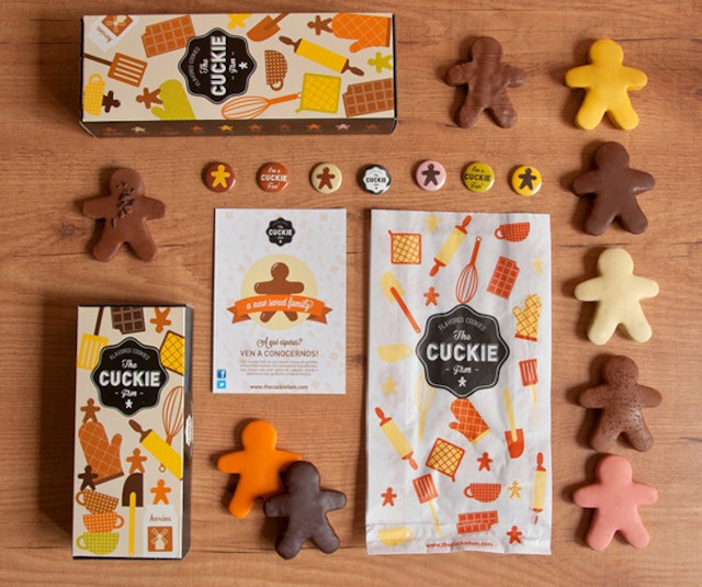
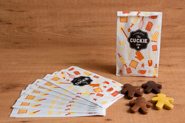
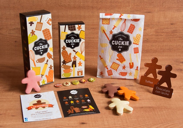
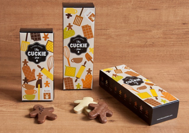
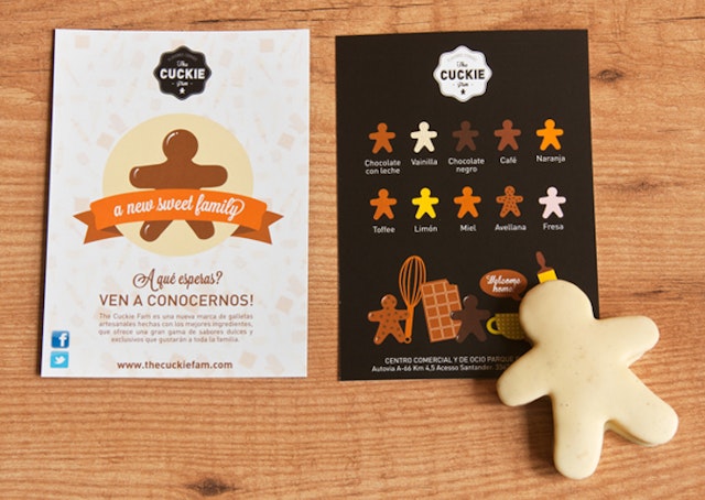
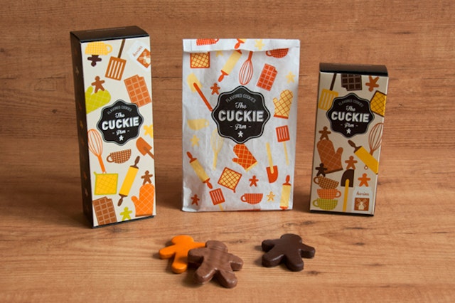
Brand: The Cuckie Fam Title(s): The Cuckie Fam Branding & Packaging DesignAgency: Oloramara Branding & Packaging Design, Gijón, Asturias, SpainAgency website: http://oloramara.comCreative Director: Mara RodríguezArt Director: Mara RodríguezIllustrator: Mara RodríguezShort Rationale (optional): New branding and packaging for a new flavoured cookies brand. The Cuckie Fam is a sweet handmade family, cooked with the best ingredients that will be loved for everyone.
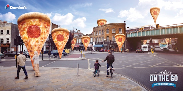
Iris: Dominos app campaign
Brand: DominosTitle(s): Dominos Pizza: Street Agency: Iris, London, UK Agency website: http://www.iris-worldwide.comCreative Director: Andy TaylorCreatives: Tian Murphy, Carly WilliamsPhotographer/Retoucher: Parker BileyAdditional Credits: Producer: Jaina MintonAccount Director: Venetia TaborPublished: July 2013
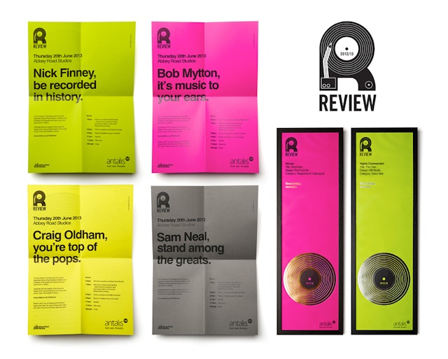
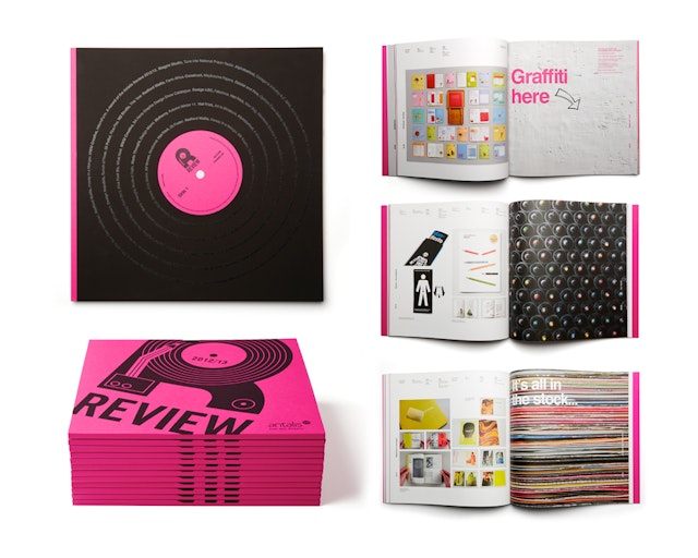
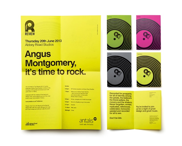
Stocks Taylor Benson: Antalis Review 2012/13
Brand: Antalis LimitedTitle(s): The Review 2012/13Agency: Stocks Taylor Benson, LeicestershireAgency website: http://www.stockstaylorbenson.com/ Creative Director: Glenn TaylorAdditional Credits: Senior Designer: Lois BlackhurstPublished: June 2013Short Rationale (optional): Stocks Taylor Benson has designed the invites, brochure and certificates to complete the set of material for the Antalis Review 2012/13 awards ceremony at Abbey Roads Studios. The brochure, containing all the recognised entries, is reminiscent of a 12 inch vinyl record, complete with sleeve and laminated die-cut cover featuring a new addition to the Antalis creative papers range - Curious Matter Black Truffle. Invites designed to be reminiscent of low cost gig posters were printed in black onto a variety of brightly coloured Antalis papers to create a striking and simple brand look. This also allowed for some nice personalisation to create a sense of anticipation for this prestigious event. The ceremony was held on the 20th June at Abbey Road Studios and included a chance to sign the Abbey Road Wall, have your picture taken on the famous crossing, and more importantly, featured a large array of outstanding print design.
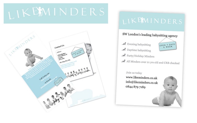
Look, Touch & Feel: LikeMinders Branding
Brand: LikeMinders Title(s): LikeMinders BrandingHeadline and copy text (in English): LikeMinders. LTF was delighted to be engaged by LikeMinders, and thoroughly enjoyed the collaborative process and challenging brief to create this contemporary branding design. Agency: Look, Touch & Feel, Northamptonshire, UK.Agency website: http://www.looktouchfeel.co.uk Creative Director: Rick O'Neill, FRSAArt Director: Matt Holland Copywriter: Chris StreetIllustrator: Andie JackmanPhotographer: Andy Lee Additional credits: Pixel, Security Director Published: 2012
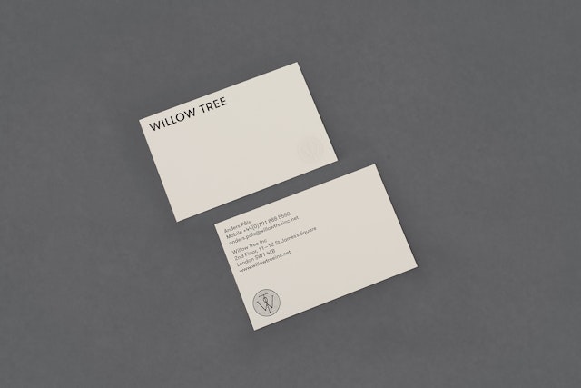
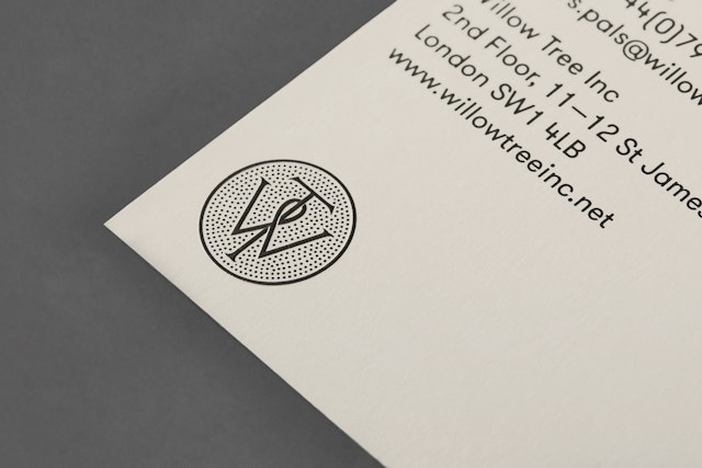
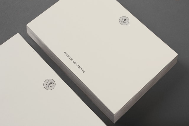
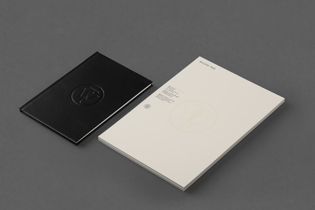
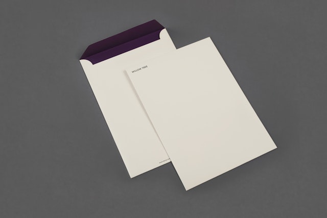
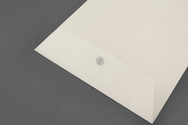
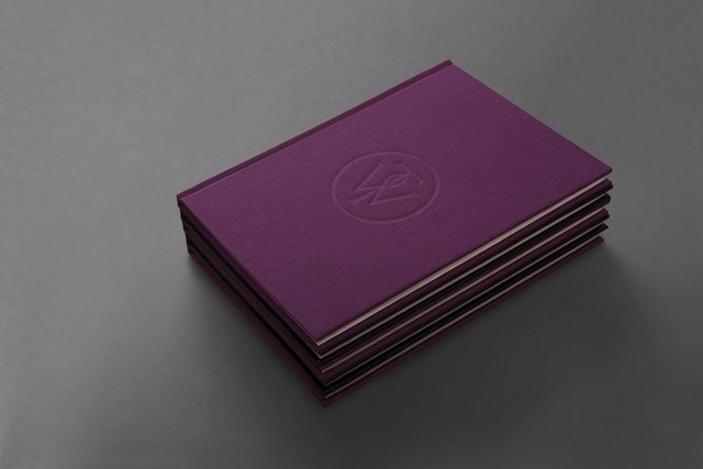
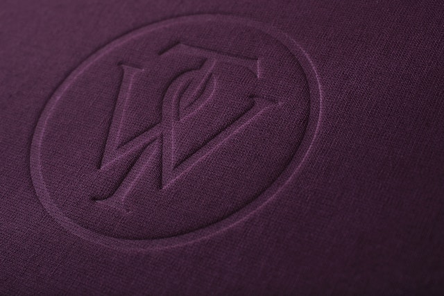
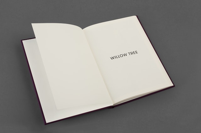
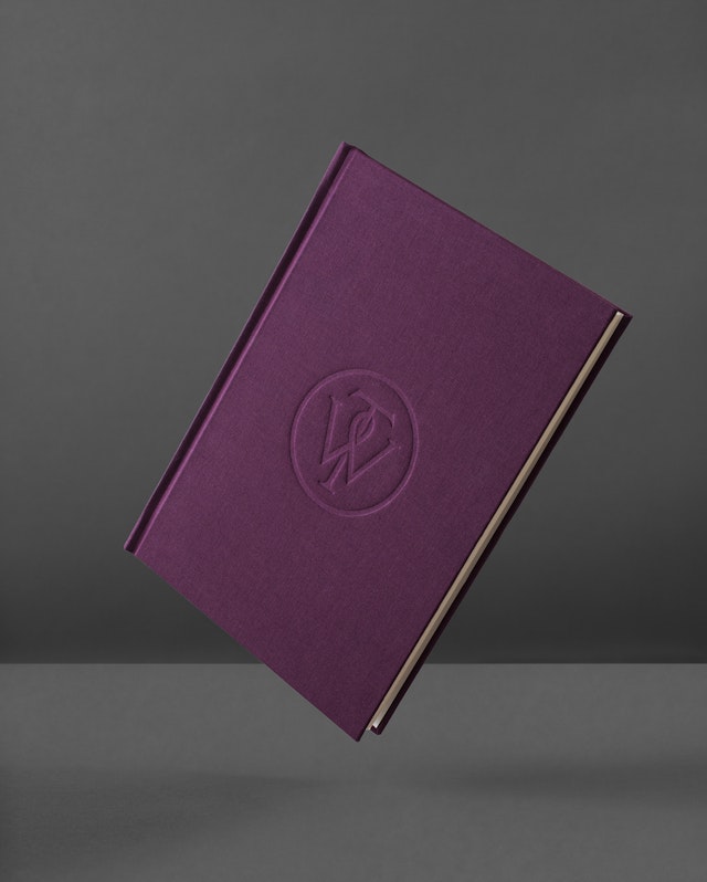
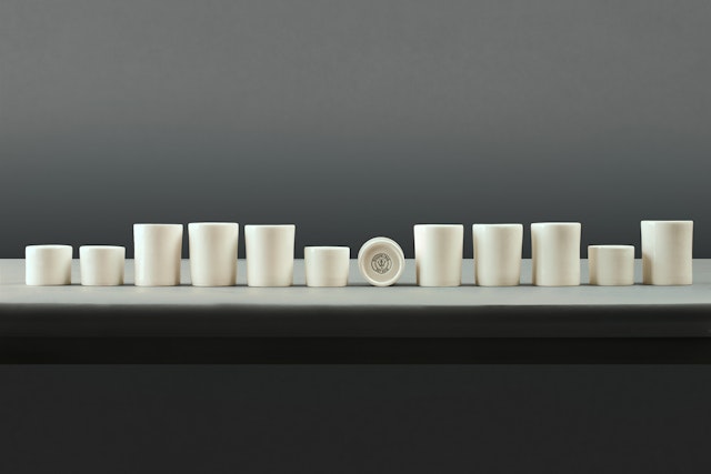
Bunch: Willow Tree brand identity
Brand: Willow TreeTitle(s): Willow TreeAgency: Bunch, London, United KingdomAgency website: http://www.bunchdesign.comCreative Director: Denis KovacAdditional credits: Spencer CharlesPublished: July 2013Short Rationale (optional): Bunch has designed a new but traditional looking identity for Willow Tree, London’s leading business consultancy.Bunch worked in close collaboration with typographer Spencer Charles to develop a bespoke WT monogram, which was executed as a mix of embosses, carved in seals and simulated watermarks – achieved with an oil-based ink – across purple cloth, black leather, slightly structured Fedrigoni Sirio Color stock and handmade coffee pottery, the solution embraces a crafted sensibility alongside a more contemporary use of space and type.
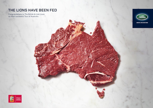
RKCR/Y&R: Landrover British & Irish Lions congratulatory ad
Brand: LandroverTitle(s): The Lions have been fedHeadline and copy text (in English): The Lions have been fed. Congratulations to The British & Irish Lions on their successful Tour of Australia. Agency: RKCR/Y&R, London, UKAgency website: http://www.rkcryr.comExecutive Creative Director: Mark RoalfeArt Director: Tim BrookesCopywriter: Phil ForesterPhotographer: Patrice De VilliersPublished: July 2013
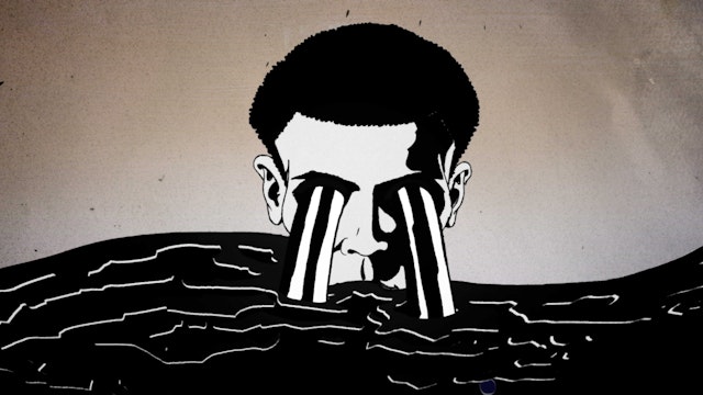
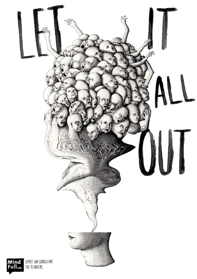
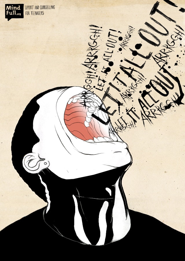
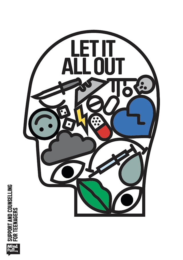
M&C Saatchi: BeatBullying MindFull TV and print launch
Brand: BeatBullying GroupTitles(s): MindFull launchAgency: M&C Saatchi, London, UKAgency website: www.mcsaatchi.comArt Director: Orlando Warner & Joe MillerCopywriter: Orlando Warner & Joe MillerAdditional Credits: Planner: Howard MillerMedia Agency: MediacomProduction Company: th1ngDirectors: Will Barras & Shay HamiasDesign Direction: Will Barras, Shay Hamais & Yui HamahashiraProducer: Milana KaraicaExecutive Producer: Dominic ButtimoreGrade: Danny AtkinsonPublished: July 2013
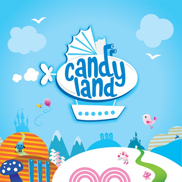
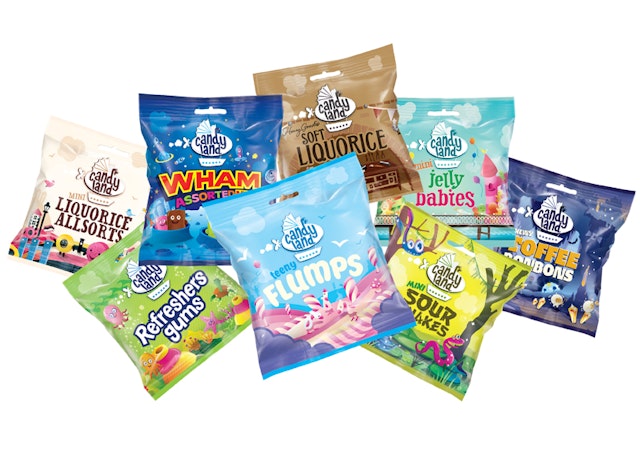
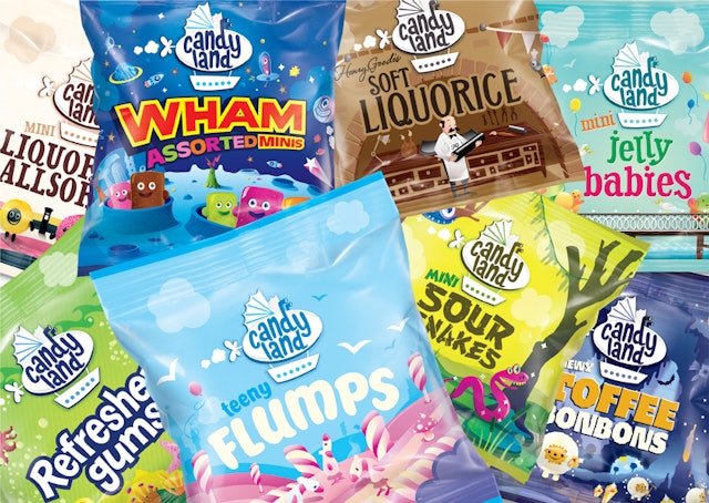
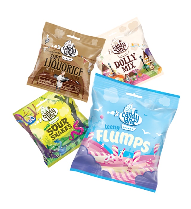
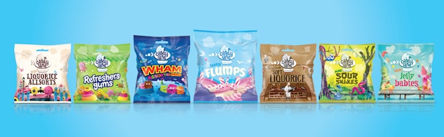
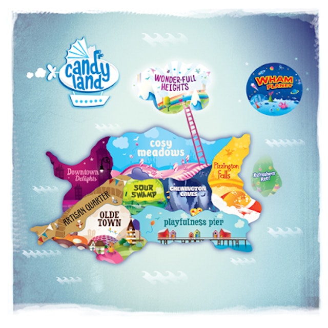
BrandOpus: Tangerine Confectionery's Candyland
Brand: CandylandTitle(s): BrandOpus helps Tangerine Confectionery look to the future with the creation of CandylandHeadline and copy text (in English): BrandOpus has worked with the UK’s leading independent manufacturer of sugar confectionery, Tangerine, to create Candyland, a single consumer-facing brand that will consolidate their wide portfolio of sugar confectionery brands, including Wham Bars. Working with the key theme of “embracing nonsense”, BrandOpus has created the concept of Candyland, a magical world where all sweets come from in the form of brand identity, packaging and point of sale materials.Agency: BrandOpus, London, UKAgency website: http://www.brandopus.comCreative Director: Paul TaylorDesign Director: Kate JonesIllustrator: BrandOpus in collaboration with Jelly LondonAdditional Credits: Account Director: Nicky RubinsAccount Manager: Ali DawkinsPublished: July 2013Short Rationale (optional): BrandOpus were briefed to create a new brand that unifies Tangerine’s sugar confectionery portfolio in order to maximize growth potential. The portfolio was previously divided between many diverse but deeply cherished and recognisable products such as Dip Dab & Refreshers under brand names such as Princess, Barratt and Henry Goode.From the brief it was clear that the agency needed to create an evocative brand; one that offered sweets to transport the consumer back to the bright, innocent happiness of childhood.Working with the key theme of “embracing nonsense”, BrandOpus created the concept of Candyland, a magical world where all sweets come from. The visual identity is represented by the fantastical airship, ever present on and off pack, transporting the consumer to Candyland, and between the different areas within.The agency segmented and named the ranges by a product type and attributed them a ‘zone’ within Candyland, such as Refreshers Reef, Olde Town, Cosy Meadows and Wham Planet. This allows the ranges to each deliver their different propositions, whilst still sitting under a unified, single brand. Each range has its own distinctive look, feel and recognisable colourway to aid portfolio navigation.The new identity allows the brand to be immediately recognisable, contributing a positive halo effect of the brand values across the entire portfolio which encourages consumer cross purchase. Candyland affords strong brand standout and ease of navigation for the consumer at point of retail.
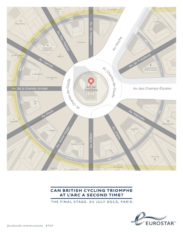
AMV BBDO: Eurostar Tour de France press ad
Brand: EurostarTitle(s): Tour de FranceHeadline and copy text (in English): Can British cycling triomphe at L’Arc a second time? The final stage. 21 July, 2013, ParisAgency: AMV BBDO, London, UKAgency website: http://www.amvbbdo.comArt Director: Richard Littler Copywriter: Zac EllisAdditional Credits: Agency Planner: Sarah SternbergAgency Accounts: Tom Shattock, Emily ElsonProject Manager: Sarah BensonMedia Agency: ArenaMedia Planner: Anna BeynonPublished: July 2013
VCCP: Telefonica O2 Be More Dog campaign
Brand: Telefonica, O2Title(s): Be More DogAgency: VCCP, London, UKAgency website: www.vccp.comCreative Director: Darren Bailes Creative: Nathaniel White, Daniel Glover-James, Ben Daly and Elias TorresPhotographer: Damien Acevedo Additional Credits: TV Producer: Catherine LongProduction Company: CaviarDirector: Keith Schofield Producer: Shirley O’ConnorExecutive Producer: Sorcha Shepherd, Anna Smith, James SortonPost Production: MPCEditing House: Marshall Street EditorsEditor: Patric RyanPublished: July 2013
Look, Touch & Feel: Fish Spa Branding
Brand: Fish Spa Title(s): Fish Spa Branding Headline and copy text (in English): Fish Spa. LTF was delighted to be engaged by Fish Spa, and thoroughly enjoyed the collaborative process and challenging brief to create this contemporary branding design. Agency: Look, Touch & Feel, Northamptonshire, UK. Agency website: http://www.looktouchfeel.co.uk Creative Director: Rick O'Neill, FRSAArt Director: Matt Holland Copywriter: Chris Street Illustrator: Andie JackmanPhotographer: Andy LeeAdditional credits: Pixel, Security DirectorPublished: 2012
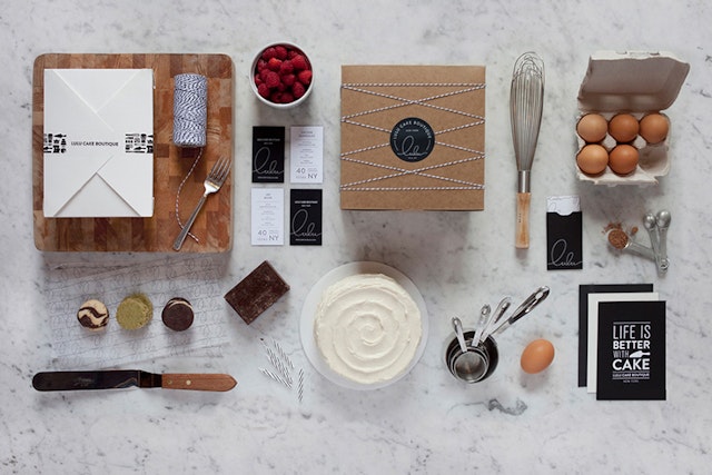
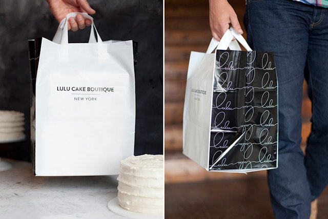
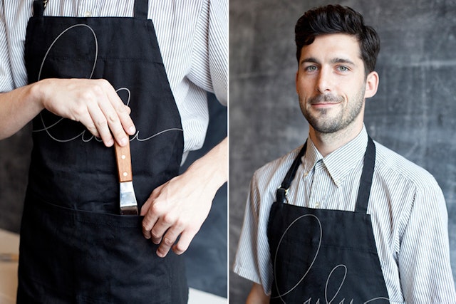
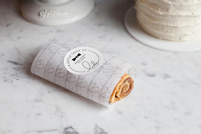
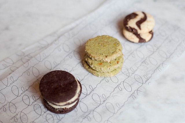
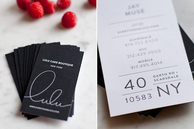
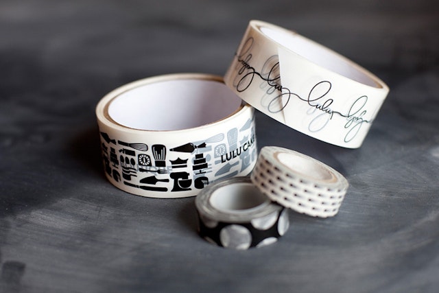
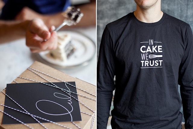
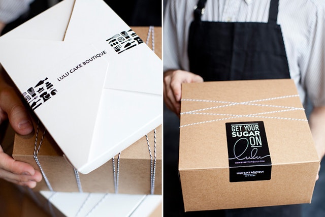
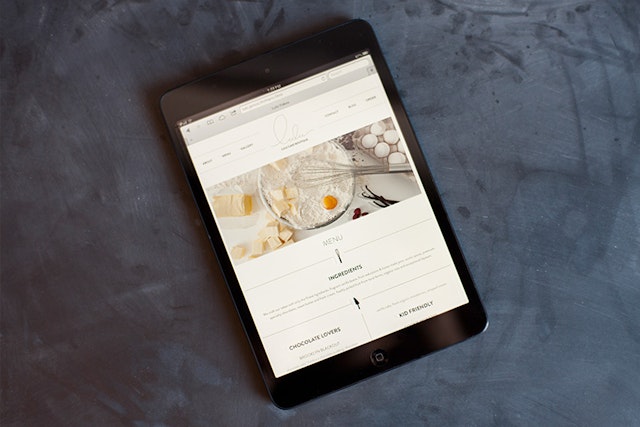
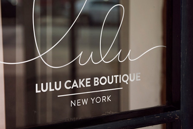
Brand: Lulu Cake BoutiqueTitle(s): Branding, Logo & Packaging DesignAgency: Peck & Co., Nashville, TN, USAAgency website: http://www.peckandco.com Creative Director: Benji PeckArt Director: Benji PeckCopywriter: Joy SarnackeIllustrator: Benji PeckPhotographer: Grin & Grain Additional Credits: Production: Rex Runyeon Published: July 2013Short Rationale (optional): They make masterpieces that also happen to be unmatched in flavour. They are obsessed with detail, artistry and flavour. And it shows. Cakes in all shapes and sizes for all types of occasions, crafted and coaxed to exquisite perfection, Lulu Cake Boutique gives us a reason to celebrate more often. Life is truly better with cake.
TBWA\G1: Nissan 'Feel the Surge' print ads
Brand: Nissan Title(s): Feel the SurgeAgency: TBWA\G1, TBWA, London, UKAgency website: http://www.tbwa.comCreative Director: Rudi AnggonoCreatives: David Hobbs, Richard Stoney and Nick CooperPhotographer: Christopher Griffith Additional Credits: Strategic Director: Filippo Del’OssoAccount Management: Ewan Veitch, Alexandra Johnson, Eva Gotteland, Caroline Allard and Gaëlle GuillouArt Buyer: Marie Moulin Retouching: We FolkPublished: July 2013
Wieden+Kennedy: Honda 'Hands' campaign
Brand: HondaTitle(s): HandsAgency: Wieden+Kennedy, London, UKExecutive Creative Directors: Tony Davidson and Kim PapworthExecutive Creative Director: Chirs O’ReillyCreatives: Chris Lapham and Aaron McGurkAdditional Credits: Producer: James GuyClient Services: Laura McGauran and Paulo SalomaoProduction Company: NexusDirectors: Smith & Foulkes Producer: Tracey CooperProduction Assistant: Fernanda Garcia LopezDirector of Photography: Clive NormanEditorial Company: Trim EditingEditors: Paul Hardcastle and David SladeVFX Company: Nexus Productions & Analog
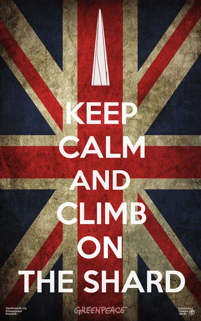
Brand: GreenpeaceHeadline copy and text (in English): Keep Calm and Climb on the Shard. It’s Europe’s tallest skyscraper and Greenpeace has scaled the Shard to Save the Arctic. Agency: Tremendous Designs Studio, Bristol, United KingdomCreative Director: Iulian MiereanuArt Director: Iulian MiereanuCopywriter: Iulian MiereanuPhotographer: Iulian MiereanuPublished: July 2013
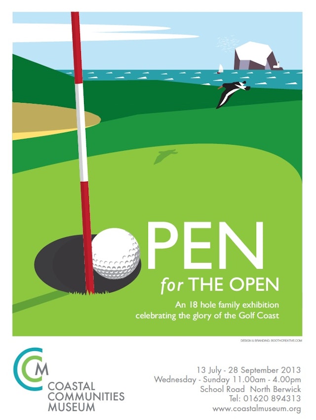
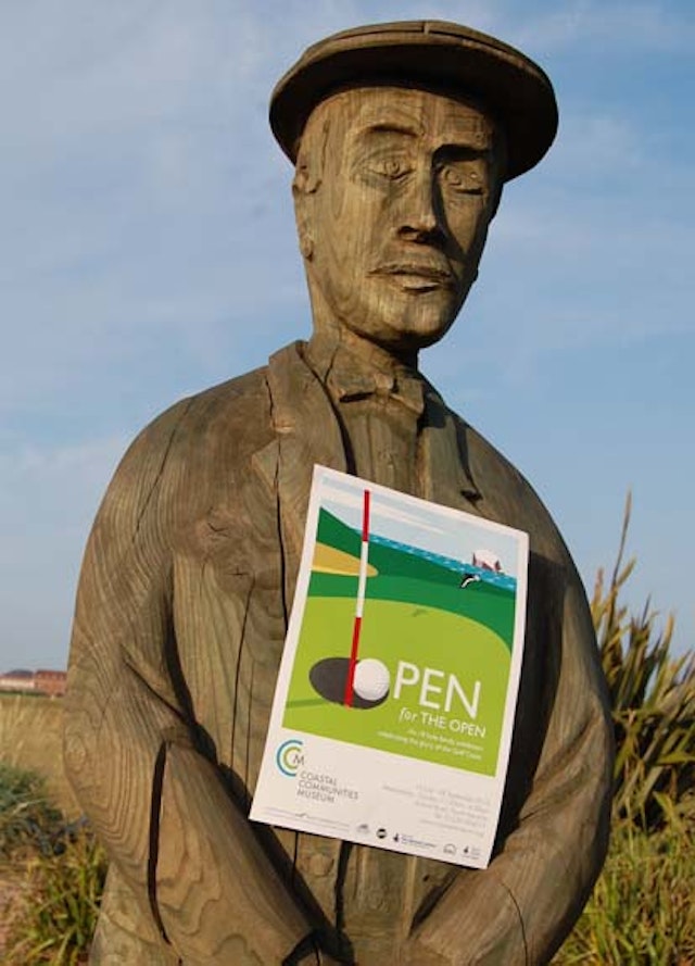
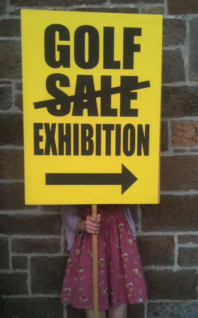
Booth Creative: Coastal Communities Museum Open for The Open Exhibition and Coastal Communities Museum Brand Identity
Brand: Coastal Communities MuseumTitle(s): Open for The Open ExhibitionHeadline and copy text (in English): Open for The Open exhibition poster and marketing for the Coastal Communities Museum first exhibition to tie in with The Open Golf Championship taking place locally. Agency: Booth Creative, Edinburgh, UKAgency website: http://boothcreative.comCreative Director: David BoothArt Director: David BoothCopywriter: David BoothIllustrator: David BoothPublished: July 2013
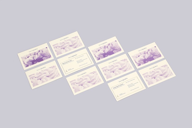
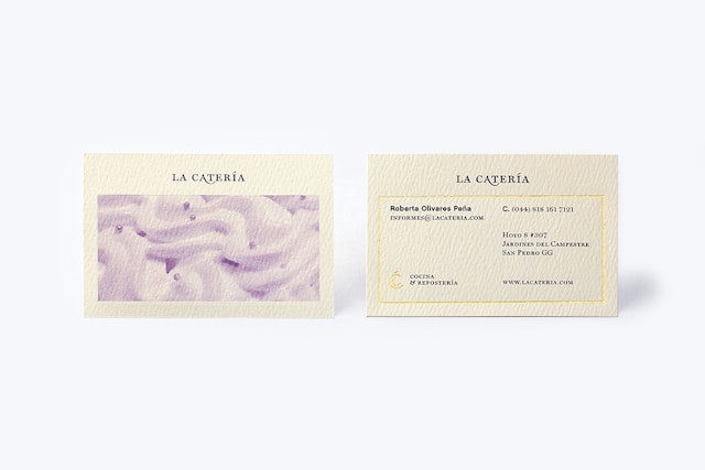
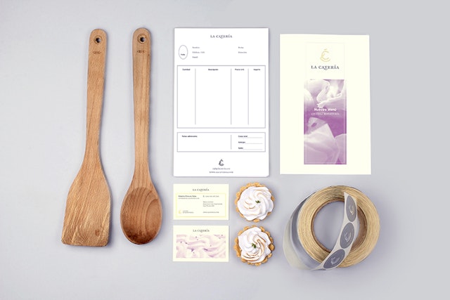
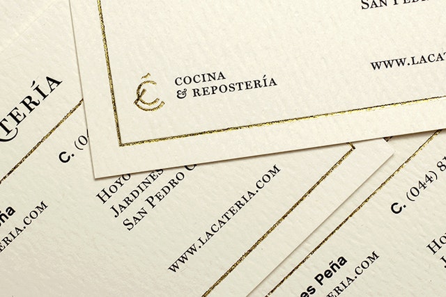
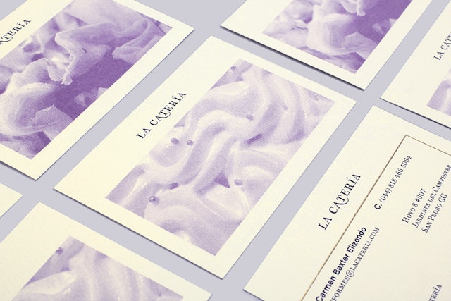
Firmalt: La Catería visual identity
Brand: La CateríaAgency: Firmalt, Monterrey, MéxicoAgency website: http://firmalt.comCreative Director: Manuel LlagunoArt Director: Francisco Puente:Photographer: Homero RuizPublished: July 2013Short rationale (optional): La Catería is a catering company that serves a variety of beautifully crafted courses and pastries. Our goal was to align the brand with the special care that was given to the preparation and presentation of each of their dishesThe concept of the brand was inspired on small European street markets, where a variety of textures, styles, forms and colors blend together to create a unique experience that feels warm and inviting. Special care was taken to give the brand classical roots with a modern execution. The result is a refined identity with fresh features that give emphasis to their delightful execution.
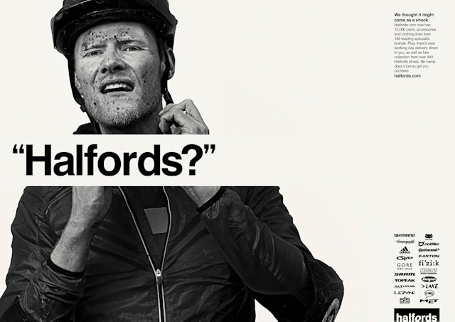
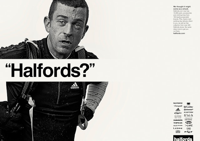
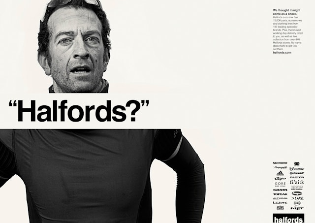
Chapter: Halfords campaign
Brand: HalfordsTitle(s): Jonny, Rich and SimonHeadline and copy text (in English): “Halfords?”We thought it might come as a shock. Halfords.com now had 15,000 parts, accessories and clothing lines from 185 leading specialist brands. Plus, there’s next working day delivery direct to you, as well as free collection from over 440 Halfords stores. No name does more to get you out there. Agency: Chapter, Birmingham, UKAgency website: http://www.chapteragency.comCreative Directors: Ian Boulter and Martin HeffernanArt Directors/Copywriters: Paul Ray and Richard NewellPhotographer: Martin BrentDesigner: Nick CastlePublished: June 2013Short Rationale (optional): With cycling becoming a major part of British sport post 2012, we wanted serious riders to re-appraise the Halfords brand. For many, Halfords was the place they got their first bike. Now they’re more serious about bikes, we wanted to show them Halfords are too. They can now get the brands the love from a name they can trust but didn’t expect.
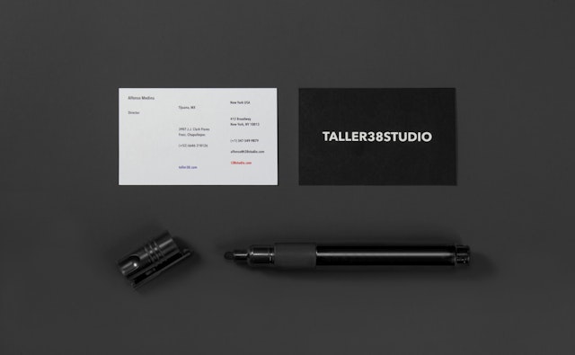
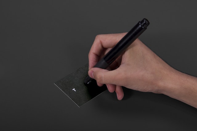
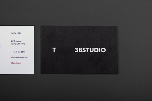
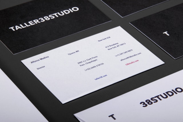
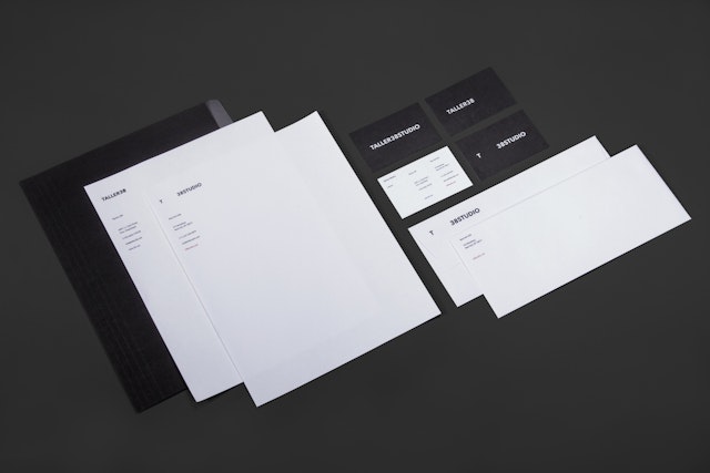
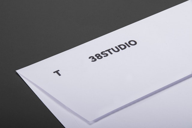
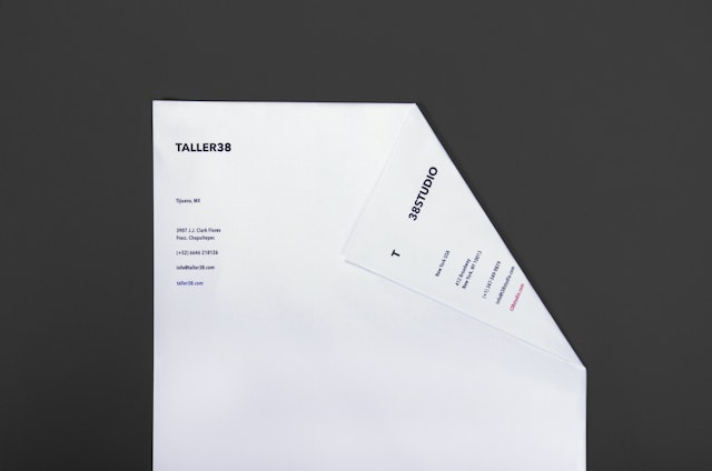
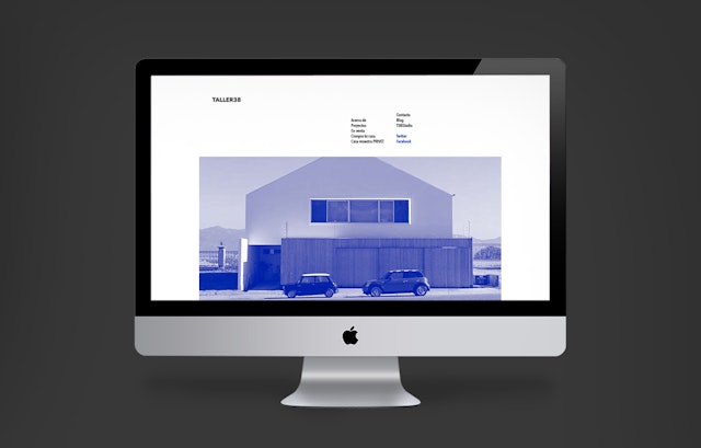
Savvy Studio: Taller38 branding
Brand: Taller38Title(s): Taller38 brand identityAgency: Savvy Studio, San Pedro Garca García Nuevo León MéxicoAgency website: http://savvy-studio.net/en/Creative Director: Savvy StudioArt Director Savvy StudioPublished: July 2013
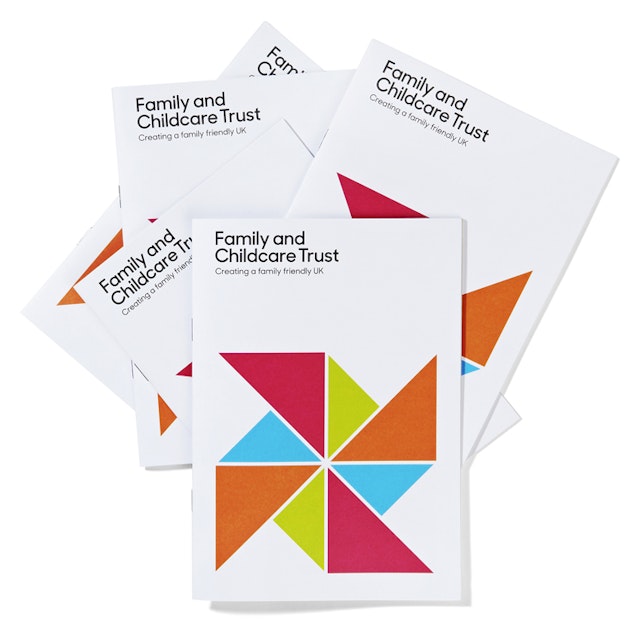
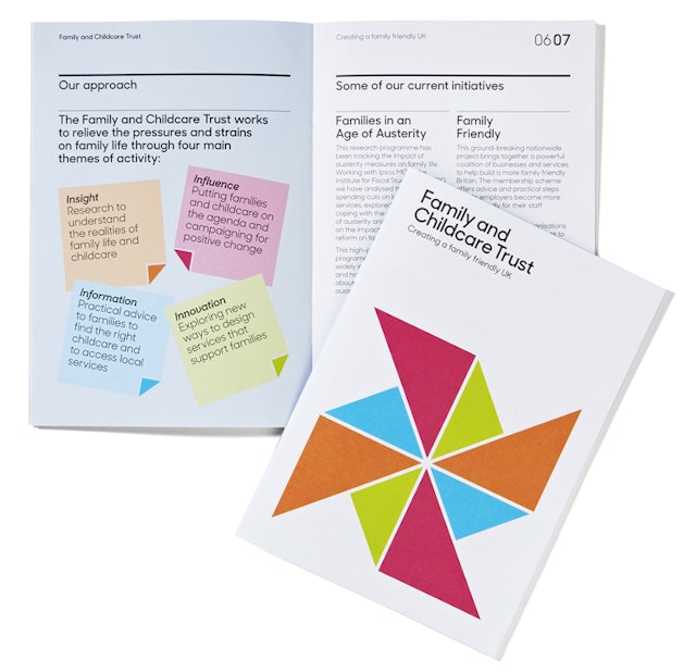
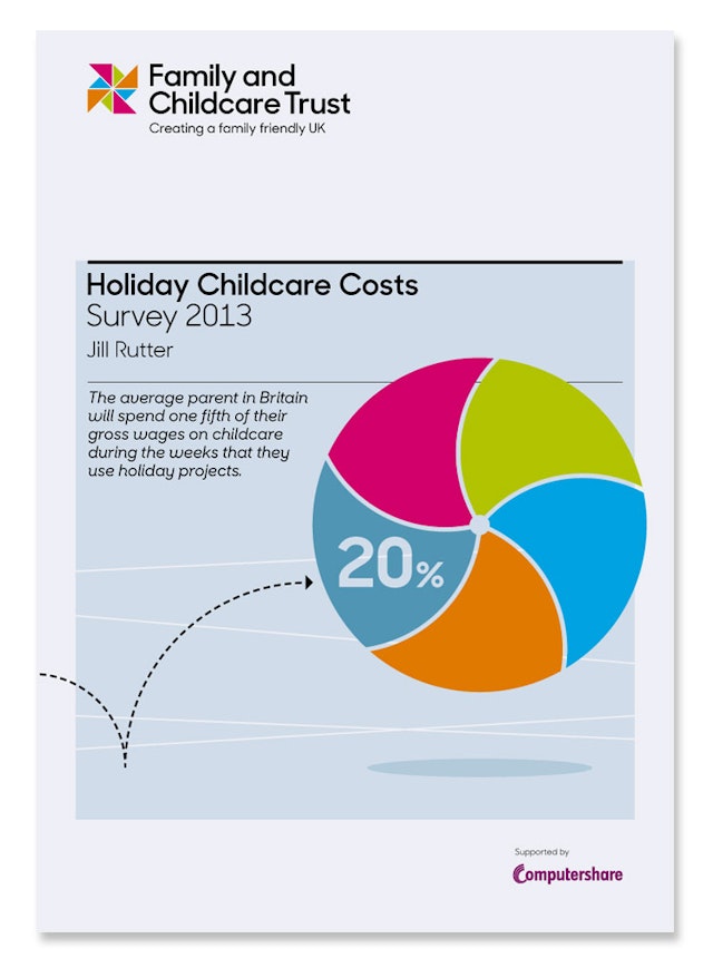
Colourful: The Family and Childcare Trust visual identity
Brand: Family and Childcare TrustTitle(s): Corporate identityAgency: Colourful Design StrategyAgency website: http://www.becolourful.co.ukBrand Consultant: Emily PennyArt Director: Phillip SouthgateCopywriter: Victoria FlintIllustrator: Phillip SouthgatePhotographer: Nick DavidPublished: July 2013Short rationale (optional): New consultancy Colourful Design Strategy has created the visual identity for Family and Childcare Trust. The new look launched at a reception at the House of Lords on Tuesday 16 July. The design draws on the charity’s values: always intelligent and pioneering, while at the same time approachable and grounded in the realities of family life. The central motif in the visual identity is a graphic pin-wheel which was selected because it is a positive symbol of childhood. The shape is used to represent diverse family structures, and provides the starting point for a geometric visual language which is toned up or down to suit either community or policy audiences.
WCRS: Sky Broadband 'Telling Stelling' TV commerical
Brand: Sky BroadbandTitle(s): Telling StellingAgency: WCRS, London, UKAgency website: http://www.wcrs.comClient Creative Director: Barry SkolnickCreative Directors: Simon RobinsonCreatives: Ben Brazier and Jonny Ruthven Additional Credits: Client Management Team: Lyssa, McGowan, Carli Farmer, Lizzie ChasemoreAgency Producer: Sally Lipsius Account Handling: Jonathan Campbell, Mike Stern, Ben SpencerMedia Agency: MediacomProduction Company: 76LtdDirector: Peter LydonProducer: Cathy HoodEditor: Spencer Ferszt @ Marshall Street Post-Production: Finish Audio: Grand Central Published: July 2013