Amazing Twitter visualisations show a city’s tourists, the languages they speak and the phones they use

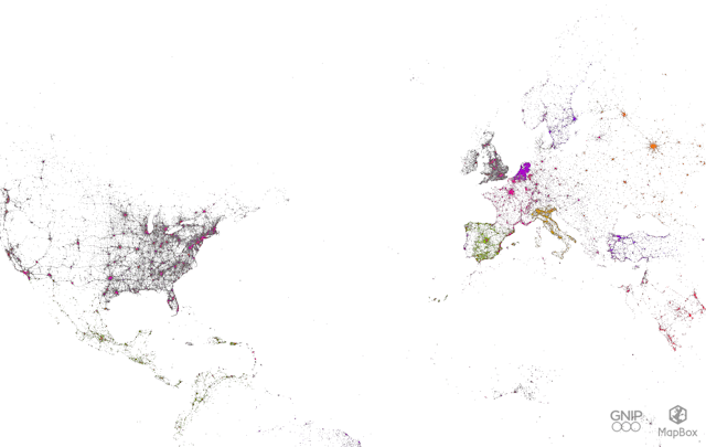
Using a raw sample of data from 280 million tweets, Gnip, a company dealing in social media data, has unveiled a new visualisation of the world’s tweeting cities.
The fully scalable and searchable visualisations were created by Eric Fischer and MapBox for Gnip.
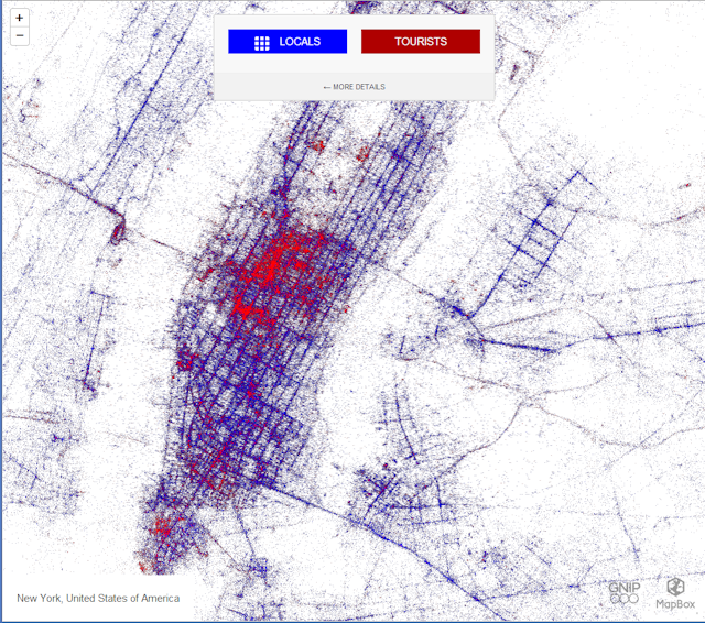
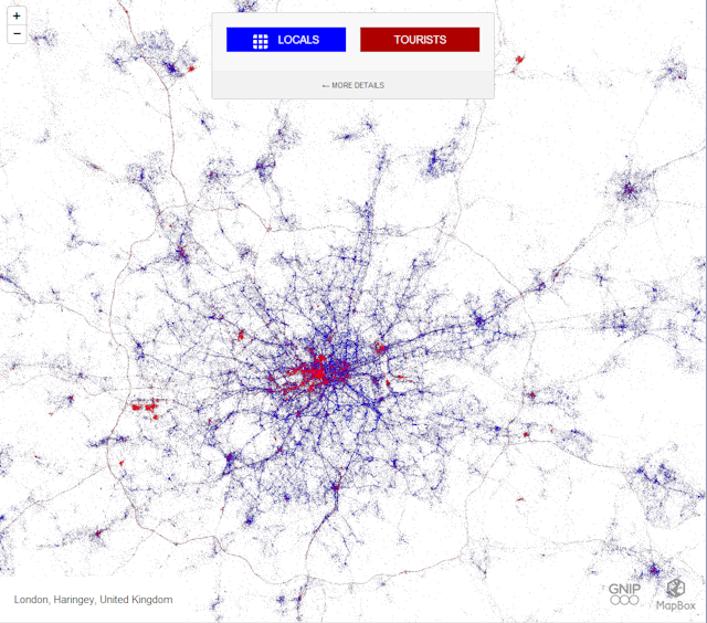
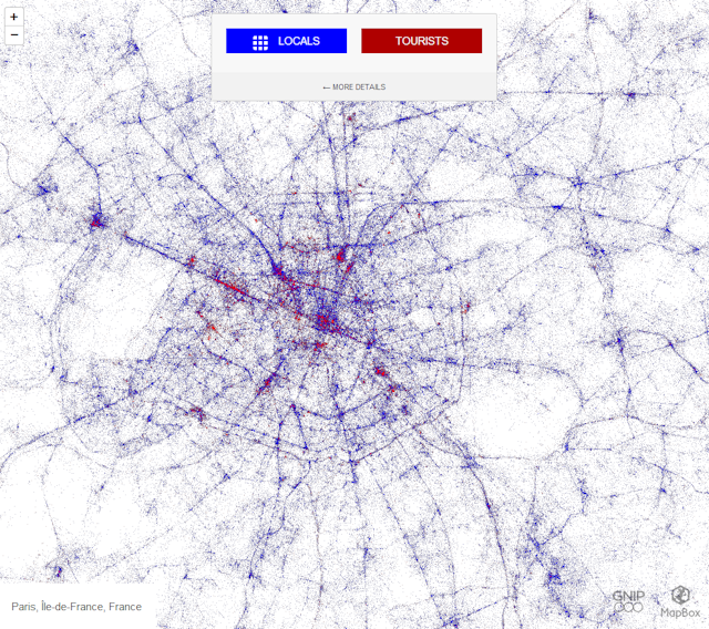
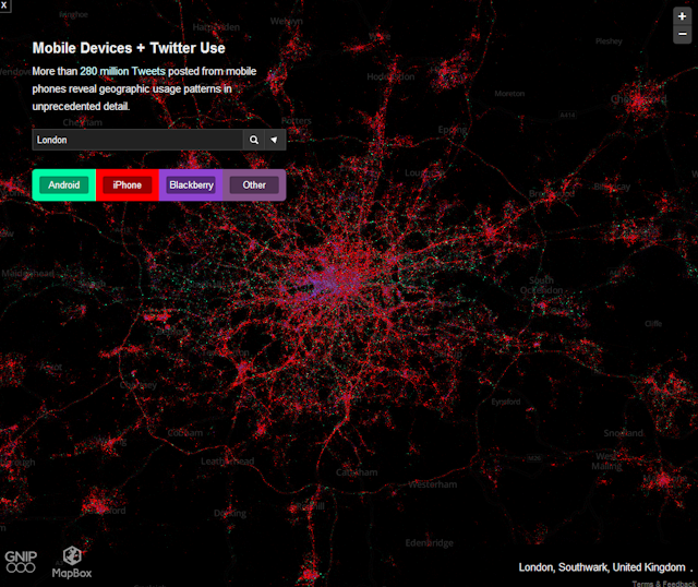
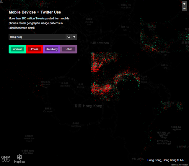
The first interactive map shows the number of residents in a city compared to the tourists, who were defined as Twitter users who sent tweets from a specific city for less than a month.
In New York, areas around the World Trade Center site, the Statue of Liberty/Ellis Island Ferries, and the Staten Island Ferry can be pinpointed by the vibrant red dots, and you can actually make out the Yankee Stadium on the map.
In the map of Paris you can pinpoint the line of red in the upper left of the city which is the Champs-Elysees, the most popular street in Paris for tourists.