Type design studio Fontsmith has launched FS Emeric, a new typeface that represents the culmination of over two years’ work by type design director Phil Garnham.
Garnham set out to created a sans serif typeface "capable of adding a fresh new voice to the classic modernist fonts".
He explains: “The timeless alphabets of the fifties have a deliberate neutrality, born out of an unfaltering mechanical solidity in each line and curve. FS Emeric has been designed to share this sense of structure and universality but it also introduces a new approach, intuitively informed by a sense of today, one of progress and optimism.”
FS Emeric comes in 11 weights - Thin, Extra Light, Light, Book, Regular, Core, Medium, Semi Bold, Bold, Extra Bold and Heavy - each with a corresponding italic.
The launch campaign for the new typeface was developed by Exeter branding studio Believe In, whose Founder and creative director Blair Thomson comments: “Our goals with the campaign were twofold — to demonstrate FS Emeric’s potential and to show off its extraordinary range and versatility. We’ve tried to capture a sense of possibility, so it feels expressive while preserving a pure typographic approach.”
The campaign consists of a type specimen booklet, a series of limited edition screen-printed posters and a campaign microsite at www.fsemeric.com.
The specimen booklet tells the story of the typeface through a range of brand applications, including packaging, signage and screen-based design. The finished booklet is crafted with a wraparound cover, printed in 4 spot colours with 2 foils on GF Smith papers.
For the poster series, 11 design studios from around the globe were invited to create a limited edition A1 poster using one weight of FS Emeric. Believe In designed an additional campaign poster, and all 12 have been screen-printed onto 175gsm Colorplan and hand numbered by Dan Mather in London.
Participating studios included Pentagram, Build and Bibliothèque in London, Manual in San Francisco, Studio Dumbar in Rotterdam and Lundgren+Lindqvist in Gothenburg.
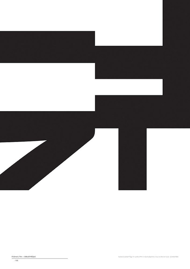
FS Emeric Thin by Bibliothèque
Bibliothèque, London (Thin / Thin Italic) “The idea came from looking at the details of the font that help define it. We liked the abstracted shapes we got when cropping into these and the fact that the Thin font became bolder and more pictorial at scale.” Jonathon Jeffrey, partner
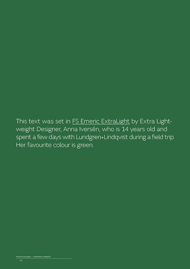
FS Emeric Extra Light by Lundgren+Lindqvist
Lundgren+Lindqvist, Gothenburg (ExtraLight / ExtraLight Italic) A play on ExtraLight, the task of typesetting the poster was given to a young student on a field trip to the studio. “FS Emeric is crafted to perfection, which made it a true pleasure to work with. By choosing the right typeface, good design is easily achieved. Easy enough for us to set aside our sometimes stifling demand for total control and have a 14 year old field trip visitor set the copy on the poster for us.” Andreas Friburg Lundgren, partner
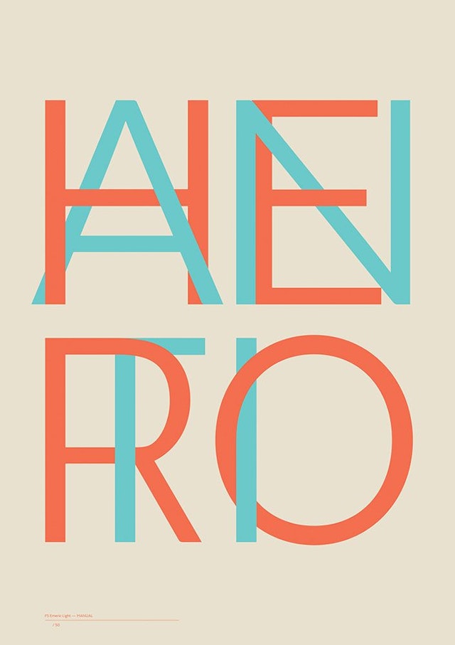
FS Emeric Light by Manual
Manual, San Francisco (Light / Light Italic) “The concept of HERO/ANTIHERO stems from the widely held assumption that the deliberate neutrality of modernist typefaces can be seen as “The Hero With a Thousand Faces” of the font world. FS Emeric does away with this neutrality by retaining functionality and infusing it with human character. Plus, we just think it just presents the typeface looking bloody lovely.”Tom Crabtree, creative director
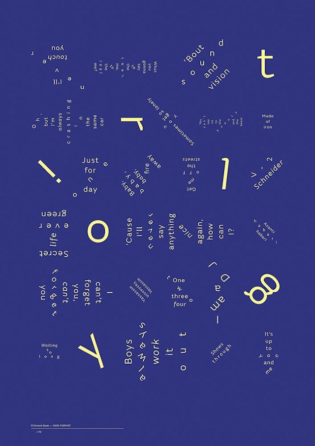
FS Emeric Book by Non-Format
Non-Format, Minneapolis / Oslo (Book / Book Italic) “Our design features lyrics from Bowie’s Berlin Trilogy (Low, Heroes & Lodger). Nothing more, nothing less. FS Emeric is a thoroughly accomplished piece of work in its own right.”Jon Forss and Kjell Ekhorn, partners
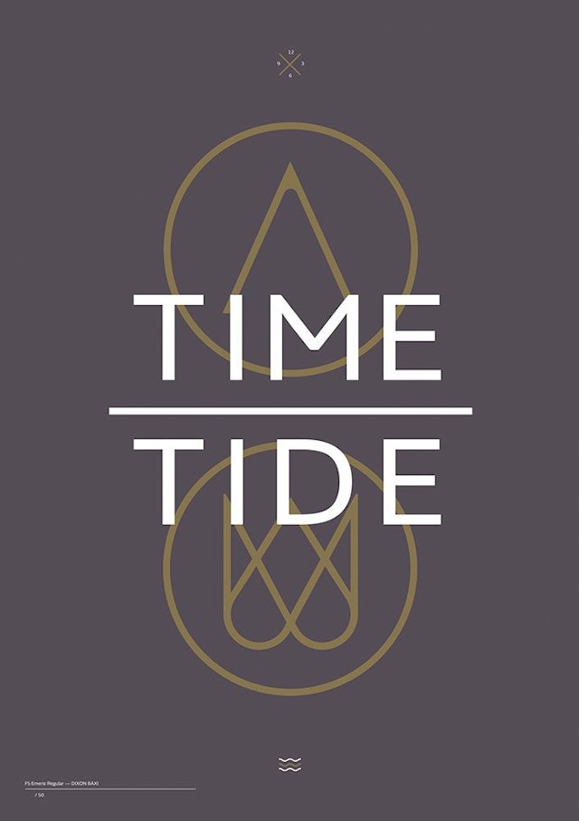
FS Emeric Regular by DixonBaxi
DixonBaxi, London (Regular / Regular Italic) “While working with FS Emeric, some of the timeless yet human qualities of the letterforms became more and more apparent. We were inspired by the history of the expression ’Time and tide wait for no man’ and used visual references from the font to craft the iconography, creating an image that aimed to capture the combined essence of the font and the phrase.”Steve Johnston, senior brand designer
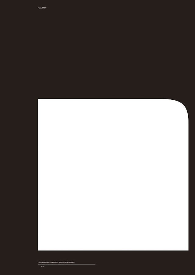
FS Emeric Core by Pentagram (Dominic Lippa)
Pentagram, London (Domenic Lippa) (Core / Core Italic)A dramatic full stop in 11,750-point type strips the typeface back to a single, universal symbol, and celebrates the design details that make FS Emeric so unique.
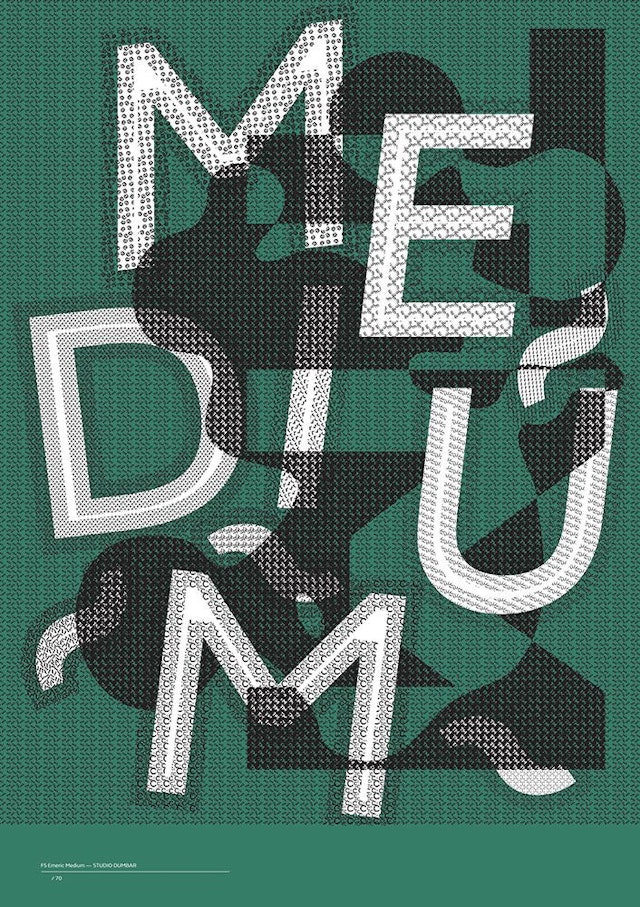
FS Emeric Medium by Studio Dumbar
Studio Dumbar, Rotterdam (Medium / Medium Italic) Both intricate and bold, crafted from thousands of individual characters.
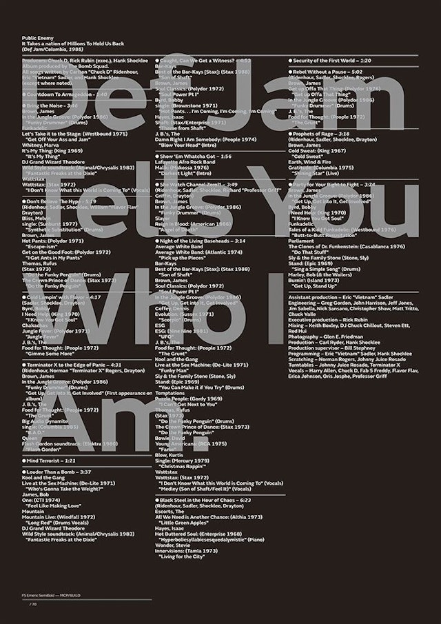
FS Emeric Semi Bold by Build (Michael C Place)
Build, London (Michael C Place) (SemiBold / SemiBold Italic) Michael combined FS Emeric’s lyrical bounce with his love of Hip Hop, rhymes and beats to create a poster that includes all of the samples that featured on Public Enemy’s seminal album ‘It Takes A Nation Of Millions To Hold Us Back’.
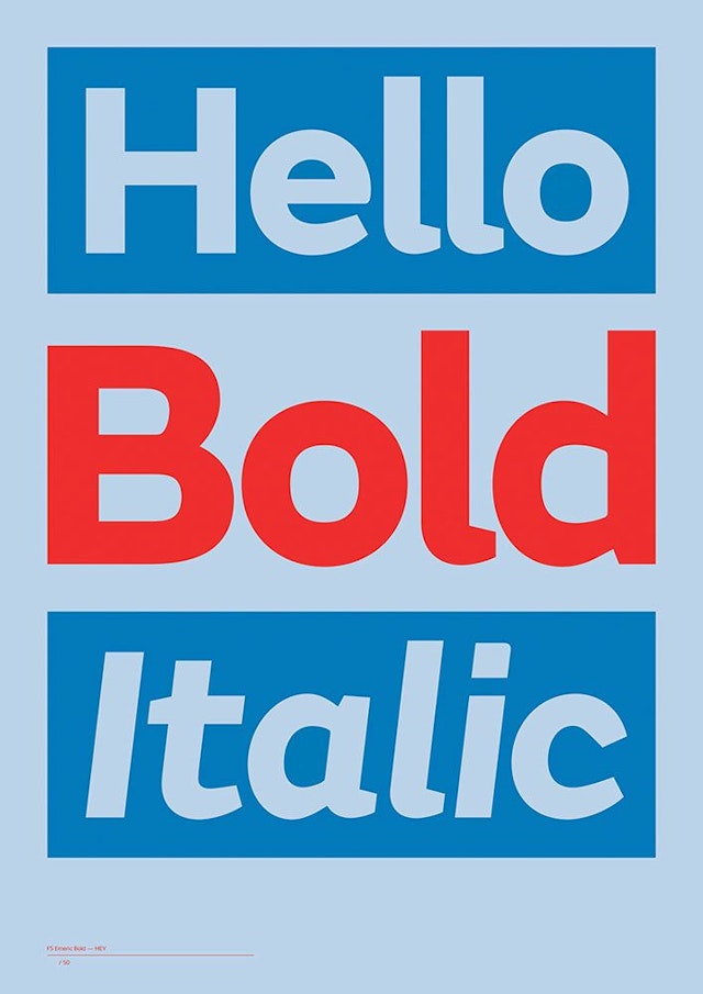
FS Emeric Bold by Hey
Hey, Barcelona (Bold / Bold Italic) Very simply, maximizing the personality of the typeface through a happy greeting.
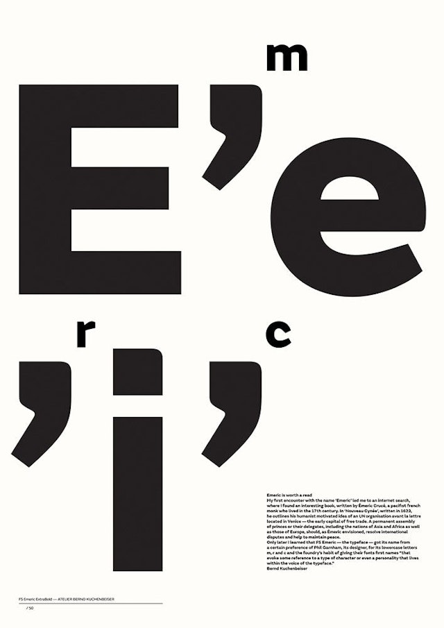
FS Emeric Extra Bold by Antelier Bernd Kuchenbeiser
10. Atelier Bernd Kuchenbeiser, Munich (ExtraBold / ExtraBold Italic) “I really enjoyed working with the font. It has so many fabulous details, like the apostrophes I fell instantly in love with.”Bernd Kuchenbeiser, principal
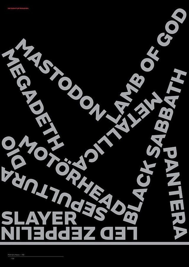
FS Emeric Heavy by NB
NB, London (Heavy / Heavy Italic) A selection of the agency’s favourite heavy metal bands, with a nod to Spinal Tap’s famous amplifiers that go all the way up to 11.