The Drum brings you a round-up of some of the latest interesting creative work.
Every fortnight The Drum publishes a selection of new creative work. Now you can vote for the work you like best with the winners to feature in the next issue of The Drum (10 May).Submit your vote before Wednesday 1 May to guarantee your favourite makes it into the printed magazine.To submit work for future publication contact gillian.west@thedrum.com.
Mother London: IKEA 'Gnomes' - Make more of your garden TV ad
CreditsBrand: IKEA Title(s): GnomesHeadline and copy text (in English): Make more of your garden Agency: Mother, London, UKAgency website: http://www.motherlondon.comCreative Director: MotherArt Director: MotherCopywriter: MotherIllustrator: MotherPhotographer: MotherAdditional credits: Director: Mike MaguireProduction Company: Biscuit FilmworksManaging Director: Shawn LacyExecutive Producer: Orlando Wood/Colleen O’DonnellHead of Production: Rachel GlaubProducer: Gustav GeldenhuysProduction Designer: Alexis RossEditor: Ed C @ Final CutPost Production: The MillAudio Post-Production: 750mphDoP: Ulla Pontikos Music Track: Time for Change originally by Motley Crue, arranged by Tom Player, performed by Palace of Budapest Philharmonic Orchestra and The Heritage Singers. Orchestra Leader: Olah VilmosPublished: April 2013
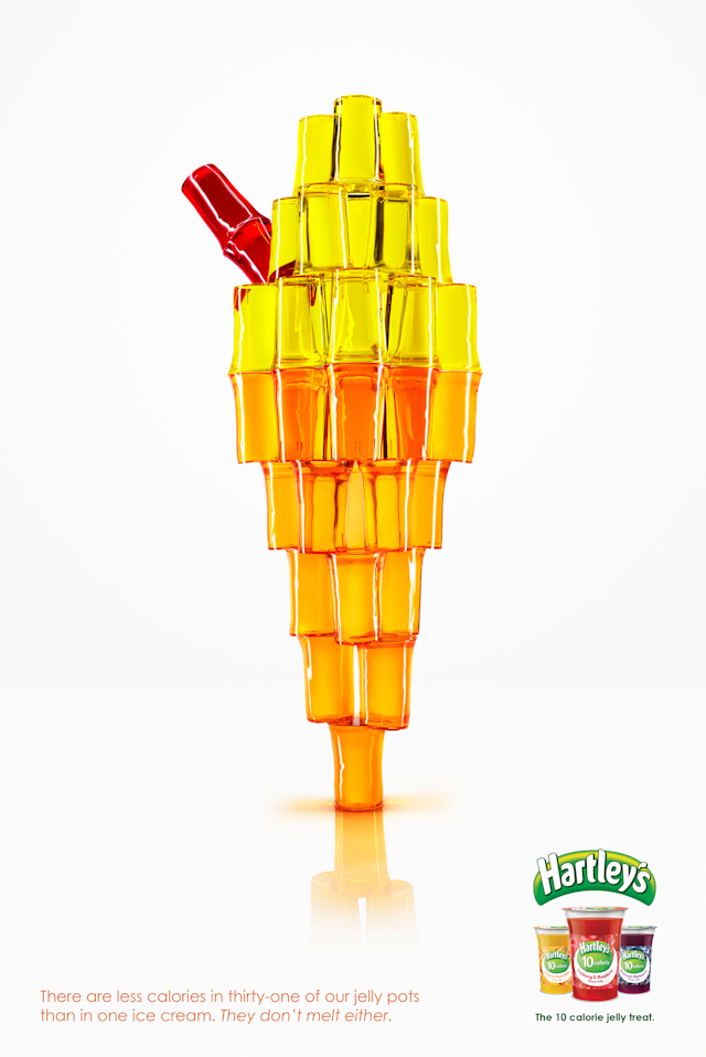
McCann Manchester: Hartley's Jelly 'Ice Cream' print ad
Credits Brand: Hartley’s JellyTitle(s): Ice CreamHeadline and copy text (in English): There are less calories in thirty-one of our jelly pots than in one ice cream. They don’t melt either.Agency: McCann Manchester, Manchester, UKAgency website: http://www.mccannmanchester.comCreative Directors: Dave Price & Neil LancasterArt Director: James ClancyCopywriter: Nick Entwistle Photographer: David GillPublished: February 2013Short rationale (optional): In a diet conscious, calorie conscious, health conscious world, snacks and treats come with a whole lot of guilt. But thanks to Hartley’s jelly pots, this guilt is taken away. At only 10 calories, these treats barely register on the recommended daily calorie intake in comparison with other calorie heavy treats. And, what’s more, they’re really tasty. Therefore, our message to diet-conscious treat lovers is that there are less calories in thirty-one Hartley’s jelly pots than there are in one single ice cream. This serves to demonstrate just how incredibly low the calorie content is in a Hartley’s jelly pot.
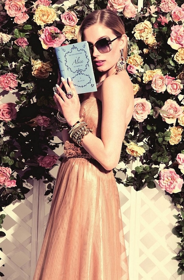
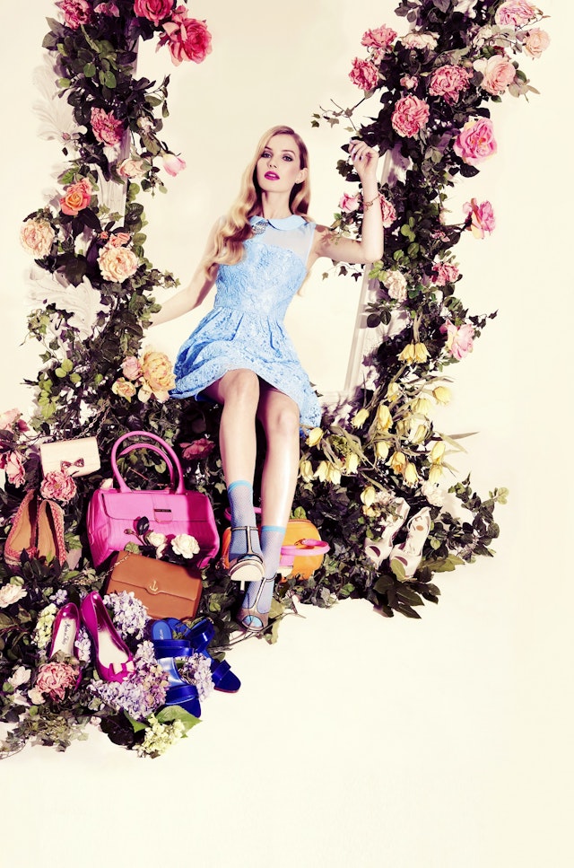
BrandAlley: BrandAlley Grown Up Alice ad campaign
Credits Brand: BrandAlleyTitle(s): Grown Up Alice Headline and copy text (in English): The Emporium of Style and LuxuryAgency: In HouseArt Director: Lyne CaseyCopywriter: Jo Beale Photographer: Julia KennedyPublished: April 2013Short rationale (optional): The new advertising campaign takes the theme of a grown up Alice In Wonderland with three striking visuals (a mad hatter-style tea party, Alice tumbling down the rabbit hole and Alice all grown up) portraying a designer lifestyle that may be considered unreachable in austere times. BrandAlley’s new tagline “The Emporium of Style and Luxury” emphasises the wide-range available to members with five new designer sales every day. It also wants to dispel the negative connotations around discount and instead celebrate the savvy shopper who maintains their lifestyle by shopping smarter.
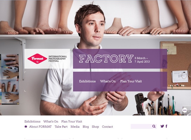
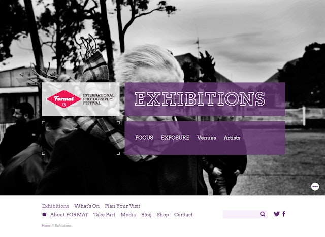
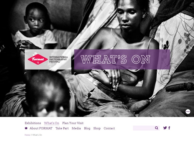
Katapult - FORMAT – International Photography Festival website development
CreditsBrand: FORMAT – International Photography FestivalTitle(s): FORMAT website development Agency: Katapult, Derby, UKAgency website: http://www.katapult-studios.comCreative Director: Martin EnrightAdditional credits: Website Developer: Katherine CoryPublished: February 2013Short rationale (optional): FORMAT13 is the fifth biennial international photography festival in Derby. The look and feel of both the website and the marketing materials was heavily influenced by the overall theme of the festival 'Factory', meaning that crop marks and box outlines were incorporated into the design style to give the sense of a 'process'. The overall design was kept clean and minimal; allowing the photographs to remain the dominant feature. The project incorporated a responsive design and build ensuring the website works seamlessly across tablet, mobile and desktop.
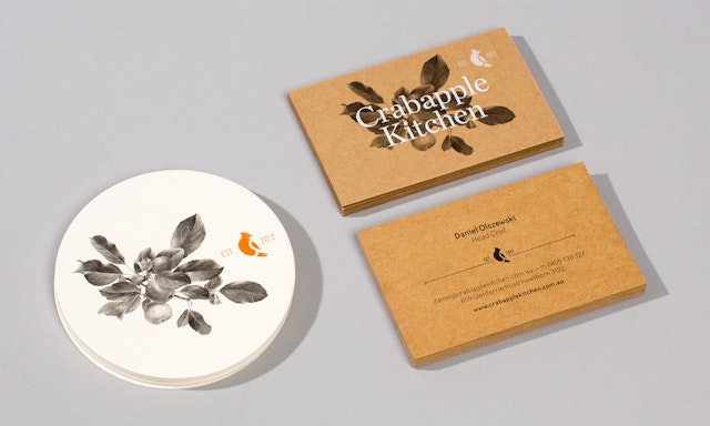
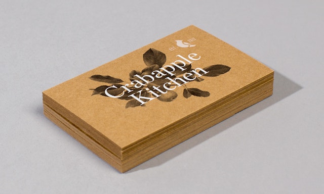
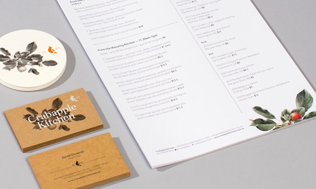
Swear Words: Crabapple Kitchen identity design and applications
CreditsBrand: Crabapple KitchenTitle(s): Identity design and applications Agency: Swear Words, Melbourne, AustraliaAgency website: http://www.swearwords.com.au Creative Director: Scott LarrittDesigner: Tom ClaytonPhotographer: Sean Fennessey Short rationale (optional): Crabapple Kitchen was designed with the busy person in mind, an oasis in Hawthorn where people can relax the moment they step through the door. The décor, the old school hospitality, the music and even the food has a touch of nostalgia, to transport you back to a simpler time. Our design solution marries a heritage, hand-made tactility to a more modern aesthetic for a timeless yet contemporary feel that mirrors the philosophy of the establishment. The Waxwing bird symbolises the nomadic nature of the extensively-travelled owner's and the inspiration of their food and service philosophy.
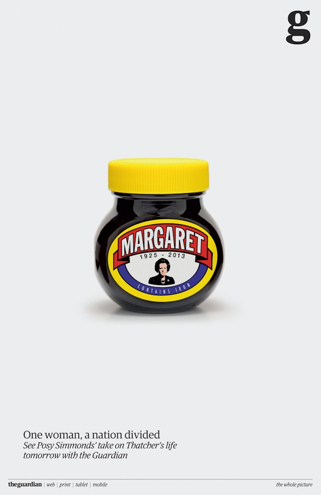
BBH London: The Guardian - Margaret 'Marmite' print ad
CreditsBrand: The GuardianTitle(s): Margaret Headline and copy text (in English): Margaret1925-2013Contains IronOne woman, a nation dividedSee Posy Simmonds’ take on Thatcher’s life tomorrow with the GuardianAgency: BBH, London, UK Agency website: http://www.bartleboglehegarty.comExecutive Creative Director: David KolbuszAdditional credits: Creatives: Peter Reid, Carl Broadhurst, Simon Pearse, Emmanuel Saint Leux, Harry Orton, Robin WarmanProducer: Aine DonovanChief Strategy Officer: Jason GonsalvesStrategic Business Lead: Ngaio PardonTeam Director: Jon BarnesTeam Manager: Lucy NebelPublished: April 2013
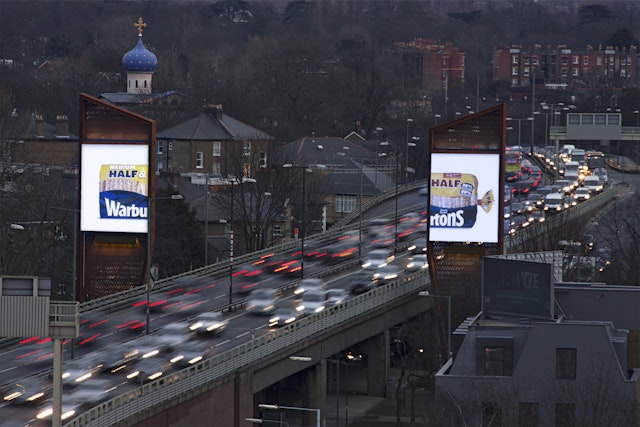
WCRS: Warburton's Half and Half outdoor execution
CreditsBrand: Warburton’s Title(s): Half and HalfAgency: WCRS, London, UKAgency website: http://www.wcrs.comCreative Director: Billy FaithfullPhotographer: Andy Gallagher Additional credits: Creatives: Naz Nazli, Rob WelchAgency Producer: Sarah Ritchie Media Owner: Clear ChannelAccount Director: Vicky JanawayPublished: April 2013
Grey London: Vodafone 'The Kiss' TV ad
Credits Brand: VodafoneTitle(s): The KissAgency: Grey London, London, UK Agency website: http://www.grey.co.ukExecutive Creative Director: Nils LeonardCreative Director: Jonathan MarlowAdditional credits: Head of Planning: Leo RaymanProduction Company: AcademyDirector: Frederic PlanchonEditor: Sam Rice-EdwardsSoundtrack Composer: Ludovico EinaudiPublished: March 2013
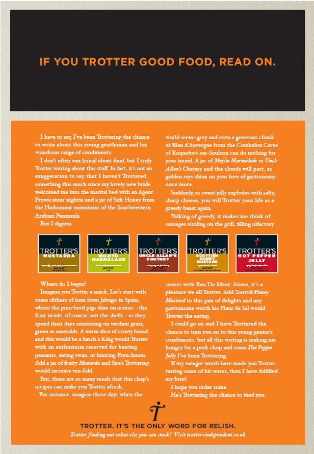
Newhaven Communications: Trotter's Independent Condiments print ad
CreditsBrand: Trotter’s Independent CondimentsTitle(s): If you Trotter good food, read on. Agency: Newhaven Communications, Edinburgh, UK Agency website: http://www.newhaven-agency.co.ukCreative Directors: Chris Watson and Rufus WedderburnArt Director: Rufus WedderburnCopywriter: Chris WatsonAdditional credits: Planner: Claire WoodPublished: May 2013 Short rationale (optional): Newhaven have written what could possibly be the first long copy advert attempted in advertising since the late 90ʼs, with their launch work for Trotterʼs Independent Condiments, a new food company based in Fife. The campaign focuses on the quality nature of the product and appeals to people who appreciate and enjoy good food. The ads will appear in the food press.
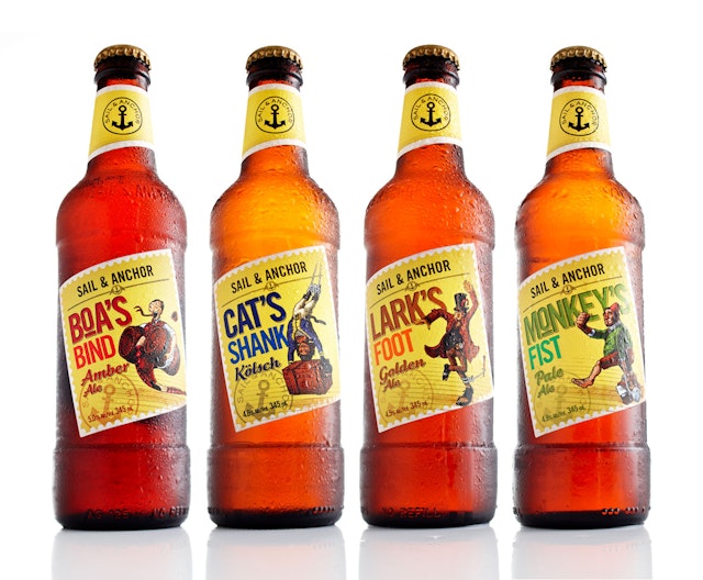
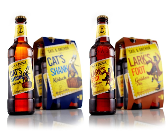
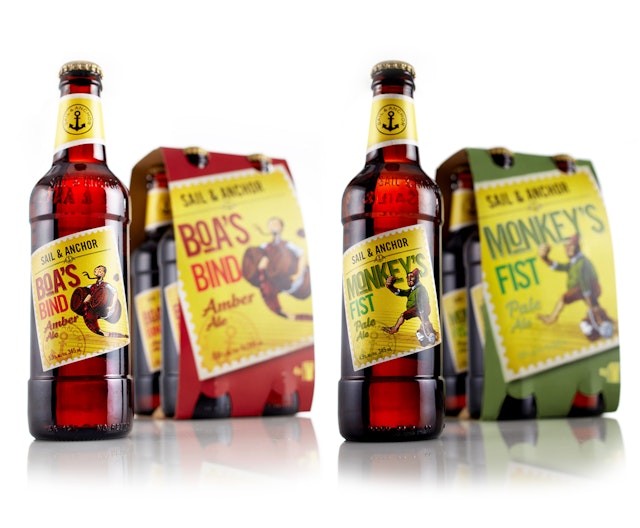
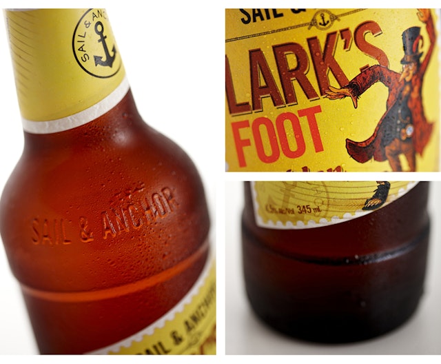
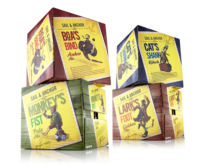
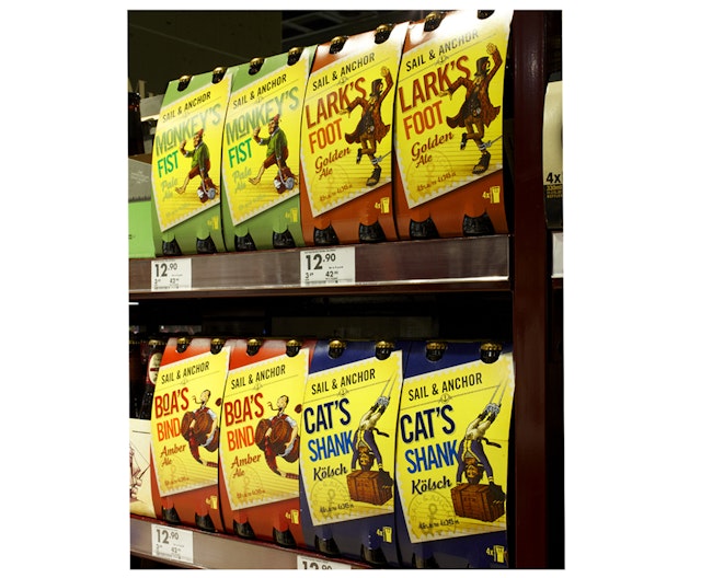
Marque Brand Consultants: The Pinnacle Group 'Sail & Anchor' craft beer branding
CreditsBrand: The Pinnacle Group Agency: Marque Brand Consultants, North Sydney, Australia Agency website: www.schawk.comCreative Director: Gavin GreenhalfCopywriter: Chris HurcombeIllustrator: Blair Sayer Additional credits: Designer: Ashley LowerShort rationale (optional): The Brief: The Pinnacle group tasked Marque Brand consultants with extending the portfolio of its mainstream Sail & Anchor brand into a craft beer territory for a new range. Knowing that the craft beer drinker most likes the authenticity in their great tasting beer of choice, and revels in the detail of crafted ingredients, Marque delved into the history of the Sail & Anchor brand to unearth a truth that could be the bedrock of the craft range. What it so excitedly discovered was that the Sail & Anchor brand has over a century of heritage in the seafaring port of Fremantle, where sea shanties have been sung and beers have been brewed in the Sail & Anchor hotel off and on for decades and is still being brewed there today. The Sail & Anchor hotel had seen many seafaring characters and personalities walk through its doors and the resulting brand weaves wonderfully romantic stories of Sailor's Knots used in days gone by, elements of Fremantle history, a little touch of humour and brings them to life in an endearing illustrative form.
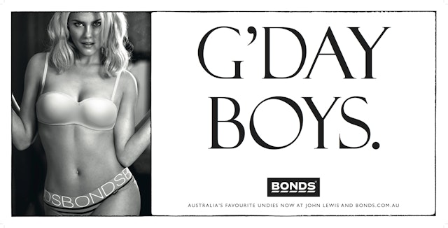
TBWA\London: Bonds 'G'Day Boys' Billboard ad
Credits Brand: Pacific Bonds, BondsTitle(s): G’Day BoysAgency: TBWA\London, London, UKAgency website: http://www.tbwa-london.comExecutive Creative Director: Andre Laurentino Photographer: Nick Hudson via The Arc FactoryAdditional credits: Chief Creative Officer: Peter SouterPresident TBWA Group UK: Lindsey EvansAccount Director: Maggie Nukk Account Manager: Kirsten Barnes Media Agency: M2M mediaModel: Rachel TaylorHair: John DeeMake Up: Robin Black Published: April 2013
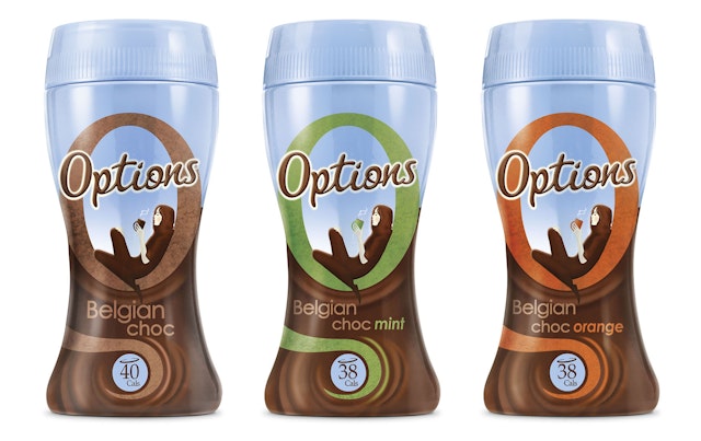
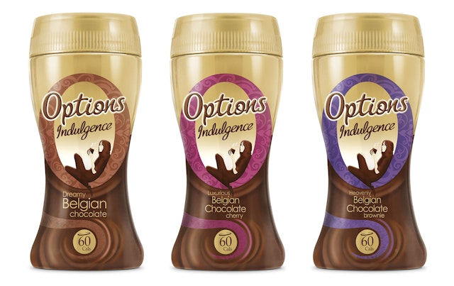
CreditsBrand: OptionsTitle(s): Brand Redesign Agency: Springetts Brand Design Consultants, London, UKAgency website: http://www.springetts.co.ukPublished: April 2013Short rationale (optional): April sees the rollout of a redesign of the Options Hot Chocolate brand by Springetts Brand Design Consultants. Springetts was tasked with optimising the branding and pack design for the core and Indulgence Options ranges to broaden the brand’s appeal. Says Springetts managing director, Andy Black, “We developed a visual architecture to help the brand establish a dual tier approach, allowing for the enhancement of taste credentials for the Options Indulgence range.”
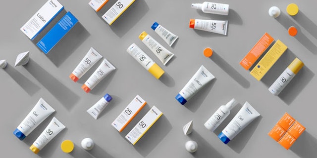
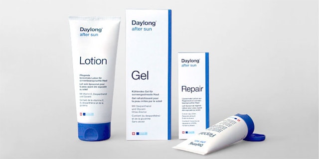
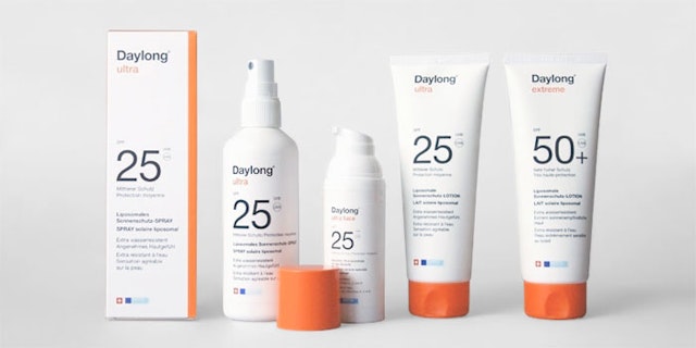
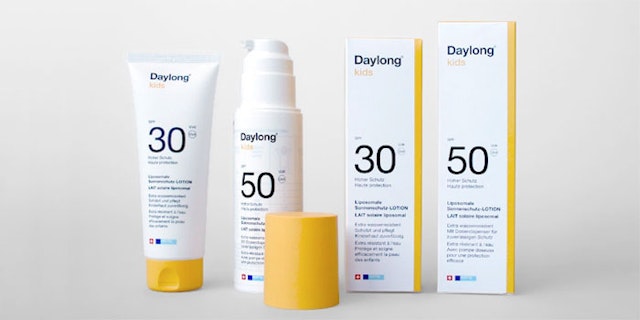
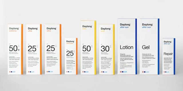
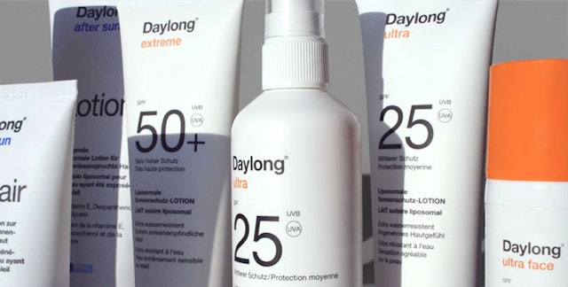
TODA: Daylong brand redesign
CreditsBrand: DaylongTitle(s): Daylong Redesign Agency: TODA, Brooklyn, New York, USAAgency website: http://www.toda.com Creative Director: Marcos Chavez (NYC) and Thom Kajaba (Hamburg)Art Director: Melissa ShowalterAdditional credits: Designers: Stine Nielsen, Louise JessenStrategic framework: The Refresh Company (Dietlinde Paetzelt, Elisabeth Baumgartner)Head of artwork at Daylong: Bruno GlanzmannPublished: February 2013Short rationale (optional): TODA redesigned Daylong, one of Switzerland's leading brands in sun protection. TODA's New York office collaborated closely with the Hamburg office to guide the Swiss client in the redesign. TODA was inspired by the deep traditions of Swiss design, and so the package embraces bold, objective typography and vibrant colors to distinguish the formulas, the families, and the brand as a whole.
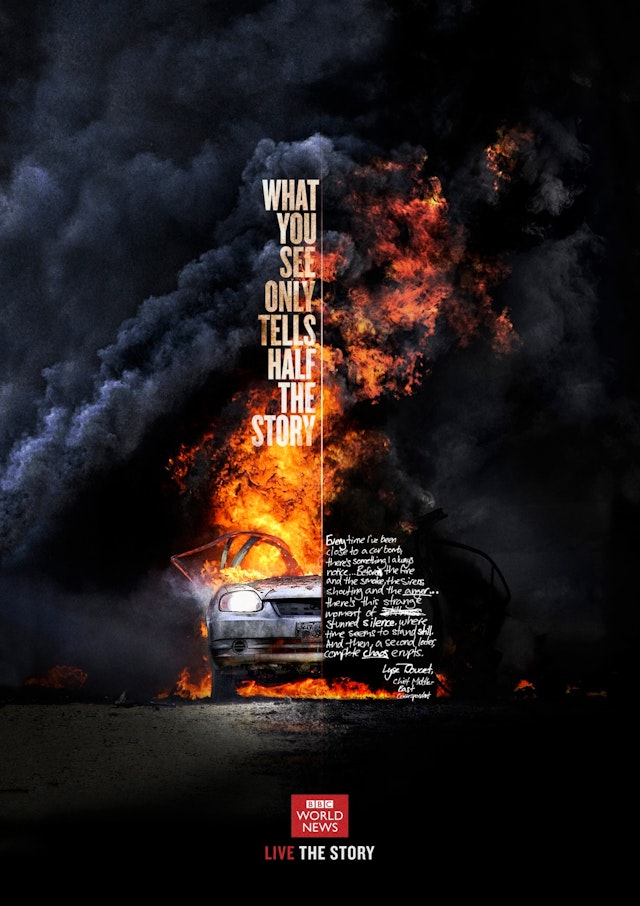
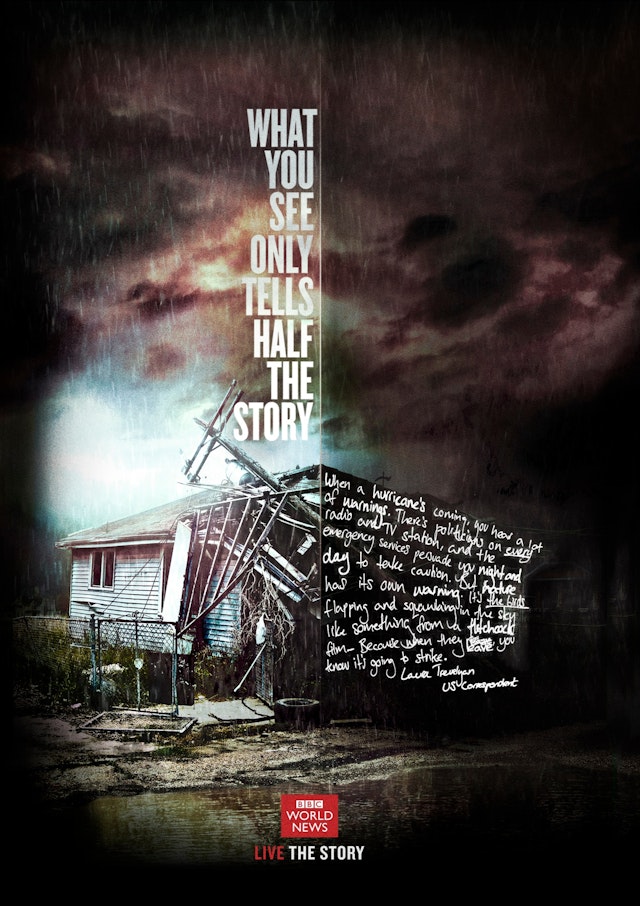
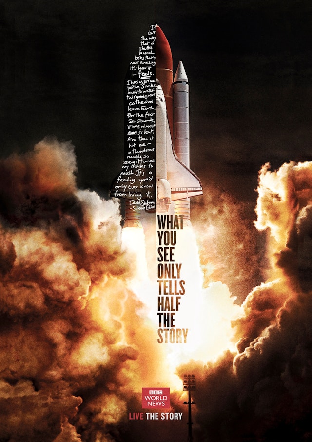
RKCR/Y&R: BBC World News print ads
Credits Brand: BBCAgency: RKCR/Y&R, London, UKAgency website: http://www.rkcryr.com Executive Creative Director: Tony Talbot Creative Directors: Ted Heath, Paul AngusArt Director: Gustavo KopitCopywriter: Barnaby BlackburnIllustrators: Lee Aldridge, Gustavo KopitTypographer: Barnaby BlackburnPublished: March 2013
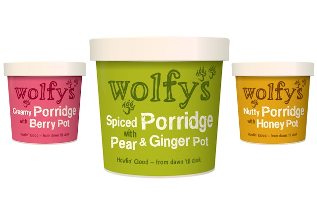
Hills Design: Wolfy's branding and packaging
CreditsBrand: Wolfy’sTitle(s): New branding and packaging Agency: Hills Design, Cheltenham, UKAgency website: http://www.hillsdesign.co.ukCreative Director: David Hills Published: April 2013Short rationale (optional): Bringing out a new porridge product into this fiercely competitive market sector placed even greater emphasis on the packaging being both unique and memorable. As brands begin to develop their own character and culture in today's world, it was also important that our design reflected this. The identity we created sets out to be compelling and playful, while always allowing for engagement with a broad consumer base. The paw prints that interlink with the type subtly suggest a character behind the identity and also allow the symbol of the paw to become synonymous with the brand. Distinctive colours and quirky typography help distinguish the varying flavours. The pots are launched this April, and we suggest that this is one wolf(y's) pack you might just want to be part of when they do start appearing on shelves.
WCRS: Sky Ireland TV ad
CreditsBrand: Sky Ireland Agency: WCRS, London, UKAgency website: http://www.wcrs.comCreative Director: Ross NeilAdditional credits: Creatives: Chris Ringsell, Naz Nazli, Rob WelchAgency Producers: Sally Lipsius, Joe PawseyAgency Digital Producers: Ivan SebastianAccount Management: Matt Edwards, Hollie AlexanderMedia Agency: MediacomProduction Company: Hungry ManDirector: Taika WaititiProducer: Camilla CullenDOP: Danny CohenEditors: John Smith at The WhitehousePost Production: Finish/Golden SquareSound: WavePublished: April 2013
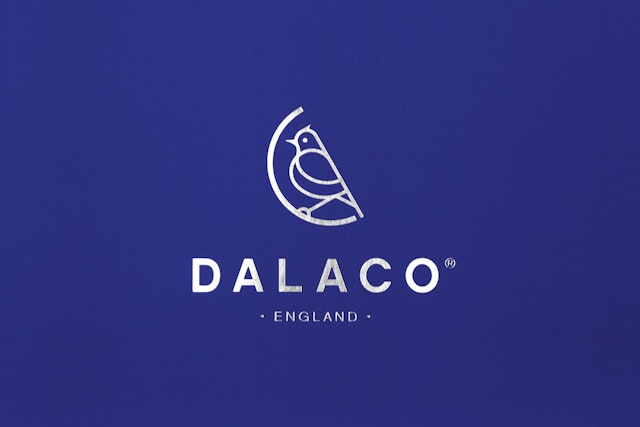
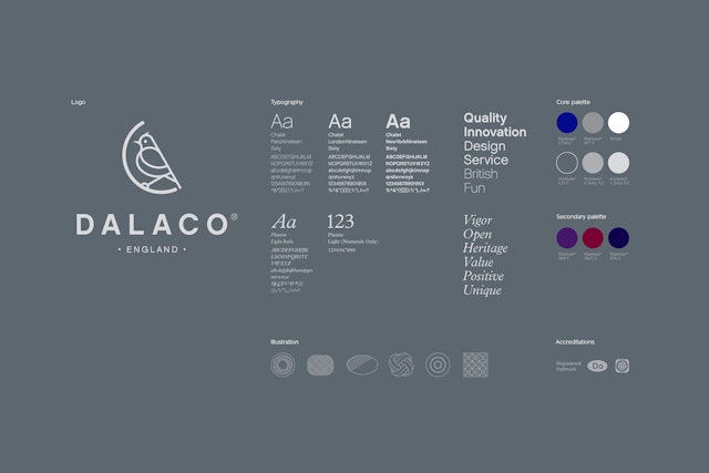
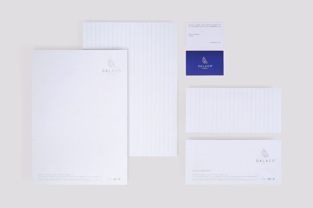
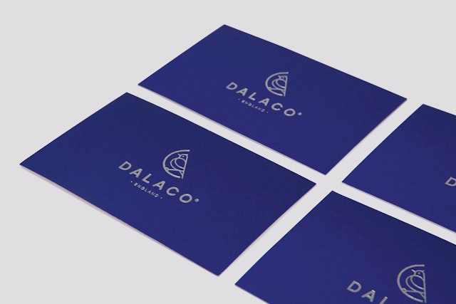
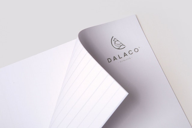
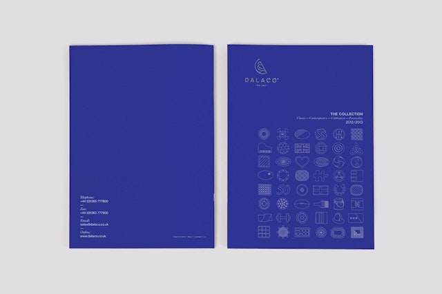
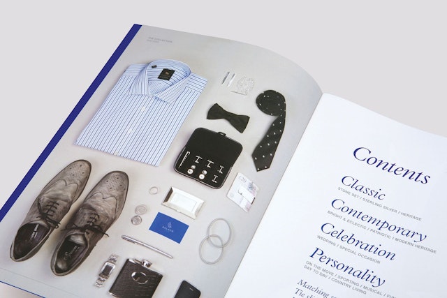
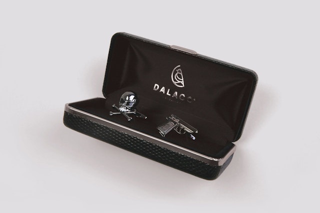
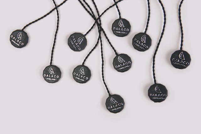
Believe In: Dalaco brand identity
CreditsBrand: DalacoTitle(s): Brand Identity Agency: Believe In, Exeter, UKAgency website: http://www.believein.co.ukCreative Director: Blair ThomsonDesigner: Tish EnglandCopywriter: Tim BurleyIllustrator: Tish EnglandPhotographer: Jo ThomsonPublished: April 2013 Short rationale (optional): The next generation of this established family business makes a strong commitment to creativity, looking forward while retaining a clear link to the past. Dalaco have been designing and marketing cufflinks and accessories to jewellers for over 30 years. When company founder David Larcombe sadly and unexpectedly passed away, his daughter Rachel was inspired to step in and lead the family company into a new chapter. At the heart of the new identity sits a lark, the classic English songbird that heralds the dawning of a new day. This was inspired by the heritage of the family name, Larcombe - derived from the Middle English larke together with cumbe, which means narrow valley or gorge. The Dalaco Lark acts as a symbol of creativity, care and passion, and a guarantee of quality.
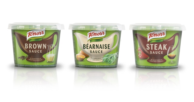
R Design: Knorr wet sauces packaging and identity initiative
CreditsBrand: KnorrTitle(s): RedzepiAgency: R Design, London, UKAgency website: http://www.r-design.co.ukCreative Director: Dave RichmondArt Director: Chris MurdochPhotographer: Steve PaynePublished: February 2013Short rationale (optional): A packaging & Identity initiative which aims to seize the growth opportunity in the Nordic markets and stem any migration from the brand. R Design was tasked with announcing the brand's presence in the fresh chilled cabinet by using its culinary credentials supported by taste and natural cues.
The Red Brick Road: Magners 'Now is a good time' TV ad
CreditsBrand: MagnersTitle(s): Now Is A Good Time Agency: The Red Brick Road, London, UK Agency website: http://www.theredbrickroad.comCreative Directors: Matt Davis and Richard MegsonArt Director: Marcus SmithCopywriter: Tom HopkinsAdditional credits: Client: Richard Schmidt, Magners GB Marketing ManagerBusiness Director: Kate ModelandProduction Company: Sonny LondonDirector: Steve RogersProducer: Charles Crisp, Tag WorldwideEditing House: SpeadeEditor: Sam SneadeSound: Factory – Tom Joyce & Sam RobsonPost: Bigbuoy – Producer: Barny Wright, Flame: Mark RobinsonGrade: Smoke and Mirrors – Mark HorrobinPublished: April 2013Short rationale (optional): Magners GB has announced an exciting new integrated marketing campaign for 2013 that revisits the traditional social spirit that first launched the brand in 2005. The new platform – Now Is A Good Time – will bring to life the sociability and spontaneity at the heart of the brand through a series of TV adverts, OOH advertising, PR and digital activity during 2013.
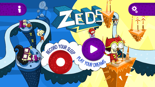
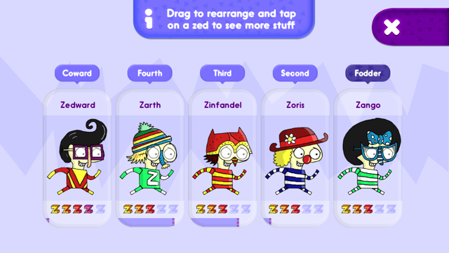
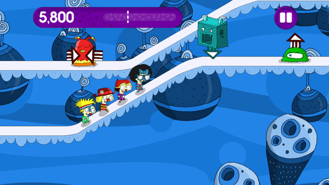
Chunk: Channel 4 'Zeds' app development
CreditsBrand: Channel 4Commissioner: Faraz OsmanTitle(s): Zeds Headline and copy text: Zeds: Record your sleep and play your dreamsAgency: Chunk, Glasgow, UKAgency website: http://www.chunkgroup.com/ Creative Director: Donnie KerriganTechnical Director: Brian McHargGame Design: Pete Low, Alan JackDevelopment: Shaun Campbell, Blair McSorelyInterface Design: Pam Holden, Graham DobieIllustrator: The Brothers McLeodPublished: April 2013Short rationale: Zeds is a unique app launched by Channel 4 and Chunk that lets teenagers record their sleep and turns the results into a game. The app works on iPhone and iPod Touch and aims to help teens learn to recognise and understand more about their sleeping habits and what they mean - helping them to become more sleep aware in a fun and entertaining way.
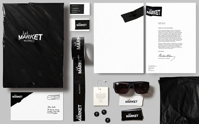
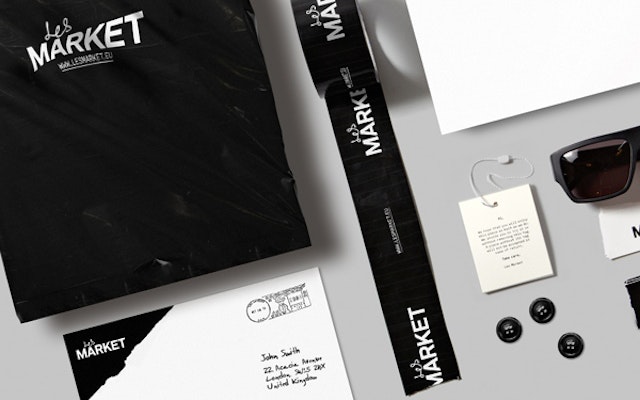
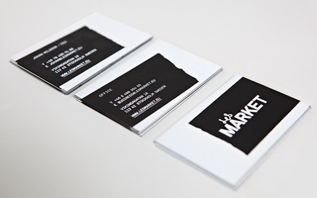
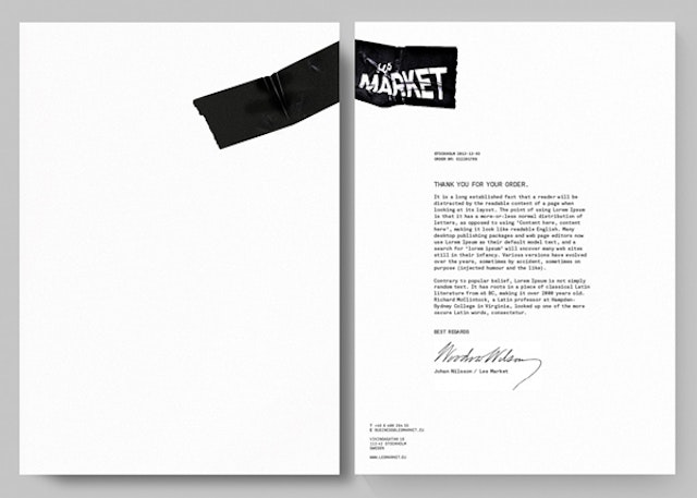
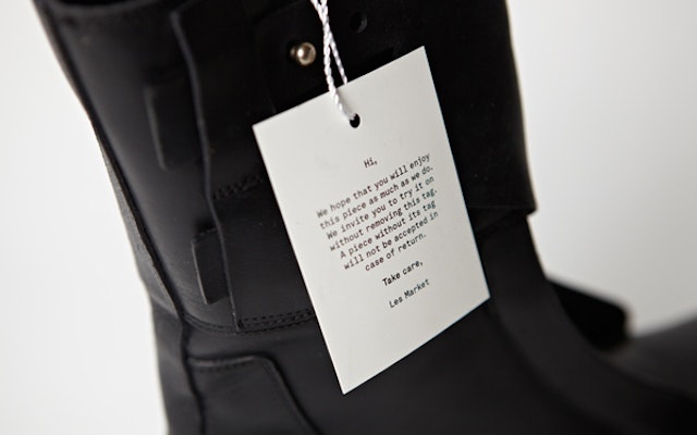
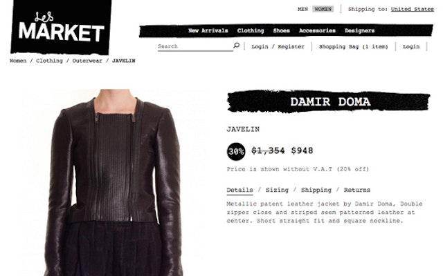
Planet Creative: Les Market branding
CreditsBrand: Les MarketTitle(s): Les Market BrandingAgency: Planet Creative, Stockholm, Sweden Agency website: http://www.planetcreative.comCreative Director: Tobias OttomarPhotographer: Patrik LindenShort rationale (optional): Les Market is an exclusive fashion boutique, offering a handpicked collection of cutting edge fashion brands such as Rick Owens, Kris Van Assche, Alexander Wang and Raf Simons. It’s first and foremost an online store, but there’s also a physical store in Stockholm. At Planet Creative, we wanted to avoid removing focus from the collection, but still show some edge. The profile and logotype is a juxtaposition of mechanical/strict and handmade/gritty. Also, we wanted Les Market to stand out amongst the often very minimalistic image of its competitors. We used the tape as a metaphor for the personal touch, and since it’s a very usable design element it can be used in great variety, both in its physical form and online.
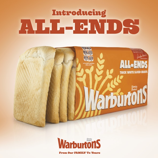
WCRS: Warburton's 'All Ends' print ad
CreditsBrand: Warburton’s Title(s): All Ends Agency: WCRS, London, UKAgency website: http://www.wcrs.comCreative Director: Billy FaithfullAdditional credits: Creatives: Hayden Rogers, Anne-Marie BurrowsAgency Producer: Sarah RitchieAccount Management: Rick Hirst, Richard Williams Published: April 2013
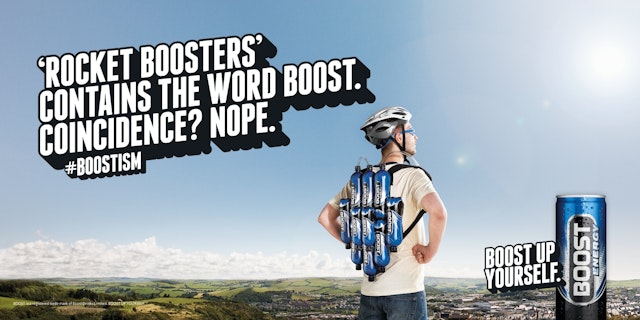
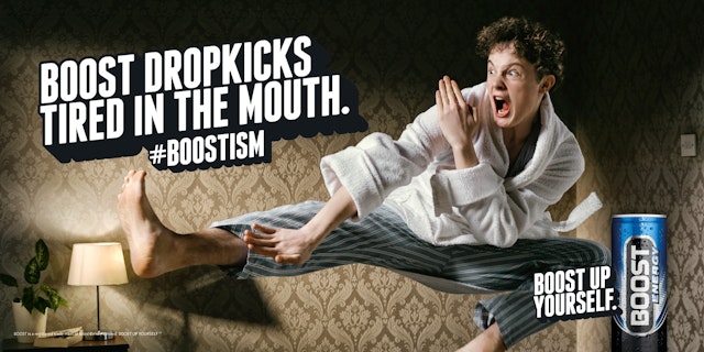
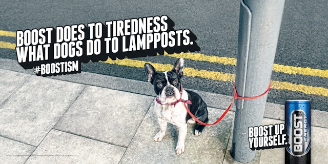
Big Communications: Boost print campaign
CreditsBrand: BoostAgency: Big Communications, Birmingham, UKAgency website: http://www.bigcommunications.co.ukCreative Director: Dylan BoggCopywriter: Josh PearcePhotographer: Gary SalterAdditional credits: Creative Group Head/Copywriter: James CrossCreative Group Head/Art Director: Tim Jones Client Team Director: Chris WalkerAgency Producer: June HackerDesigner: Duncan BancroftAccount Manager: Amelia SmithPublished: April 2013
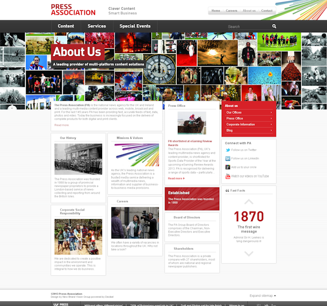
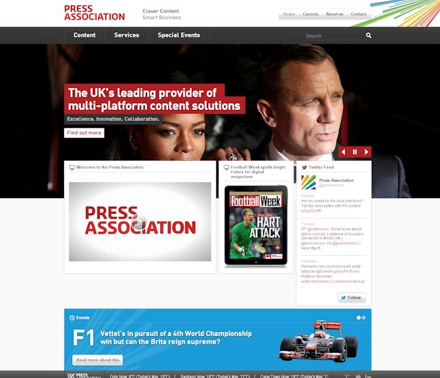
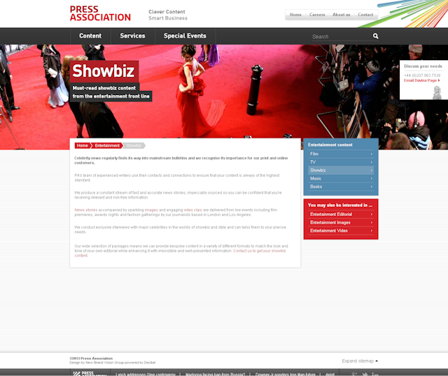
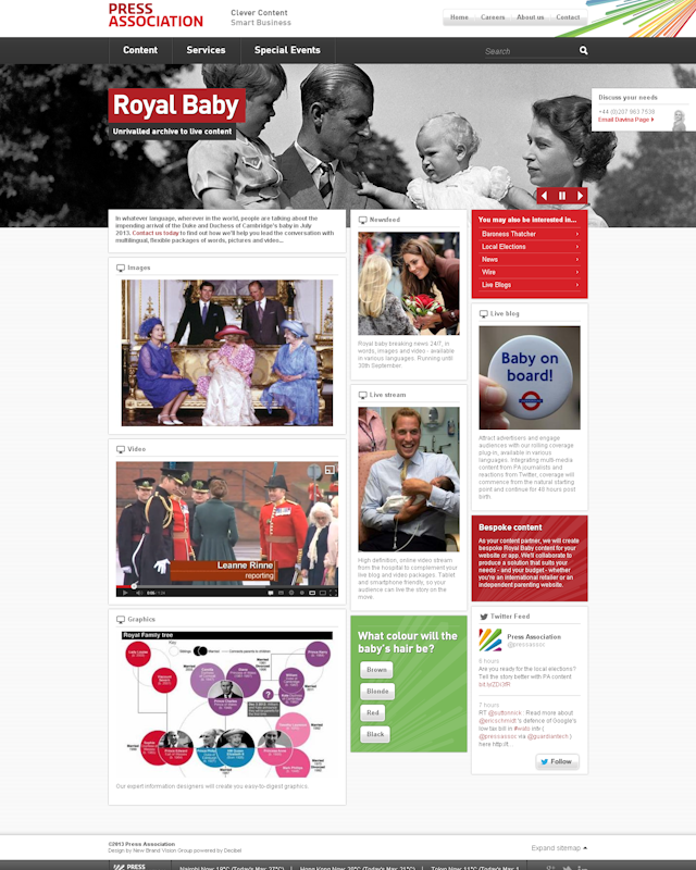
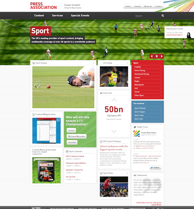
New Brand Vision: Press Association website re-launch
CreditsBrand: Press AssociationTitle(s): Re-launch of the Press Association’s websiteAgency: New Brand Vision, London, UKAgency website: http://www.newbrandvision.com Short rationale (optional): NBV successfully brought together the depth and volume of PA's content into one, user-friendly, visual site.
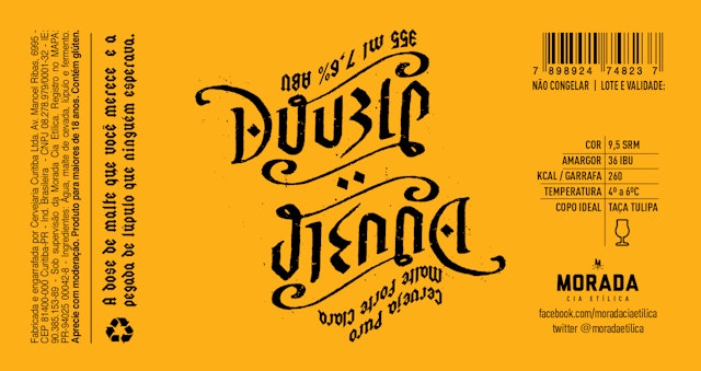
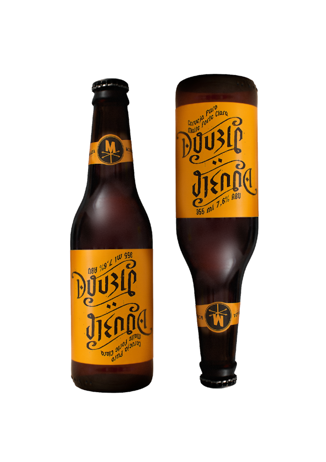
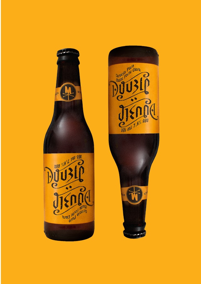
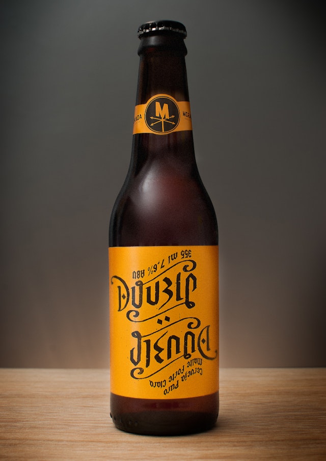
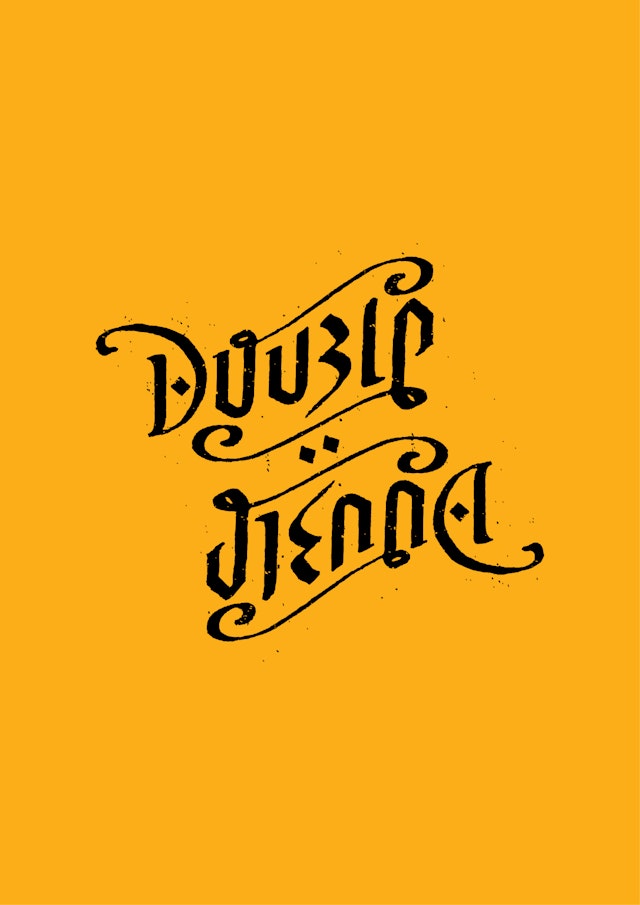
CreditsBrand: Morada Cia. EtilicaTitle(s): Double Vienna Beer Packaging Agency: D-lab, Curitiba, BrazilAgency website: http://www.dlab.com.br Creative Directors: Daniel Mazer and Henrique BorgesArt Director and Design: Daniel Mazer and Diego Martins Ambigram Illustrator: Beto JanzPhotographer: Henrique BorgesPublished: February 2013Short rationale (optional): Concept and creation of a beer label Double Vienna for Morada Cia Etilica from Curitiba, Brazil. The label design was inspired by ambigrams, in which a graphical representation of one or more words can be rotated with same phonetics and visual representations.
Swear Words: Bindle identity design and applications
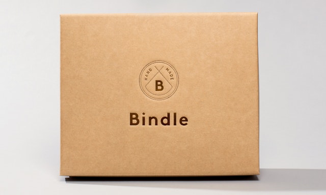
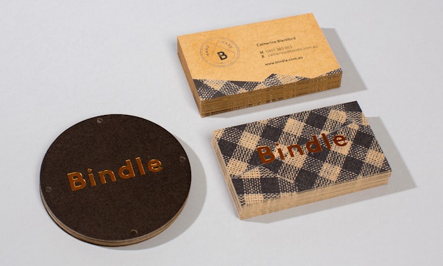
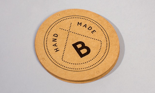
CreditsBrand: Bindle Title(s): Identity design and applications Agency: Swear Words, Melbourne, AustraliaAgency website: http://www.swearwords.com.au Creative Director: Scott LarrittDesigner: Paul GreskiePhotographer: Sean FennesseyShort rationale (optional): Catherine Blackford (Director) "...faced an ever recurring small nightmare of trying to find an inspired gift for friends and family for milestone occasions. After seeing the world becoming a lot smaller due to globalisation, and local produce becoming less and less a feature in gift purchases, Bindle was born. Bindle engages local artisans to produce Australian, hand-made, tailored gift packages. There are Bindles for every occasion and every part of the creation is Australian - the products within the Bindles; the boxes that contain them; the hand that wrapped them." Our design solution uses subtle visual cues of the bindle (a wrapped bundle traditionally carried over the shoulder with a stick) within a polished, modern and premium package. The identity needed to be somewhat timeless yet aligned with premium the brands contained within. Copper foiling and raw stock enhance the hand-made feel, sense of preciousness and occasion. Hopefully the lovely boxes are coveted and re-used by the recipient.
Leo Burnett: McDonald's 'Worth getting up early for' TV ad
CreditsBrand: McDonald’s Title(s): Worth getting up early for Agency: Leo Burnett, London, UKAgency website: http://www.leoburnett.co.uk Creative Director: Adam TuckerAdditional credits: Creatives: Phil Deacon and Sabina KellyAgency Producer: Hannah BoaseMedia Agency: OMDPlanner (media agency): Lucinda AllenProduction Company: Rattling Stick Published: April 2013
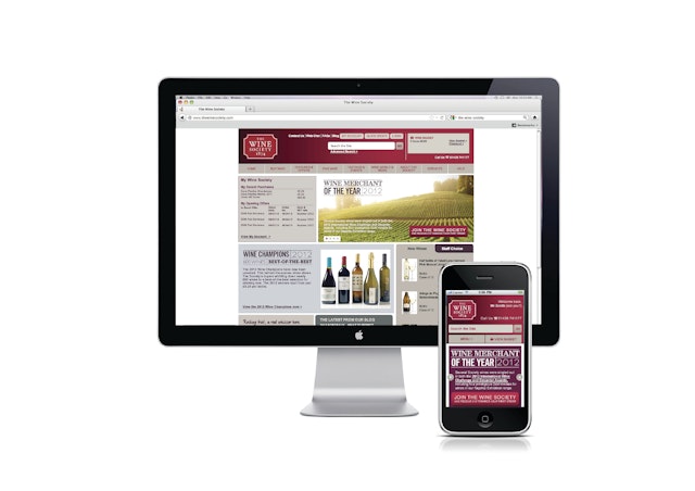
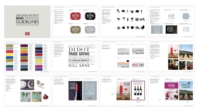
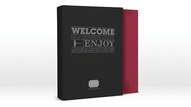
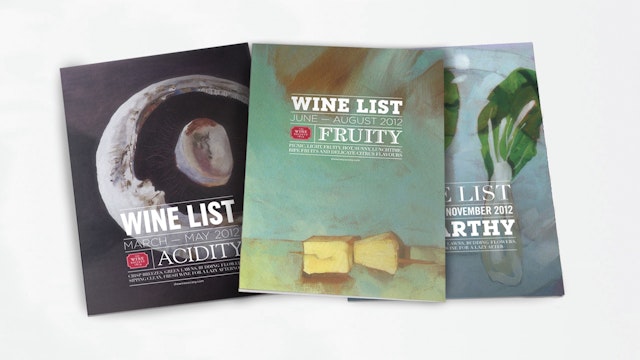
True North: Wine Society visual identity and e-commerce site
CreditsBrand: Wine SocietyAgency: True North, Manchester, UKAgency website: http://www.thisistruenorth.co.ukCreative Director: Ady BibbyAdditional credits: Planning Director: Claire RigbyDesigners: Vicky Pinnington, Karen HughesAccount Directors: Tree Tabernor, Jill RichardsArtwork: Emma RalphLogo Type: The Caseroom PressDigital Aspects: Neal AndrewsPublished: April 2013
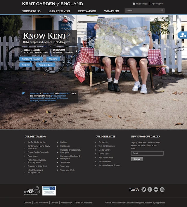
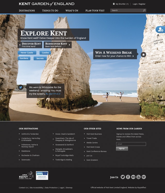
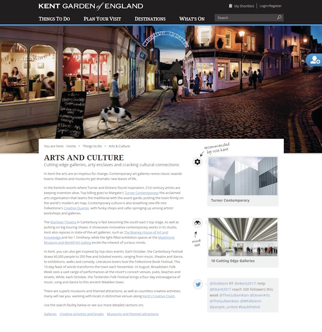
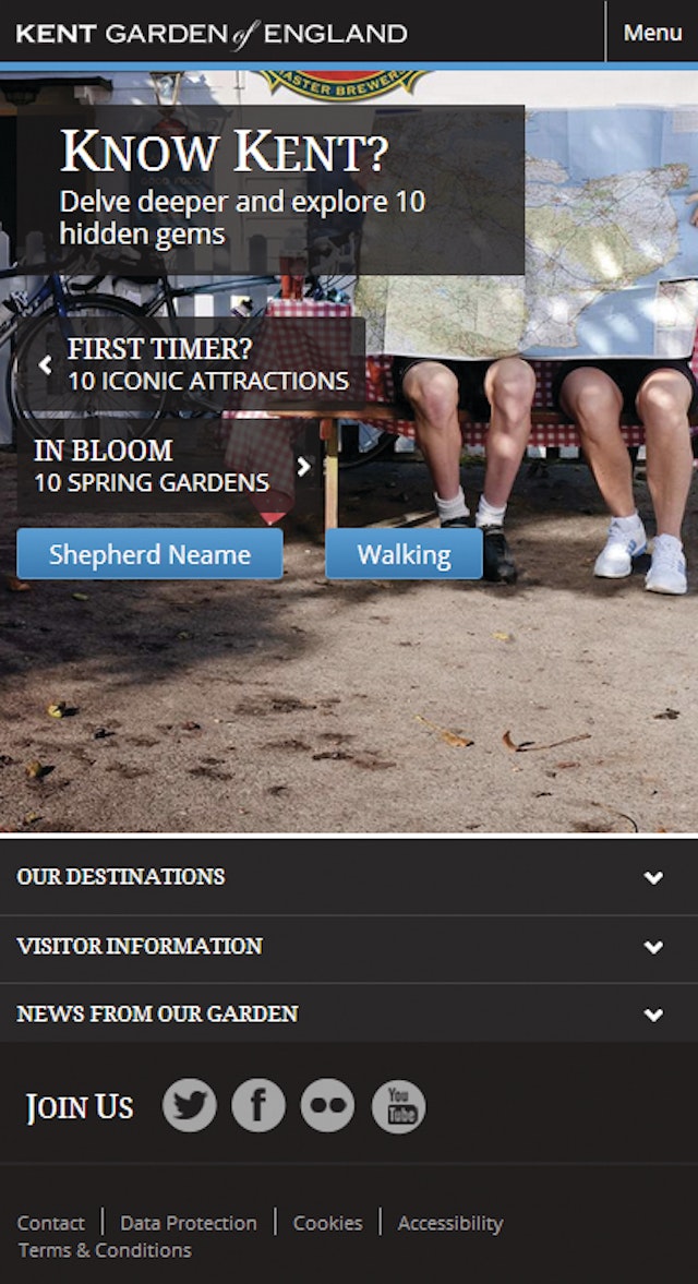
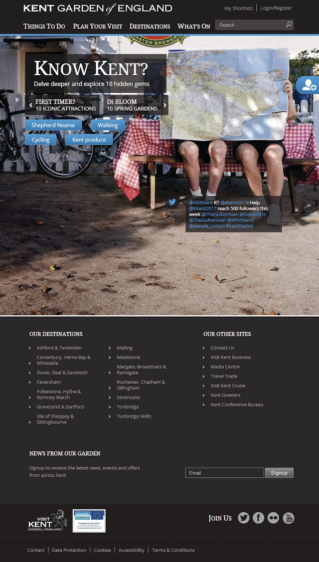
Rippleffect: Visit Kent website redesign
CreditsBrand: Visit KentTitle(s): Visit Kent website - Make Kent Your GardenAgency: Rippleffect, Liverpool, UKAgency website: http://www.rippleffect.com Creative Director: Hayden EvansDesigners: Ian Kendrew & Leah DoughertyDeveloper: Nick DolleyFront-end developer: Stuart RaysonCopywriter: Belinda DixonProject manager: Nathalie AucuttPublished: April 2013Short rationale (optional): Kent is a beautiful region, with countless things to do and places to visit. Such an inspiring setting and working with the strong 'Garden of England' brand brought a great responsibility to create a site that delivered a real impact in the tourism sector. Our approach was a completely user-centric, personalised experience that allows the user to tailor the content of the site based on their own choices. These preferences are set around the people in their group, the activities they are interested in and the season of their visit. Stunning photography was given real prominence in the designs to provide inspiration to new, returning or regular visitors to Kent. To ensure that this strong visual style was maintained across mobile devices we developed the site as a responsive design solution. This enabled us to craft an interface that worked best on smaller screens whilst still representing the brand values of beauty and inspiration strongly.
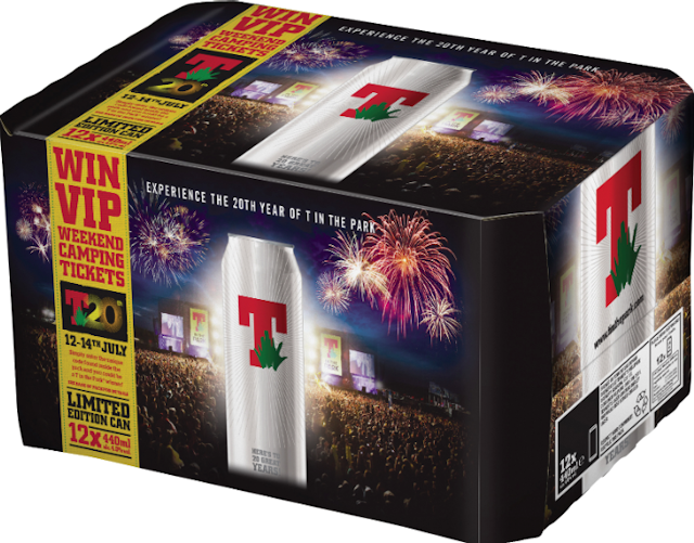
D8 Agency: Tennent's Lager T20 Limited Edition can and pack design
CreditsBrand: Tennent’s LagerTitle(s): T20 Limited Edition CanAgency: D8 Agencywebsite: http://www.weared8.com/Creative Director: Adrian CarrollAdditional credits: Ian Middleton, Jo SteinPublished: April 2013Short rationale (optional): Can: Working with the team at Tennent's, we were tasked with designing a can that was clean, confident, simple and iconic. Something covetable that would have an element of collectability. We're delighted with the result.Pack: We were asked to create a pack which would convey the spirit and experience of T in the Park. Drawing from the Tennent's image library we decided to combine an impactful and energetic shot with the product to create something that would have a real presence on shelves. It's been a great project to be involved in and we're looking forward to seeing both the can and pack in stores across Scotland.