Pubstomper Brewing Co.: advert-body-2 by Robot Food
- Location:


With an uncompromising take on flavour, the West Virginia based brewery needed a brand as ‘righteously dank’ as their ales.
With a demanding audience of craft beer lovers, the young co-founders wanted to intentionally understate the flavour inside and give their niche market something totally unexpected. The new identity had to communicate – but not overemphasize – the powerful flavour and craft credentials of the brand.
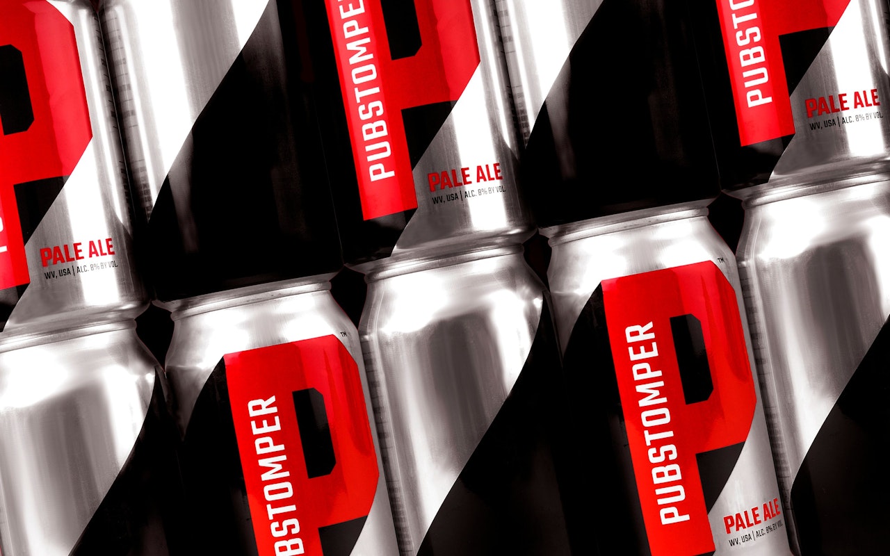
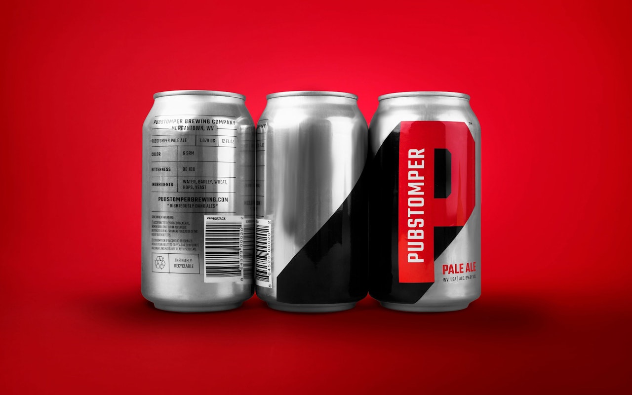
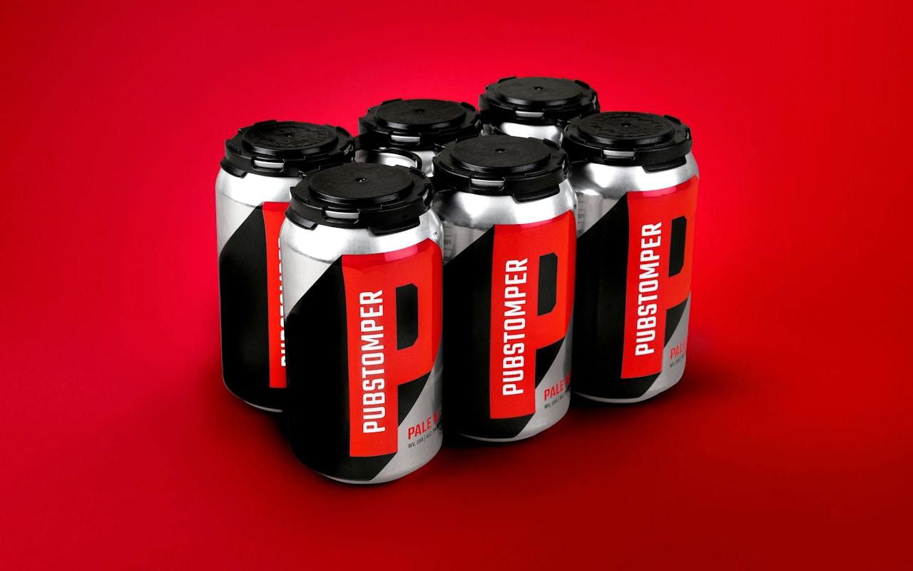
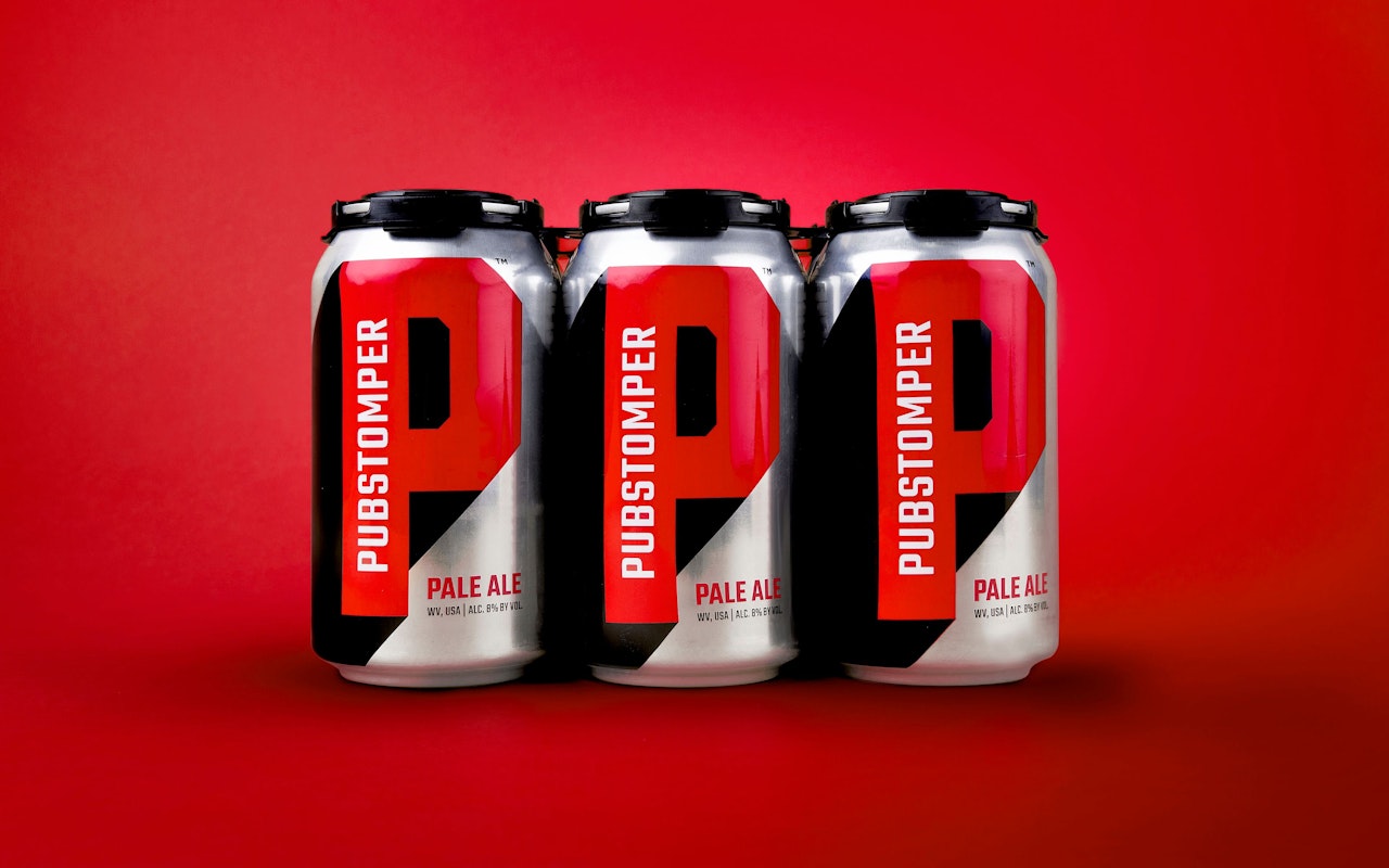
Robot Food’s solution was a muscular identity with plenty of positive impact. The black, red and silver colour palette packs a visual punch, indicative of the strength and depth of flavour found inside, while a strikingly simple on-pack ingredients table lets the ale speak for itself. Typography is distinct and confident, with the logo’s distinctive ‘P’ an unmissable beacon front and centre.
The new identity promises to grab as much attention online as it will do on-shelf, with sharp, clean graphics proving to be a winning combination in an execution that’s every bit as bold as their beer tastes.
Credits
Creative director: Simon Forseter
Additional credits: Co-founder (Pubstomper): Cody Cheesebrough