Sano: advert-body-1 by Clinic
- Location:


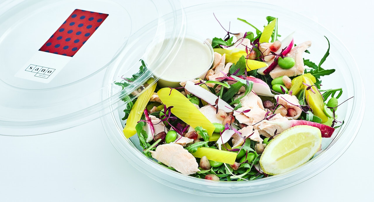


Creative agency Clinic have created the branding and identity for Sano: a new, fad-free food brand using nutritional science to change the way people eat.
Clinic positioned Sano in the complete opposite direction of other healthy, wellbeing brands by using vibrant colours, bold patterns, and striking visual cues. This reflects Sano’s fresh way of thinking and their ‘facts not fads’ approach of sticking to real nutritional science and staying clear of transient health trends.
The logo is inspired by the grid of a periodic table, referencing the precision, thought and science that has gone into considering the qualities of all Sano’s ingredients and how they work together. Meanwhile, typography is inspired by the founders’ mission to start a ‘nutritional revolution’ and subtly references the stenciled typography seen on revolutionary posters and artwork.
Clinic have created website guidelines, digital architecture and UX; tone of voice; photographic guidelines; ‘food-to-go’ interior in conjunction with interior design studio DesignLSM and exterior retail signage; packaging concepts; and print and digital advertising and marketing assets.
Credits
Agency: Clinic, London
Client: Sano